Audit Brief

cipionmarketing.com

All 8 pages combined · generated automatically

61
Today
84
After fixes

Your site is 61% ready on average across all 8 pages. Fixing everything below gets it to an estimated 84%.

⚡ Ship the fixes

Send 117 fixes to whoever ships it

Check or uncheck items in the checklist below, then use the bar right above it: Copy prompt pastes into a chat-based AI agent (Claude, ChatGPT...). Download JSON or the Advanced API below hand it to an autonomous coding agent (Claude Code, Cursor...). Download checklist is a plain to-do list for a human developer. Or skip all of that — see "Path 2" below.

Or open the raw JSON (all pages) →
Advanced: my agent has internet access, skip the files

Your site's API key (keep it private):

da3e5f20eb72a3b34a5d0927bd3790b8ab5baca2

Give your agent this command — it always fetches your latest saved findings for ALL pages, live:

curl "https://vislumbra.com/agent-fetch.php?api_key=da3e5f20eb72a3b34a5d0927bd3790b8ab5baca2"
Path 2: let it apply fixes for you automatically (private beta)

Instead of you copying a prompt or downloading a file, a weekly check can do the finding-and-proposing part for you:

  1. Once a week, it re-reads your latest Audit Brief and picks out fixes that need no file and no judgment call from you (blocker-free ones only — anything marked "needs a file" or "ask before doing" is never touched by this).
  2. Nothing is written to your site at this point. Each fix is queued as a proposal, exactly like this one:
{ "domain": "yoursite.com", "file_path": "index.html", "pillar": "Words on the Page", "task": "Clarify what 'GEO' means on first mention", "why": "Visitors may not know the acronym.", "old_snippet": "GEO optimizes for citation...", "new_snippet": "GEO (Generative Engine Optimization) optimizes for citation...", "status": "pending" }
  1. You get notified that proposals are waiting. You open your review queue, see a before/after diff for each one, and click Accept or Reject individually — nothing ships to your live site without that click.
  2. You can reject anything, anytime, for any reason. There is no "auto-approve" setting — every single change needs your explicit yes.

This is a private pilot right now, not a self-serve toggle yet — ask us to turn it on for your site.

selected
🖼️

Photos & Images

19 to fix
Replace or sharpen the huge out-of-focus hero photo/video Home
Five screen-heights of blur with no visible subject or message wastes the most valuable real estate on the page and looks like a loading error to visitors.
why: hero media appears heavily blurred across chunks 1-5, no in-focus subject or overlay text visible
Add descriptive alt text to the hero image/video Home
Screen reader users currently get no information about what this large visual is meant to convey.
why: no visible caption/alt indicator on hero media
Increase contrast/size of the small logo mark in the header Home
The paw-print icon next to 'Cipion Marketing' is tiny and low-contrast against the dark background, making the brand hard to notice.
why: chunk 0, header logo icon ~15px on near-black background
Replace the plain text client names with actual logo marks Services Geo
A wall of grey text (Toyota, T-Mobile, Bank of America...) reads as a claim, not proof; real logos are instantly more credible.
why: social-proof credibility bar, section 1
Add at least one real product or report screenshot Services Geo
Every visual on the page is a generic stylised dark background graphic; showing an actual citation report or dashboard sample would make the service tangible.
why: no product imagery anywhere in 6 sections
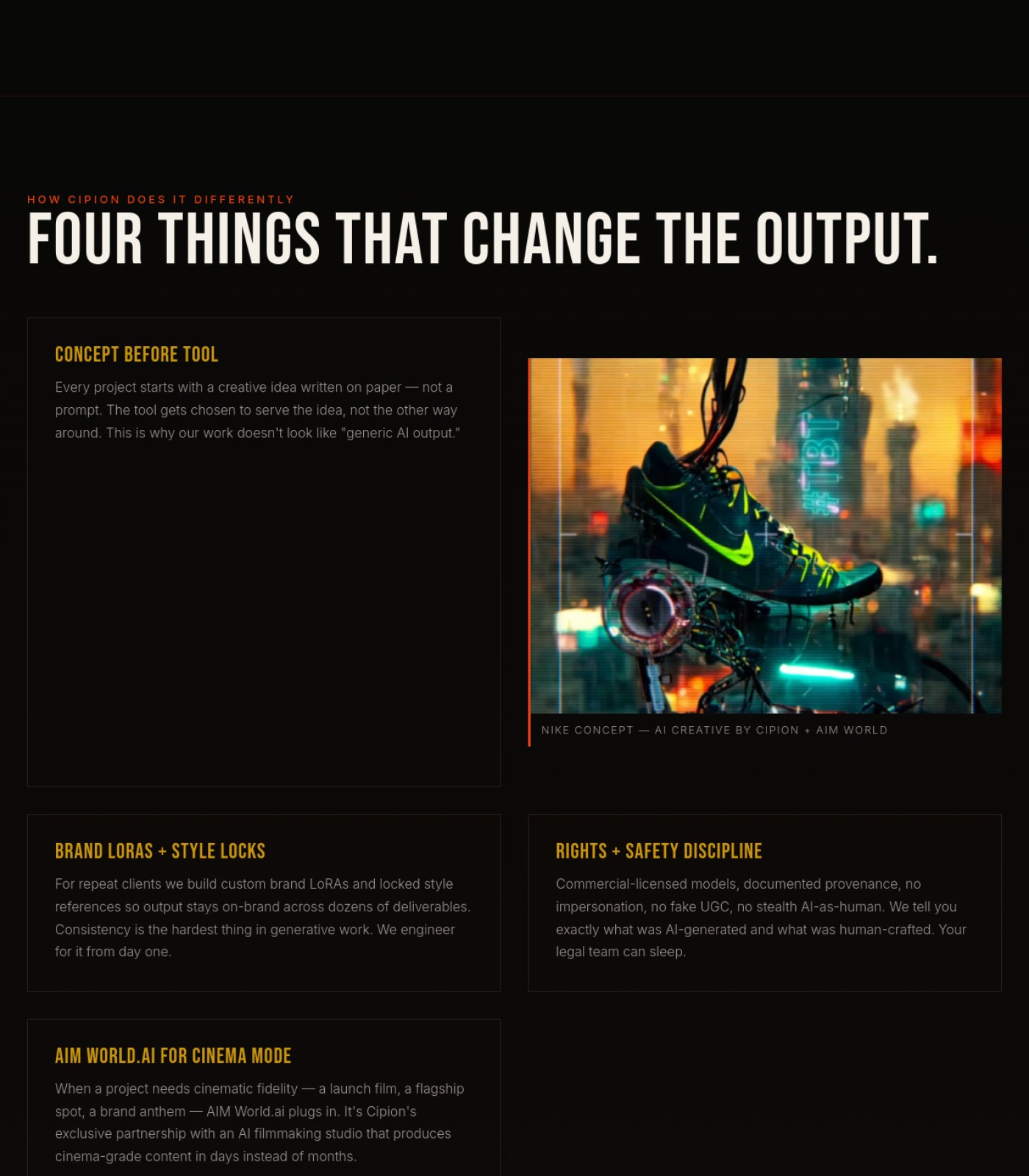
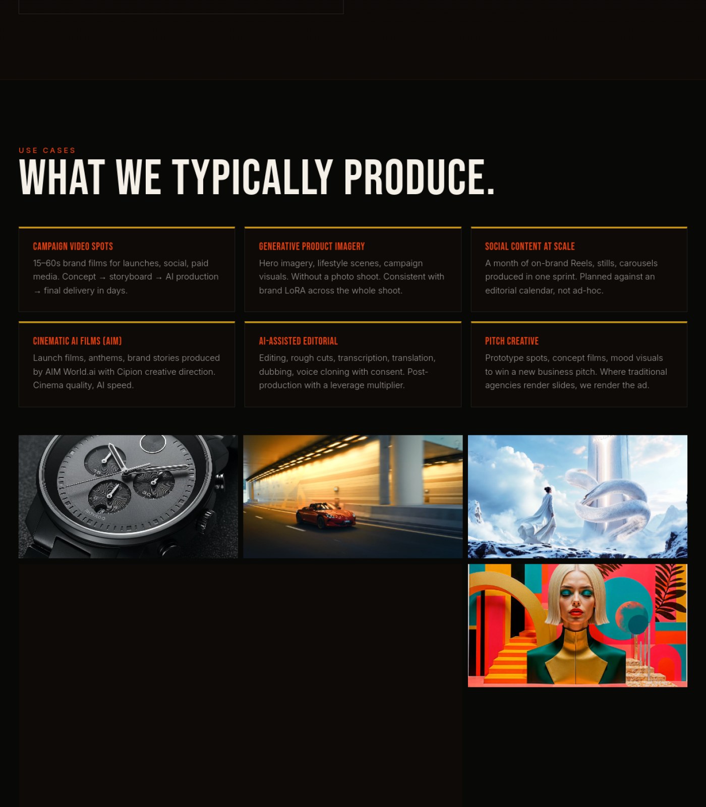
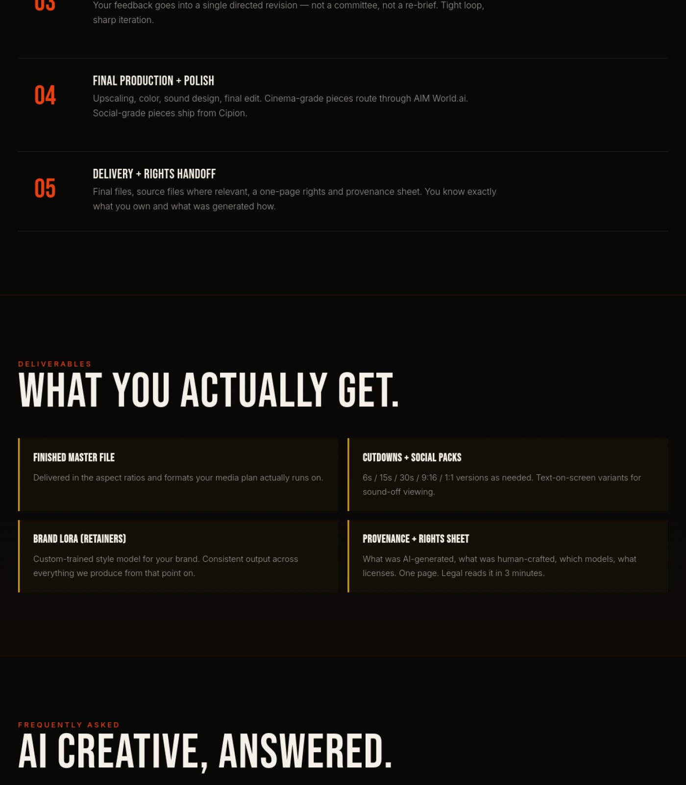
Add a short caption/credit to each of the four sample images in the 'What We Typically Produce' grid (watch, car, fashion editorial, colorful portrait) Services Ai Creative
Without labels, visitors can't tell whether these are Cipion's actual AI-generated work or generic stock photos, weakening the trust the section is trying to build
why: consistency of trust cues; compare to captioned Nike image above
Confirm the hero background video/image and all sample images have descriptive alt text Services Ai Creative
Screen reader users and search engines can't understand what's shown without it
why: WCAG 1.1.1 non-text content
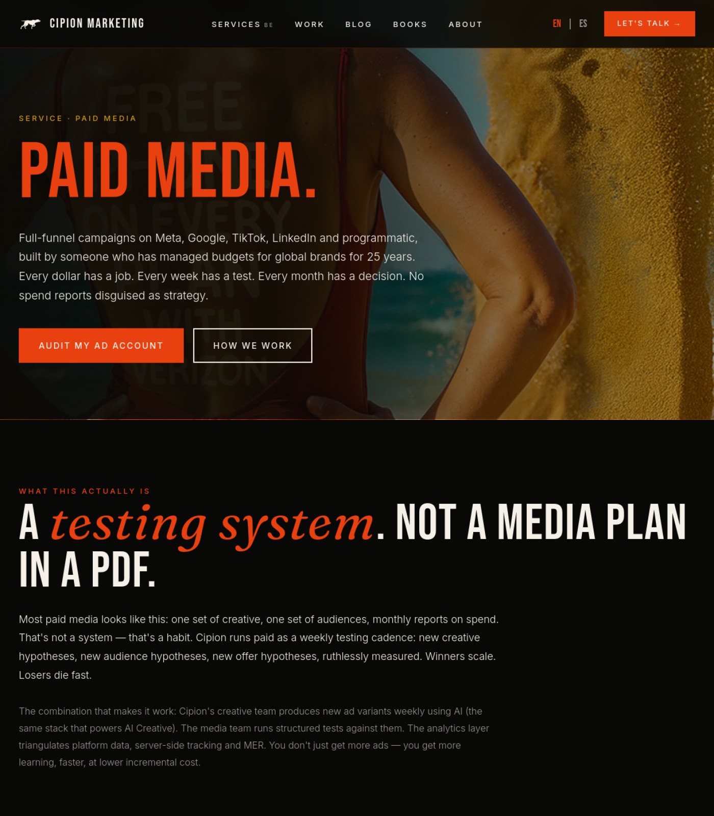
Remove or hide the ghosted second image/text layered behind the hero beach photo Services Paid Media
The faint 'FREE / ON EVERY / THAN VERIZON' text bleeding through the woman-on-beach photo looks broken and distracts from the 'PAID MEDIA.' headline.
why: layered background image with visible bleed-through, low legibility
Replace or caption the hero beach photo so it clearly relates to paid media work Services Paid Media
Right now the hero photo reads as generic stock imagery with no connection to advertising, which weakens the page's credibility compared to the well-labeled 'AI Cinematic' image further down.
why: uncaptioned stock-style hero photo vs. labeled example image below
Add client logos or campaign screenshots as proof images Services Paid Media
The copy claims work for 'global brands' but no logos, screenshots, or case-study visuals appear anywhere on the page to back that up.
why: no client/brand proof imagery found across all 6 sections
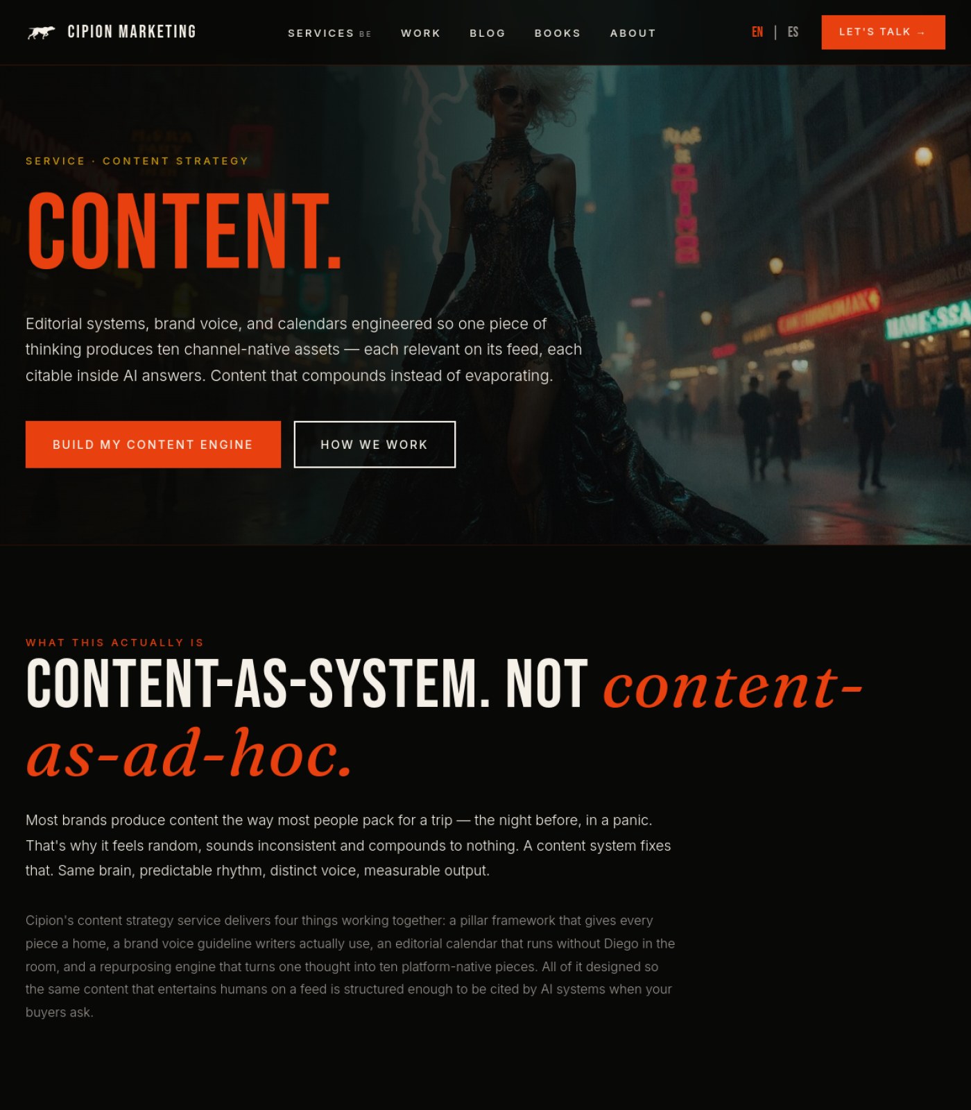
Swap the hero image for something that actually represents content strategy work (editorial calendars, brand voice docs, real campaign shots) instead of the fantasy-style photo of a woman in a gown on a rainy street. Services Content Strategy
Visitors judge relevance in seconds, and an unrelated moody fashion image makes the page feel disconnected from the service being sold.
why: hero visual relevance
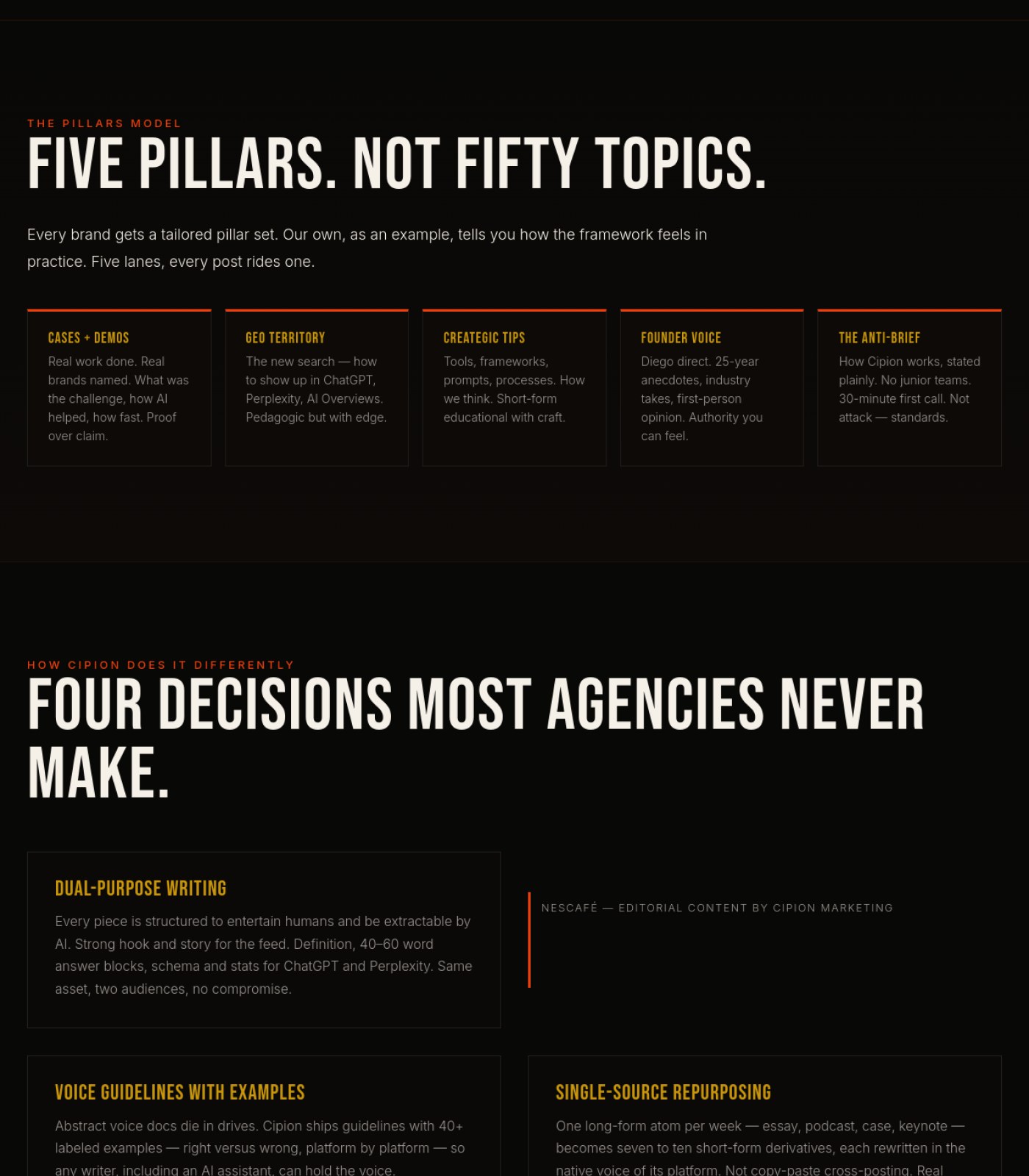
Fill the 'NESCAFÉ — Editorial Content by Cipion Marketing' box with an actual screenshot or thumbnail of that work instead of leaving it as empty space with just a headline and an orange line. Services Content Strategy
An empty case-study card next to fully-written text cards looks broken and removes the proof this section is trying to give.
why: missing case-study image placeholder
Add client logos, team photos, or work samples somewhere on the page, since the copy repeatedly promises 'real brands named' and 'proof over claim' but no visual proof appears anywhere on the page. Services Content Strategy
An agency page that only shows text and one unrelated hero image misses an easy trust-building opportunity.
why: no supporting proof imagery across full page
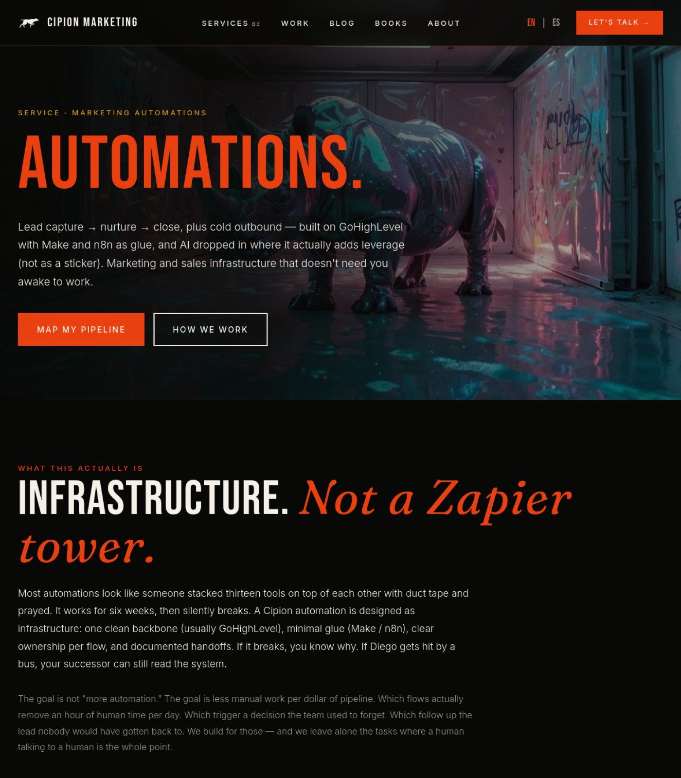
Add descriptive alt text to the hero rhino photo Services Automations
Screen reader users and Google Images currently have no way to know what this large stylized photo shows or why it's there.
why: WCAG 1.1.1 non-text content
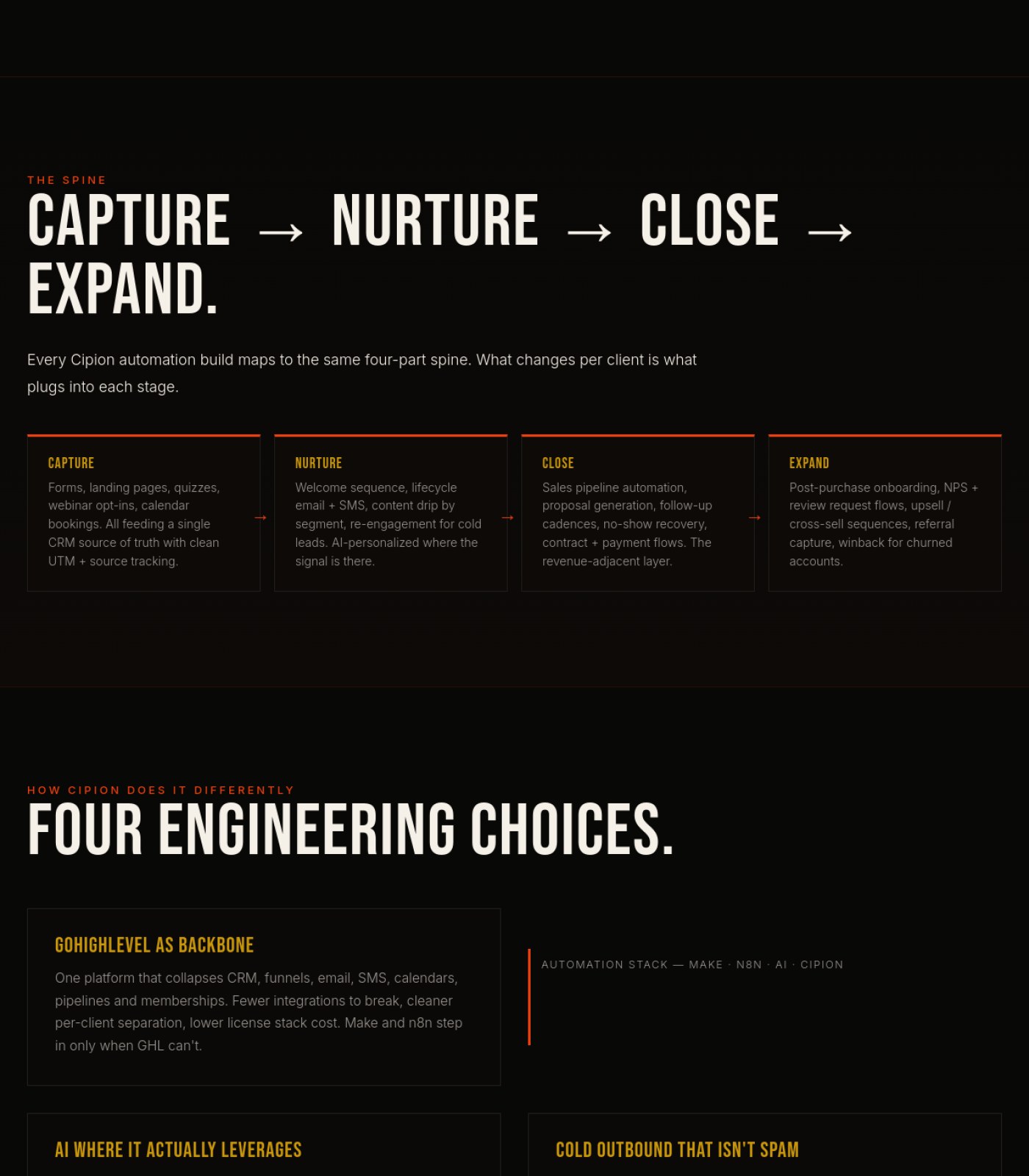
Consider adding small supporting icons or visuals to the Spine, Engineering Choices, and Deliverables sections Services Automations
After the hero, the entire rest of the page is text and colored boxes only, which makes long sections feel monotonous to scan.
why: visual scanning / picture superiority effect
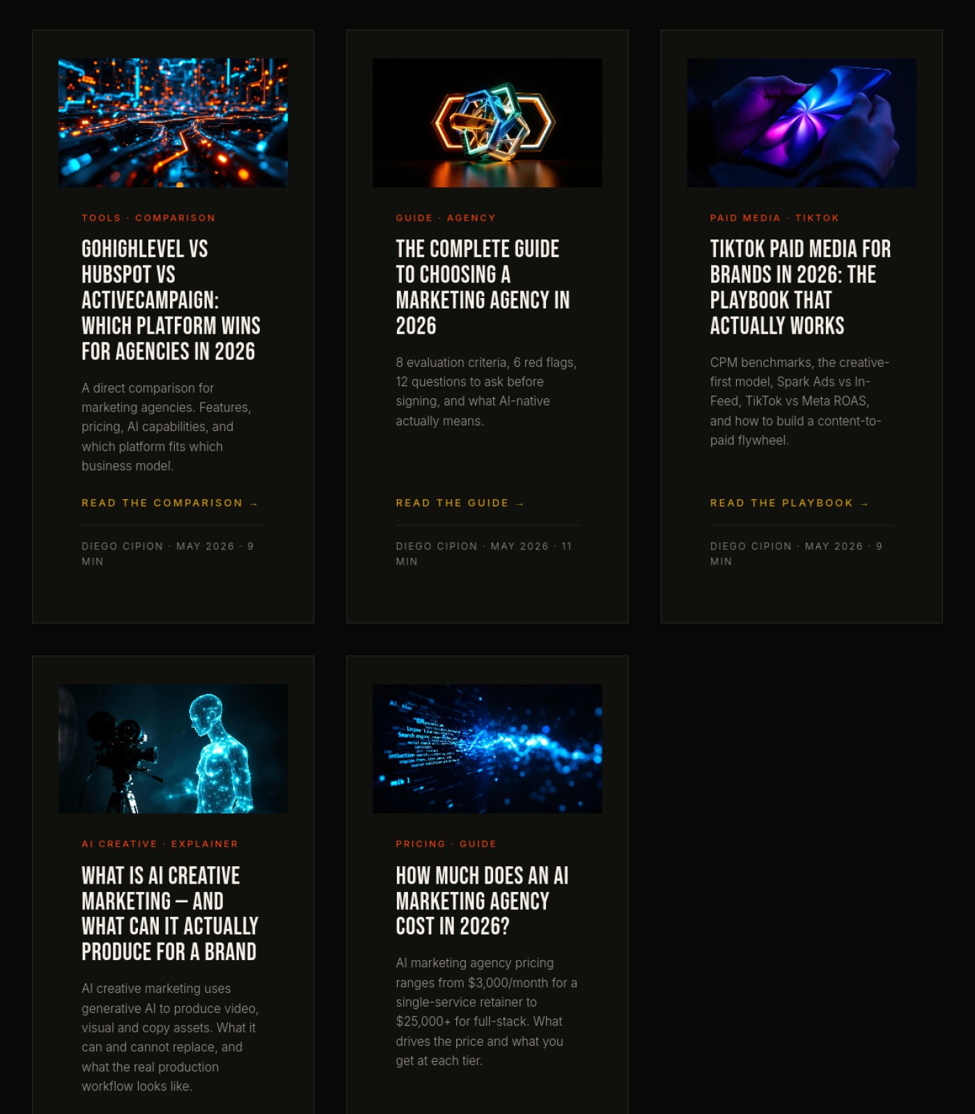
Replace generic AI-generated abstract graphics on blog cards with real photos of the team's work, clients, or campaign results where available Blog
An agency that sells strategy and 'showing the work' loses credibility when every article thumbnail is the same type of synthetic stock art instead of proof of real work.
why: trust signals / social proof imagery
Swap the large hero graphic (the glowing infinity light-trail image) for a real photo or screenshot tied to Cipion's actual work Blog
The hero visual is decorative and generic, so it doesn't reinforce the personal, 25-years-of-experience story told in the text next to it.
why: relevance of hero imagery to copy
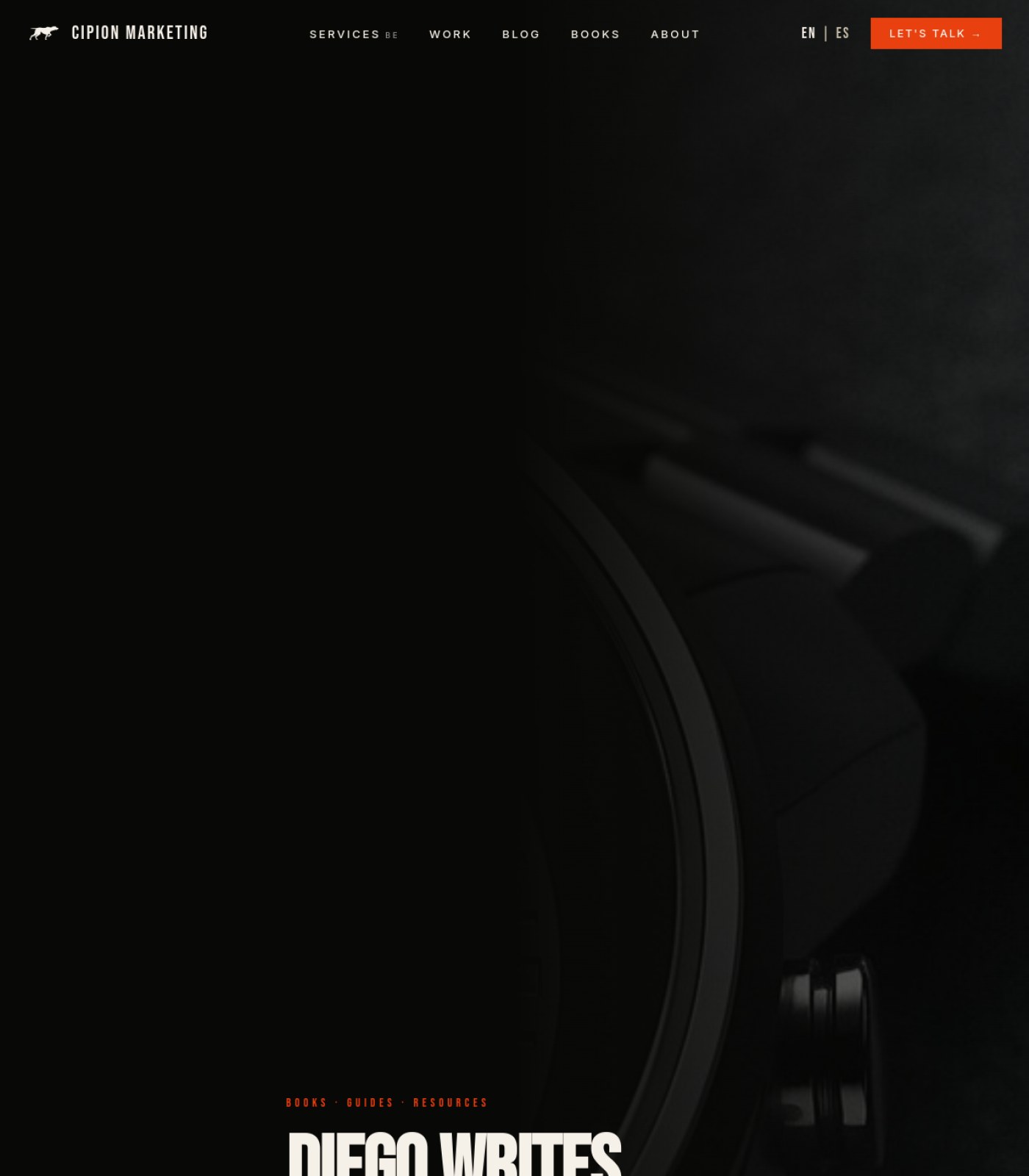
Brighten or crop the hero background image so the camera/lens is actually recognizable Libros
Right now the image is so dark it's almost impossible to tell what it shows, wasting a strong visual moment.
why: low luminance/contrast on hero background image, section 1
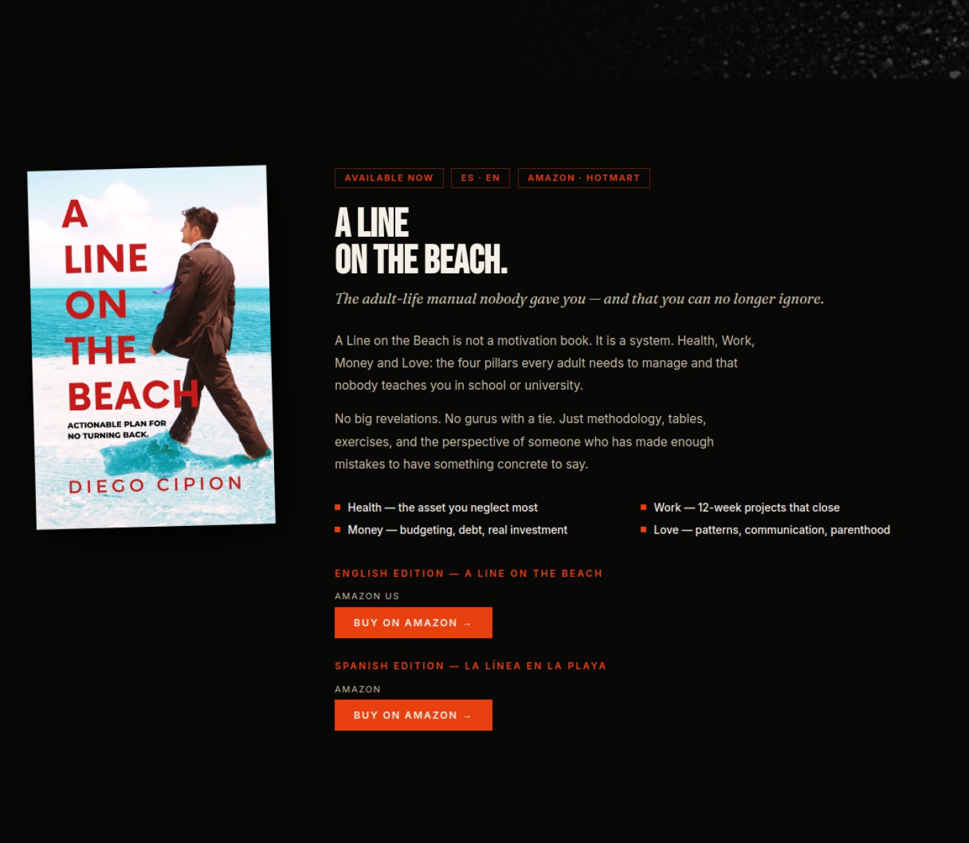
Add a photo of Diego Cipion near the personal bio text Libros
The copy talks about him personally ('marketing director, father of two, Spaniard'), and a real photo would build trust faster than text alone.
why: missing author headshot near bio paragraph, section 2
🔘

Buttons & Actions

11 to fix
Duplicate the primary CTA button earlier in the hero Home
Because the buttons only appear after a very long scroll of blurry imagery, most visitors will never see 'Start a Project' or 'Explore GEO.'
why: CTA buttons only visible in chunk 5 (bottom of hero)
Repeat a booking button in the Five Levers and 5-Step Audit sections Services Geo
Two long content sections (sections 4 and 5) pass with no call-to-action button at all, so an interested reader has to scroll far to act.
why: sections 4-5, no CTA between cards
Unify CTA wording Services Geo
The button text changes slightly each time ('Book my free citation check', 'Book free citation check', 'Check my AI visibility — free'), which can feel like three different offers.
why: CTA buttons, sections 1-3
Make the phone number shown in the footer contact block a tappable/clickable link Services Ai Creative
Visitors on mobile expect to tap a phone number to call directly instead of having to copy it
why: tap-to-call convention
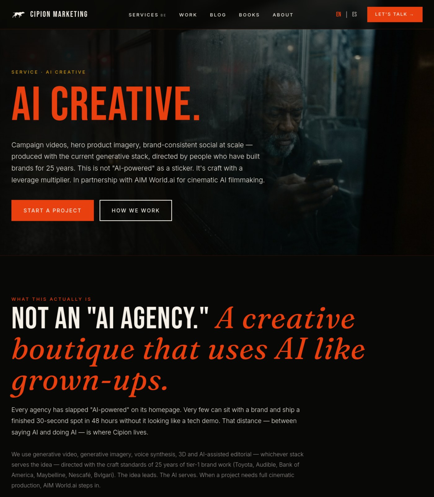
Make sure the 'How We Work' button in the hero scrolls or links to the actual process section shown lower on the page Services Ai Creative
A secondary button with an unclear destination reduces its usefulness as a real choice for hesitant visitors
why: n/a
Fix or clarify the small 'BE' tag next to 'SERVICES' in the top navigation Services Paid Media
It's unclear what 'BE' means next to the Services menu item, and it could confuse visitors trying to use the menu.
why: nav label 'SERVICES BE', section 1 header
Standardize the call-to-action wording across the page (currently 'Let's Talk', 'Build My Content Engine', and 'Start The Conversation' all point to the same action). Services Content Strategy
Using three different phrases for what is likely the same booking action can make visitors unsure if they lead to different things.
why: CTA label consistency
Pick one consistent name for the main action across the page Services Automations
The nav says 'Let's Talk' while the hero and footer say 'Map My Pipeline,' which can make visitors unsure which is the 'real' next step.
why: single clear call-to-action principle
Add a working email input field and subscribe button to the Newsletter box in the footer Blog
Right now the footer just says 'One email a month' with no way to actually type an email in or hit subscribe, so interested visitors can't sign up.
why: missing form control for stated CTA
Add a 'Load more' or pagination control at the bottom of the blog grid Blog
With dozens of posts stacked in one long scroll and no way to jump ahead or filter, visitors have to scroll a very long way to find older or newer posts.
why: long single-page list without pagination
Add working links or buttons for the 'Guides' and 'Resources' mentioned in the eyebrow tag Libros
The page teases guides and resources but gives no way to click through to them, which is a dead-end for interested visitors.
why: eyebrow tag 'BOOKS · GUIDES · RESOURCES' with no matching links, section 1
📐

Layout & Structure

17 to fix
Shorten the hero section dramatically Home
A visitor should see the headline, subheadline, and a button within the first screen, not after scrolling through several screens of unclear imagery.
why: content (headline/body/CTA) only appears in chunk 5 of 6, i.e. near the very bottom
Build out an actual footer with contact info, address, and legal links Home
The final section of the page (which should be the footer) only repeats hero-style content with no copyright notice, contact details, or policy links.
why: chunk 5 (bottom of page) shows only headline/CTA content, no footer elements
Add a clear visual break between the media section and the text/CTA section Home
Right now the text block sits directly over the continuation of the blurry background, making the layout feel unintentional rather than designed.
why: chunk 5 text overlays same blurred background as chunks 1-4
Add a proper footer section Services Geo
The page currently just stops after the last deliverable card with no closing section, contact block, or navigation recap.
why: end of section 6, no footer element visible
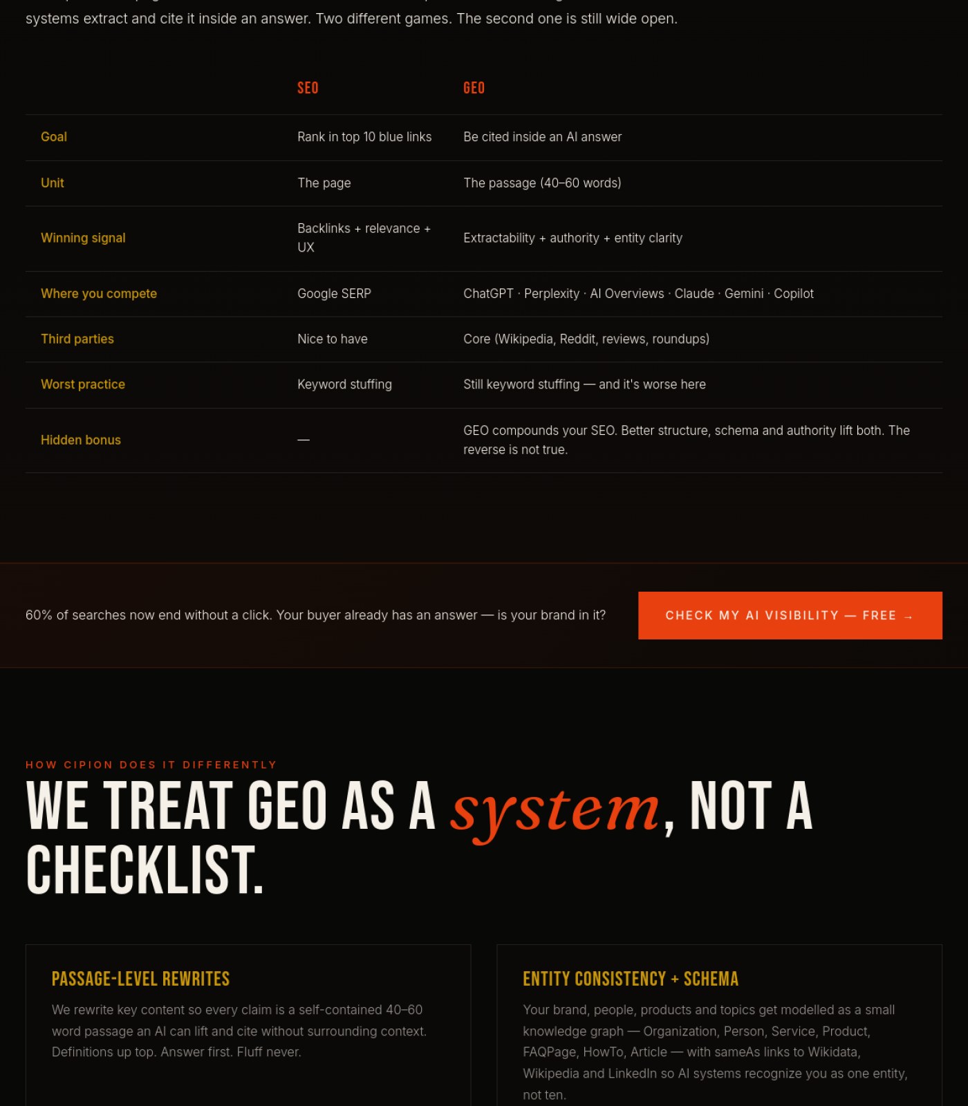
Vary the SEO vs GEO comparison table with a highlight color on the GEO column Services Geo
Right now both columns look equally weighted, so the 'this is the one that matters' message doesn't stand out visually.
why: comparison table, section 3
Rebalance the image grid in 'What We Typically Produce' so there's no large empty black space where a 4th top-row or 2nd-row image should be Services Ai Creative
An uneven grid with visible empty cells makes the page look unfinished or broken to a first-time visitor
why: layout completeness heuristic
Reduce the large vertical black gaps that appear at the top of several sections before their headline Services Ai Creative
Excess empty space between sections can make the page feel slow to load or poorly spaced as people scroll
why: n/a
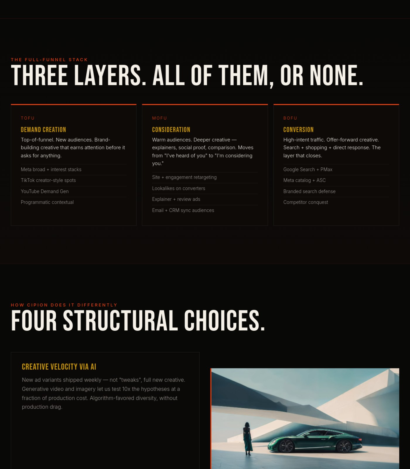
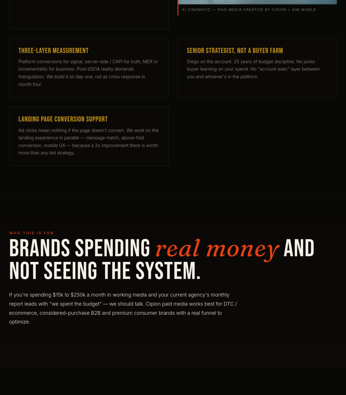
Give all four 'structural choices' cards the same visual treatment Services Paid Media
The first choice ('Creative Velocity via AI') is paired with a large image while the other three are plain text-only cards, which makes the section feel unfinished or inconsistent.
why: mixed image/text card layout, sections 2-3
Expand the footer to show a fuller set of links instead of a short, cut-off looking list Services Paid Media
The footer only shows one or two items per column (e.g. 'GEO', 'Home'), which feels incomplete for a real company footer and limits easy navigation from the bottom of the page.
why: truncated footer columns, section 6
Fix the nav item that currently reads 'SERVICES BE' — the trailing 'BE' looks like a leftover label or typo. Services Content Strategy
A garbled menu label right at the top of the page looks unfinished and confuses first-time visitors.
why: nav label text error
Give the empty Nescafé case-study card the same visual weight (padding, content, image) as its neighboring text cards. Services Content Strategy
Right now it reads as noticeably shorter and mostly blank, which breaks the visual rhythm of an otherwise tidy grid.
why: card height/content imbalance
Reduce or fill the large empty black space at the top of 'The Spine' section Services Automations
There's a noticeably tall gap of blank space before the section heading appears, which can look like a loading error rather than intentional design.
why: visual continuity
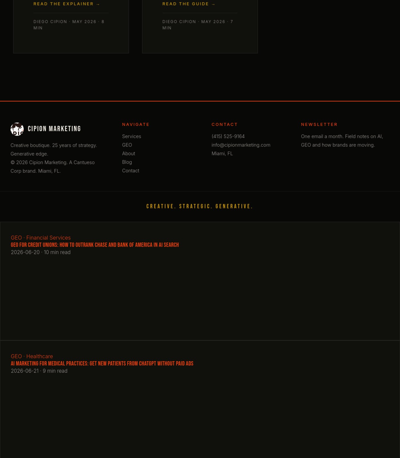
Move the 'GEO for Credit Unions' and 'AI Marketing for Medical Practices' post entries back into the main blog grid instead of leaving them stranded below the footer Blog
These two posts currently render after the footer, outside the site's normal layout, which looks like a broken page to anyone who scrolls that far.
why: content rendered outside main container / footer
Remove or clarify what the hamburger icon in the header opens, since the full menu (Services, Work, Blog, Books, About) is already visible Blog
Showing both a complete visible menu and a hamburger icon side by side is confusing — visitors won't know if the icon opens something different.
why: duplicate navigation controls
Fix or relabel the stray 'BE' text sitting next to 'SERVICES' in the top navigation Blog
That extra 'BE' next to Services looks like a leftover label or bug and makes the menu look unfinished.
why: unexplained text fragment in nav
Remove or fill the large empty black area between the intro text and the book showcase Libros
This blank stretch takes up most of the middle of the page and looks like a loading error rather than intentional design.
why: empty black block, section 2 lower half into section 3 top
Align the plural 'Diego Writes'/'Books · Guides · Resources' framing with the single book actually shown Libros
Visitors are set up to expect a library of content but only find one product, which can feel like a bait-and-switch.
why: content mismatch, sections 1 and 3
✏️

Words on the Page

14 to fix
Merge the two overlapping pre-headline lines into one Home
'Miami · Creative Boutique · Est. 2001' and 'Miami AI Marketing Agency — Brand Strategy, AI Creative, and GEO' say overlapping things right on top of each other and read as repetitive.
why: chunk 5, two eyebrow/subhead lines stacked above main headline
Attribute the testimonial to a real name/company or a titled role with credentials Services Geo
An anonymous quote is weak proof, and the page itself argues that 'author signals' and 'expert quotes' are what make content trustworthy.
why: testimonial block, section 1
Make the voice consistent between 'I've been doing marketing for 25 years' and the surrounding 'we/our' agency language Services Geo
Switching between a founder's personal voice and a team voice in the same paragraph can confuse who the reader is actually hiring.
why: 'What This Actually Is' body copy, section 2
Add a one-line plain-language explanation the first time 'Brand LoRA' is used Services Ai Creative
Marketing decision-makers reading this page likely don't know this technical AI term, and an unexplained acronym can make copy feel exclusionary or confusing
why: plain-language readability
Clarify or remove the small 'BE' text next to 'SERVICES' in the top navigation Services Ai Creative
It reads like a leftover label or typo and can confuse visitors about what it means
why: n/a
Briefly explain acronyms like TOFU, MOFU, BOFU, CAPI, MER, ASC, and PMax the first time each appears Services Paid Media
A prospective client evaluating an agency may not know these terms, and unexplained jargon can make the page feel harder to trust or act on.
why: unexplained acronyms, sections 2 and 3
Link the mention of 'Diego' to his bio on the About page Services Paid Media
The page leans on '25 years of budget discipline' from a named person but gives no way to verify who he is or see his background.
why: 'Diego on the account' text with no link, section 3
Correct the footer copyright, which currently shows '© 2026' — a future date. Services Content Strategy
A copyright year in the future looks like a factual mistake and can quietly damage credibility.
why: footer date error
Make the hero headline more descriptive than just 'CONTENT.' by working in the actual service name. Services Content Strategy
A one-word headline is stylish but doesn't tell a skimming visitor (or a search engine) what the page is actually about.
why: vague H1 copy
Add at least one real testimonial, client result, or named case study Services Automations
The page makes strong claims about reliability and 'infrastructure not duct tape' but offers no proof from an actual client anywhere on the page.
why: social proof / conversion copywriting
Add a short plain-language explainer for technical terms like ICP, UTM, GoHighLevel, and n8n Services Automations
A founder or non-technical buyer reading this may not know what these acronyms mean, which can cause them to bounce.
why: plain language accessibility
Change large uppercase headlines (hero title and all blog post titles) to normal sentence or title case Blog
Long stretches of all-capital-letter text are harder for people to read quickly and can feel like shouting.
why: WCAG 1.4.8 / all-caps readability
Fix or remove the stray 'BE' text next to 'SERVICES' in the main menu Libros
It reads like a leftover label or typo and makes the navigation look unfinished.
why: 'SERVICES BE' menu item, header, section 1
Add a short testimonial or review quote near the book description Libros
There's currently no third-party proof (reviews, quotes, ratings) that the book delivers value, which weakens the pitch.
why: no testimonial/review content, section 3
🧭

Menu & Getting Around

16 to fix
Add footer navigation links (Privacy, Terms, Sitemap, Contact) Home
There are currently no secondary navigation links anywhere at the bottom of the page for visitors who want policies or contact info.
why: no footer nav visible in chunk 5 (final section)
Fix the 'SERVICES BE' label in the top navigation Services Geo
It reads as a typo or a broken dropdown icon next to the word Services, which looks unpolished on a page selling technical polish.
why: top nav item, section 1
Add a persistent 'back to top' or section jump-links for this long page Services Geo
The page is six screen-lengths long with no shortcuts, so returning to the CTA at the top means a long scroll back up.
why: overall page length, sections 1-6
Add Work, Blog, Books, and Services links to the footer's 'Navigate' column to match the top navigation Services Ai Creative
Visitors who scroll all the way to the footer looking for more to explore currently only find Home, About, FAQ, Contact
why: footer nav completeness
Add a small breadcrumb or page label indicating this is under Services (e.g., Services > AI Creative) Services Ai Creative
Helps visitors orient themselves within the site, especially if they land here directly from search or an ad
why: n/a
Add a simple breadcrumb like 'Services > Paid Media' near the top of the page Services Paid Media
This is a deep sub-page under Services, and a breadcrumb would help visitors understand where they are and get back to other services easily.
why: no breadcrumb visible below main nav, section 1
Clarify the 'SERVICES BE' nav label so visitors know if it opens a submenu Services Paid Media
An unclear label in the main menu can make people hesitate to click it.
why: nav item 'SERVICES BE', section 1
Align the footer 'Navigate' list with the header menu — the footer only shows Home, About, FAQ, and Contact, dropping Work, Blog, Books, and Services that appear in the top nav. Services Content Strategy
Visitors scrolling to the bottom expect the same set of links as the top, and missing ones force them to scroll back up.
why: footer/header nav mismatch
Add a visible indicator (e.g. highlighted state) showing 'Content Strategy' is the current page within the Services menu. Services Content Strategy
Without this, visitors landing directly on this sub-page have no cue where they are inside the site structure.
why: no active-state wayfinding
Investigate and fix the unexplained 'BE' label next to 'Services' in the main nav Services Automations
This small tag doesn't correspond to any visible meaning and looks like a leftover placeholder or bug to visitors.
why: UI cleanliness / trust signal
Align footer navigation with header navigation (Work, Blog, Books are missing from the footer) Services Automations
Visitors who scroll to the bottom lose easy access to pages that were available in the header.
why: navigation consistency
Make the existing category tags (GEO, GUIDE, ESSAY, CHECKLIST, etc.) clickable filters for the blog grid Blog
With so many posts, letting people click a tag they already see to filter the list would make it much easier to find topics they care about, without adding any new visual element.
why: underused taxonomy tags as filters
Add Work and Books links to the footer 'Navigate' list to match the top navigation Blog
The footer menu only repeats some of the top menu items (Services, GEO, About, Blog, Contact) and drops Work and Books, so footer visitors can't reach those pages.
why: inconsistent footer nav vs header nav
Link the author name 'Diego Cipion' on posts to an author bio if one exists on the site Blog
Right now the author name is plain text with no link, so readers can't learn more about who wrote the article.
why: author entity linking for trust
Add a footer navigation menu mirroring the header links Libros
There is no navigation of any kind at the bottom of the page, so visitors who scroll all the way down have no easy way back to other sections.
why: no footer nav visible, bottom of section 3
Highlight 'BOOKS' as the active menu item since the visitor is on that page Libros
Showing which section you're currently in helps people orient themselves, and it's not visibly indicated here.
why: header nav, section 1
🔍

Being Found by AI & Google

14 to fix
Make sure real headline text (H1) loads near the top of the page code, even if it's visually revealed after the hero animation Home
Search engines and AI assistants favor pages where the main topic sentence appears early; burying it behind a huge media block visually can also mean it's coded late, hurting how the page is understood and summarized.
why: main H1 'Creategic.' only visible in chunk 5 of 6
Add a short, clear meta description and page title referencing 'Miami AI marketing agency' since that phrase is already in your own copy Home
This phrase in the body copy is a strong candidate for how people search for you locally, and should also live in the page's title/description for AI answer engines and Google to pick up.
why: chunk 5 subheadline text: 'Miami AI Marketing Agency — Brand Strategy, AI Creative, and GEO.'
Add visible author name and credentials to the '25 years of marketing' paragraph Services Geo
This page is selling authority signals as a GEO tactic, but its own expert claim has no named, checkable author attached to it.
why: 'What This Actually Is' section, section 2
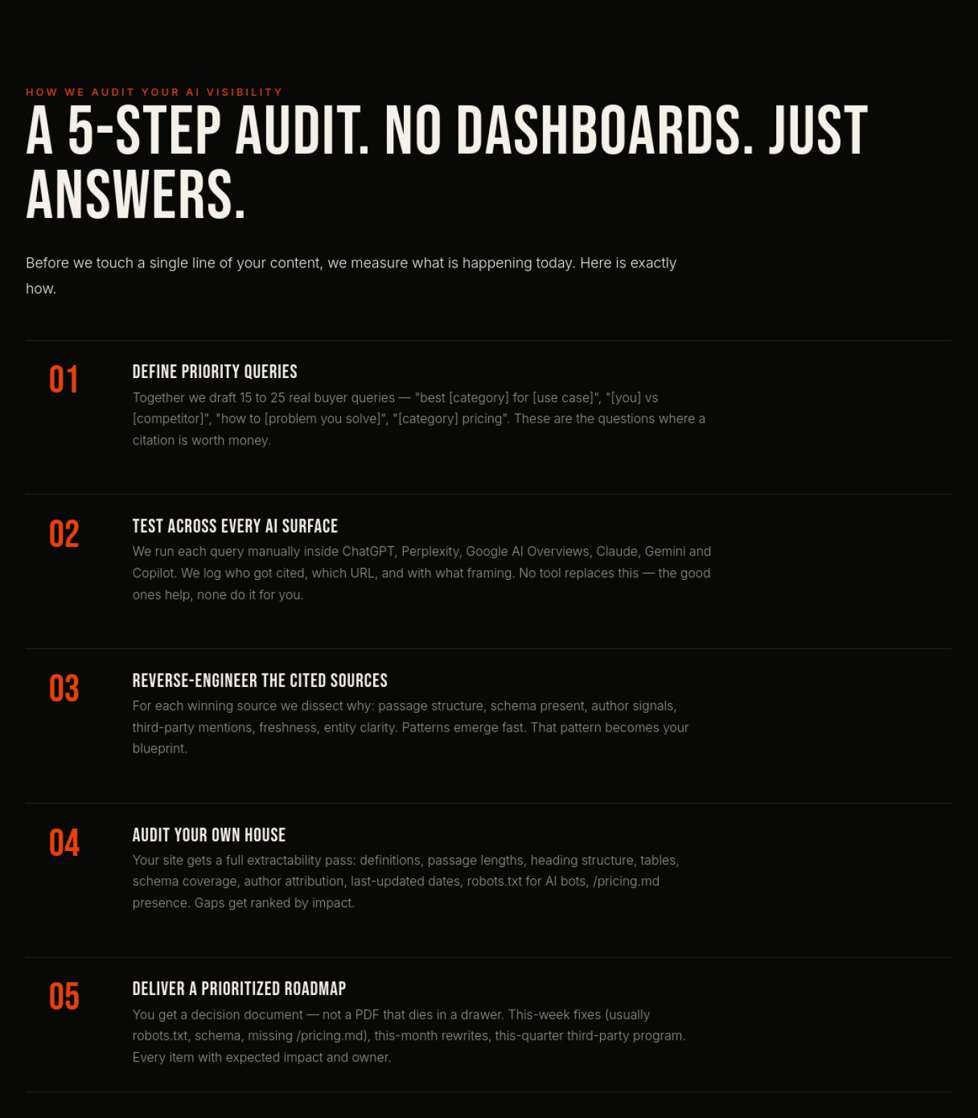
Turn the numbered '5-Step Audit' and 'Five Levers' sections into structured, citable passages (short definition-first blocks) Services Geo
The page argues AI engines only cite short self-contained passages, so its own long paragraphs under each numbered step should follow that same 40-60 word answer-first pattern.
why: 5-step audit list, section 5
Add at least one real client testimonial or a link to a case study proving the named clients (Toyota, Audible, etc.) actually used this AI Creative service Services Ai Creative
Search engines and AI answer tools favor pages with verifiable proof; right now the client names are unlinked claims with nothing to back them up
why: E-E-A-T trust signal
Write descriptive, keyword-relevant alt text for the sample images once they're captioned Services Ai Creative
Helps image search and AI crawlers understand and surface this page's actual work
why: n/a
Link the named expert ('Diego') to a credentialed bio page Services Paid Media
Search engines and AI tools increasingly check for real, verifiable experience behind expertise claims, and an unlinked name doesn't provide that proof.
why: 'Diego' mention with no linked bio, section 3
Add visible proof elements (client names, results, or case study links) referenced by this page Services Paid Media
Claims like 'managed budgets for global brands for 25 years' need supporting evidence somewhere on the page to be credible to both readers and AI-driven search evaluation.
why: no proof content across sections 1-6
Rewrite the H1 from just 'CONTENT.' to something that includes the actual keyword phrase, such as 'Content Strategy'. Services Content Strategy
Search engines and AI answer tools weigh the main heading heavily to understand what a page is about, and a single vague word wastes that signal.
why: H1 keyword clarity
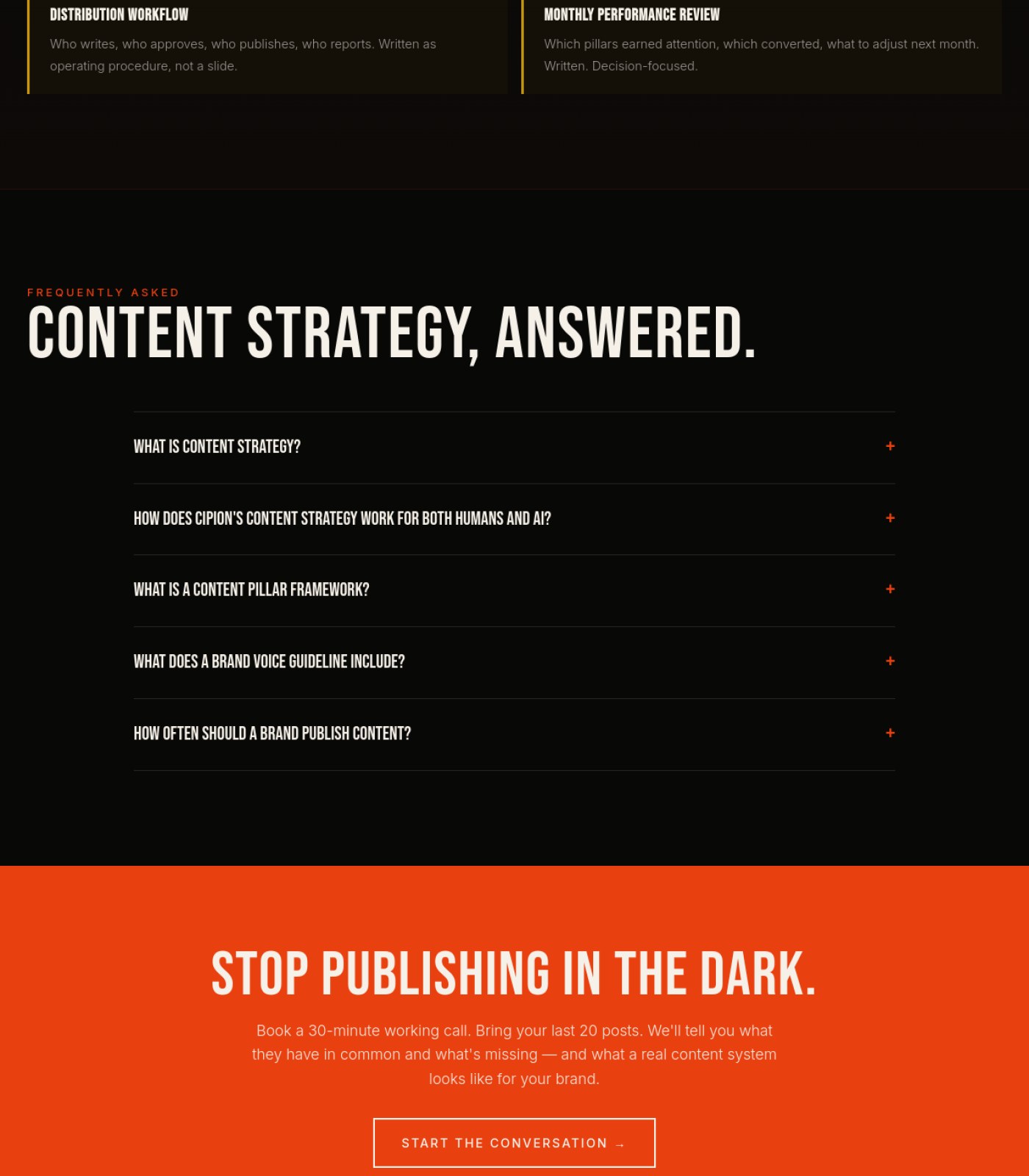
Make sure the five visible FAQ questions are marked up as structured FAQ content so AI tools like ChatGPT or Google's AI Overviews can pull them directly. Services Content Strategy
The page's own pitch is about being 'citable inside AI answers,' so its own FAQ should be set up to actually get cited.
why: FAQ schema markup
Confirm the FAQ section uses structured FAQ data so Google and AI assistants can pull answers directly Services Automations
The FAQ content is well-written and answer-shaped, which is exactly what AI search tools look for, but only works fully if it's marked up correctly.
why: FAQPage schema / AEO
Add descriptive alt text to the hero image mentioning the service context Services Automations
Without alt text, this image contributes nothing to image search rankings for automation-related queries.
why: image SEO
Add a visible breadcrumb (e.g. Home > Blog) above the blog title Blog
A simple breadcrumb reinforces the page's place in the site structure for both users and search/AI crawlers, and it's a low-effort addition using existing page names.
why: breadcrumb navigation for crawlability
Add visible pricing, format, or rating info near the book for richer search/AI snippets Libros
Search engines and AI assistants favor pages with concrete product details like price and format, which aren't shown here.
why: no price/rating shown, section 3
⚖️

Legal & Accessibility Risk

26 to fix
Confirm rights/permission to name Toyota, T-Mobile, Audible, and Bank of America as clients, and add a disclaimer if needed Home
Naming specific brands as past clients (especially a bank) without an approved case study, logo usage agreement, or disclaimer can create legal exposure for an agency.
why: chunk 5 body copy lists client names as plain text, no logos or disclaimer shown
Increase color contrast on the light-gray 'ES' language toggle against the black header Home
Low-contrast text fails accessibility guidelines and is hard for many users to read.
why: chunk 0, 'ES' text approx light-gray on near-black background
Add a visible privacy policy and terms of service link somewhere on the page Home
No legal/compliance links are visible anywhere across the full page, which is a basic requirement for a professional services business site.
why: no privacy/terms links found in any of the 6 sections including the final/footer section
Add a footer with Privacy Policy, Terms of Service and an accessibility statement Services Geo
None of these legal pages or links appear anywhere on the page, which is a real compliance gap for an agency working with regulated clients like Bank of America.
why: no footer visible across all 6 sections
Confirm rights to display named client brands (Toyota, T-Mobile, Bank of America, Bvlgari, etc.) or add a 'trademarks belong to their respective owners' disclaimer Services Geo
Listing well-known regulated brands as clients without visible permission or a disclaimer is a trademark and reputational risk.
why: 'Brands Cipion has worked on' list, section 1
Check contrast of the grey/beige body text against the black background Services Geo
Long paragraphs in a muted grey on near-black can fall below accessible contrast minimums for readers with low vision.
why: body copy throughout, sections 2-6
Add Privacy Policy and Terms of Service links to the footer Services Ai Creative
No legal or privacy links appear anywhere on the page, which is a standard expectation and a compliance gap for a business collecting contact information
why: footer legal-link convention
Verify the FAQ accordion items are keyboard-operable and announce their expanded/collapsed state to screen readers Services Ai Creative
Collapsed FAQ content needs to be accessible to keyboard and assistive-technology users, not just mouse clickers
why: WCAG 4.1.2 name/role/value
Check contrast of small all-caps orange labels (e.g. 'SERVICE · AI CREATIVE', 'USE CASES') against the black background Services Ai Creative
Small low-contrast text can be hard to read for visitors with low vision
why: WCAG 1.4.3 contrast minimum
Add clearly visible Privacy Policy and Terms of Service links in the footer Services Paid Media
This agency touches client ad accounts, tracking pixels, and CAPI data, so a visible legal/privacy link is expected and currently isn't shown anywhere on the page.
why: no privacy/terms link found in footer, section 6
Add a darker overlay or scrim behind the hero headline text over the beach photo Services Paid Media
Text placed directly over a busy, bright photo (plus the ghosted second image) can be hard to read for some visitors, including those with low vision.
why: hero text-over-photo contrast, section 1
Confirm all images have descriptive alt text for screen readers Services Paid Media
None of the images (hero photo, structural-choice photo, AI cinematic image) show visible alt text, and this can't be confirmed from the page, so it should be checked and added where missing.
why: unknown alt attributes, all image instances
Verify the FAQ accordion is keyboard- and screen-reader-accessible Services Paid Media
None of the FAQ answers are shown expanded, so it's worth confirming the accordion can be opened without a mouse and announces its state properly.
why: collapsed FAQ accordion, section 5
Add a Privacy Policy and Terms of Service link to the footer — none is visible anywhere on the page despite phone and email contact details being displayed. Services Content Strategy
A site collecting or displaying contact information without a visible privacy link is a common legal gap that's easy to flag and expensive to ignore.
why: missing footer legal links
Increase the contrast of the muted grey body text used in process steps and descriptions (light grey on near-black background). Services Content Strategy
Lower-contrast text is harder to read for visitors with low vision and risks failing basic accessibility contrast guidelines.
why: WCAG 2.1 contrast ratio (AA)
Correct the future-dated '© 2026' copyright notice. Services Content Strategy
An incorrect legal date on a footer is a small but real accuracy issue that can be flagged in a compliance review.
why: outdated/incorrect legal notice
Add a visible Privacy Policy and Terms of Service link in the footer Services Automations
The page collects leads through forms and CTAs but has no visible link to legal terms anywhere, which is a compliance gap for an agency.
why: basic web legal disclosure requirement
Add a cookie consent notice Services Automations
The site offers a Spanish-language toggle suggesting an international audience, and there's no visible cookie/consent banner anywhere on the page.
why: GDPR / cookie consent requirement
Increase contrast on small orange all-caps section labels against the black background Services Automations
Thin orange text on black (like 'THE SPINE' and section eyebrows) may be hard to read for visitors with low vision.
why: WCAG 1.4.3 contrast minimum
Add a Privacy Policy and Terms of Service link to the footer Blog
The site collects emails through the newsletter and lists a phone number and email, but there is no visible privacy or terms link anywhere on the page, which is a real legal gap.
why: missing privacy/terms disclosure
Confirm whether a cookie consent banner is needed and add one if the site uses tracking cookies Blog
The site offers both English and Spanish, suggesting international visitors, but no cookie consent notice appears anywhere on the page, which can be a compliance risk in the EU and some US states.
why: GDPR/CCPA cookie consent requirement
Check that the orange link and tag text meets minimum contrast against the near-black background, especially at smaller sizes Blog
Small orange category labels and links on a dark background can be hard to read for users with low vision if the contrast isn't strong enough.
why: WCAG 2.1 contrast ratio (AA)
Restore the two blog posts that currently render below the footer into the normal page flow Blog
Content sitting outside the main layout after the footer breaks the logical reading order that screen reader users rely on to navigate the page.
why: logical reading order for assistive tech
Add a visible privacy policy and terms of service link somewhere on the page Libros
None appear anywhere across the top, middle, or bottom of the page, which is a legal gap for a business operating in the EU (EN/ES site).
why: no privacy/terms links, entire page including footer area, section 3
Add a cookie consent notice if the site uses tracking cookies Libros
No cookie banner is visible, and EU visitors (Spanish content is offered) legally need to be asked for consent before tracking.
why: no cookie consent UI visible, entire page
Add basic contact information (email, address, or company details) in the footer Libros
There's no way for a visitor to find contact details other than the 'Let's Talk' button, which limits transparency and trust.
why: no contact info visible, bottom of section 3
Audit Brief

cipionmarketing.com

Home · generated automatically · https://cipionmarketing.com

46
Today
79
After fixes

This page is 46% ready to send traffic to. Fixing the items below gets it to an estimated 79%.

Do these 3 first
1

Cut the giant blurry hero down to one screenVisitors have to scroll past roughly five full screens of an out-of-focus photo or video with no text before they reach the headline, tagline, or any call to action, which will make most people leave before they see your message.

2

Add real footer contentThe bottom of the page has no copyright line, contact details, address, or legal links (privacy/terms), which looks unfinished and creates compliance gaps.

3

Move a call-to-action button higher on the pageRight now the only 'Start a Project' and 'Explore GEO' buttons sit after all that scrolling, so many visitors won't ever reach them.

📍 The map

 — this page, with the fixes marked where they happen

Section 1 of 6
cipionmarketing.com screenshot
3
Section 2 of 6
cipionmarketing.com screenshot
Section 3 of 6
cipionmarketing.com screenshot
1
Section 4 of 6
cipionmarketing.com screenshot
Section 5 of 6
cipionmarketing.com screenshot
Section 6 of 6
cipionmarketing.com screenshot
2
1

Blurry hero, no content

2

Missing footer/legal links

3

Low-contrast language toggle

⚡ Ship the fixes

Send this page's fixes to whoever ships it

Check or uncheck items in the checklist below, then use the bar right above it: Copy prompt pastes into a chat-based AI agent (Claude, ChatGPT...). Download JSON or the Advanced API below hand it to an autonomous coding agent (Claude Code, Cursor...). Download checklist is a plain to-do list for a human developer. Or skip all of that — see "Path 2" below.

Or open the raw JSON (all pages) →
Path 2: let it apply fixes for you automatically (private beta)

Instead of you copying a prompt or downloading a file, a weekly check can do the finding-and-proposing part for you:

  1. Once a week, it re-reads your latest Audit Brief and picks out fixes that need no file and no judgment call from you (blocker-free ones only — anything marked "needs a file" or "ask before doing" is never touched by this).
  2. Nothing is written to your site at this point. Each fix is queued as a proposal, exactly like this one:
{ "domain": "yoursite.com", "file_path": "index.html", "pillar": "Words on the Page", "task": "Clarify what 'GEO' means on first mention", "why": "Visitors may not know the acronym.", "old_snippet": "GEO optimizes for citation...", "new_snippet": "GEO (Generative Engine Optimization) optimizes for citation...", "status": "pending" }
  1. You get notified that proposals are waiting. You open your review queue, see a before/after diff for each one, and click Accept or Reject individually — nothing ships to your live site without that click.
  2. You can reject anything, anytime, for any reason. There is no "auto-approve" setting — every single change needs your explicit yes.

This is a private pilot right now, not a self-serve toggle yet — ask us to turn it on for your site.

selected
🖼️

Photos & Images

3 to fix
Replace or sharpen the huge out-of-focus hero photo/video
Five screen-heights of blur with no visible subject or message wastes the most valuable real estate on the page and looks like a loading error to visitors.
why: hero media appears heavily blurred across chunks 1-5, no in-focus subject or overlay text visible
Add descriptive alt text to the hero image/video
Screen reader users currently get no information about what this large visual is meant to convey.
why: no visible caption/alt indicator on hero media
Increase contrast/size of the small logo mark in the header
The paw-print icon next to 'Cipion Marketing' is tiny and low-contrast against the dark background, making the brand hard to notice.
why: chunk 0, header logo icon ~15px on near-black background
🔘

Buttons & Actions

1 to fix · 1 already good
Duplicate the primary CTA button earlier in the hero
Because the buttons only appear after a very long scroll of blurry imagery, most visitors will never see 'Start a Project' or 'Explore GEO.'
why: CTA buttons only visible in chunk 5 (bottom of hero)
Keep the orange 'Let's Talk' header button and orange primary CTA styling consistent
Using one consistent accent color for all primary actions helps visitors instantly recognize what to click.
why: chunk 0 header button vs chunk 5 'Start a Project' button both orange
Already good
📐

Layout & Structure

3 to fix
Shorten the hero section dramatically
A visitor should see the headline, subheadline, and a button within the first screen, not after scrolling through several screens of unclear imagery.
why: content (headline/body/CTA) only appears in chunk 5 of 6, i.e. near the very bottom
Build out an actual footer with contact info, address, and legal links
The final section of the page (which should be the footer) only repeats hero-style content with no copyright notice, contact details, or policy links.
why: chunk 5 (bottom of page) shows only headline/CTA content, no footer elements
Add a clear visual break between the media section and the text/CTA section
Right now the text block sits directly over the continuation of the blurry background, making the layout feel unintentional rather than designed.
why: chunk 5 text overlays same blurred background as chunks 1-4
✏️

Words on the Page

1 to fix · 1 already good
Merge the two overlapping pre-headline lines into one
'Miami · Creative Boutique · Est. 2001' and 'Miami AI Marketing Agency — Brand Strategy, AI Creative, and GEO' say overlapping things right on top of each other and read as repetitive.
why: chunk 5, two eyebrow/subhead lines stacked above main headline
Keep the strong, specific headline and value proposition copy
'Creative Thinking. Strategic Execution. Generative Edge.' plus the named client list (Toyota, T-Mobile, Audible, Bank of America) is concrete and credible copy.
why: chunk 5 body copy
Already good
🧭

Menu & Getting Around

1 to fix · 1 already good
Add footer navigation links (Privacy, Terms, Sitemap, Contact)
There are currently no secondary navigation links anywhere at the bottom of the page for visitors who want policies or contact info.
why: no footer nav visible in chunk 5 (final section)
Keep the top navigation simple with clear sections and language toggle
Services, Work, Blog, Books, About plus EN/ES gives visitors an easy, complete way to explore the site.
why: chunk 0 header nav
Already good
🔍

Being Found by AI & Google

2 to fix
Make sure real headline text (H1) loads near the top of the page code, even if it's visually revealed after the hero animation
Search engines and AI assistants favor pages where the main topic sentence appears early; burying it behind a huge media block visually can also mean it's coded late, hurting how the page is understood and summarized.
why: main H1 'Creategic.' only visible in chunk 5 of 6
Add a short, clear meta description and page title referencing 'Miami AI marketing agency' since that phrase is already in your own copy
This phrase in the body copy is a strong candidate for how people search for you locally, and should also live in the page's title/description for AI answer engines and Google to pick up.
why: chunk 5 subheadline text: 'Miami AI Marketing Agency — Brand Strategy, AI Creative, and GEO.'
⚖️

Legal & Accessibility Risk

3 to fix
Confirm rights/permission to name Toyota, T-Mobile, Audible, and Bank of America as clients, and add a disclaimer if needed
Naming specific brands as past clients (especially a bank) without an approved case study, logo usage agreement, or disclaimer can create legal exposure for an agency.
why: chunk 5 body copy lists client names as plain text, no logos or disclaimer shown
Increase color contrast on the light-gray 'ES' language toggle against the black header
Low-contrast text fails accessibility guidelines and is hard for many users to read.
why: chunk 0, 'ES' text approx light-gray on near-black background
Add a visible privacy policy and terms of service link somewhere on the page
No legal/compliance links are visible anywhere across the full page, which is a basic requirement for a professional services business site.
why: no privacy/terms links found in any of the 6 sections including the final/footer section
For your boss / your team

One-line summary you can forward

This page currently scores 46/100 mainly because of one big structural problem: visitors must scroll through roughly five full screens of an out-of-focus photo or video with no visible text before they ever reach the headline, offer, or a button — a strong risk that people leave before seeing what the agency does. On top of that, the page ends abruptly with no real footer (no contact info, address, or legal/privacy links), and the copy names specific clients including a bank without any visible logo, case study, or disclaimer, which is a legal exposure worth confirming. The good news is the actual message once you reach it — 'Creative Thinking. Strategic Execution. Generative Edge.' plus named client work — is strong and clear, and the top navigation and CTA styling are solid. Shortening the hero, adding a proper footer, and moving the call-to-action button higher on the page should bring this to about 79/100.

Audit Brief

cipionmarketing.com

Services Geo · generated automatically · https://cipionmarketing.com/services/geo

64
Today
86
After fixes

This page is 64% ready to send traffic to. Fixing the items below gets it to an estimated 86%.

Do these 3 first
1

Build a real footerThe page ends after the deliverables cards with no privacy policy, terms, contact info or copyright line anywhere on the site.

2

Prove the brand-name claimsToyota, Bank of America, T-Mobile and others are listed as clients in plain text with no logos, links or permission notice, which is a reputational and trademark risk if unverified.

3

Make the testimonial realThe only client quote is credited to 'GEO Client, B2B Professional Services' instead of a real name or company, which undercuts the exact 'authority' signal this page tells visitors to build.

📍 The map

 — this page, with the fixes marked where they happen

Section 1 of 6
cipionmarketing.com screenshot
1
2
Section 2 of 6
cipionmarketing.com screenshot
Section 3 of 6
cipionmarketing.com screenshot
Section 4 of 6
cipionmarketing.com screenshot
Section 5 of 6
cipionmarketing.com screenshot
Section 6 of 6
cipionmarketing.com screenshot
3
1

Client brand names as plain text

2

SERVICES BE nav glitch

3

Page ends, no footer

⚡ Ship the fixes

Send this page's fixes to whoever ships it

Check or uncheck items in the checklist below, then use the bar right above it: Copy prompt pastes into a chat-based AI agent (Claude, ChatGPT...). Download JSON or the Advanced API below hand it to an autonomous coding agent (Claude Code, Cursor...). Download checklist is a plain to-do list for a human developer. Or skip all of that — see "Path 2" below.

Or open the raw JSON (all pages) →
Path 2: let it apply fixes for you automatically (private beta)

Instead of you copying a prompt or downloading a file, a weekly check can do the finding-and-proposing part for you:

  1. Once a week, it re-reads your latest Audit Brief and picks out fixes that need no file and no judgment call from you (blocker-free ones only — anything marked "needs a file" or "ask before doing" is never touched by this).
  2. Nothing is written to your site at this point. Each fix is queued as a proposal, exactly like this one:
{ "domain": "yoursite.com", "file_path": "index.html", "pillar": "Words on the Page", "task": "Clarify what 'GEO' means on first mention", "why": "Visitors may not know the acronym.", "old_snippet": "GEO optimizes for citation...", "new_snippet": "GEO (Generative Engine Optimization) optimizes for citation...", "status": "pending" }
  1. You get notified that proposals are waiting. You open your review queue, see a before/after diff for each one, and click Accept or Reject individually — nothing ships to your live site without that click.
  2. You can reject anything, anytime, for any reason. There is no "auto-approve" setting — every single change needs your explicit yes.

This is a private pilot right now, not a self-serve toggle yet — ask us to turn it on for your site.

selected
🖼️

Photos & Images

2 to fix · 1 already good
Replace the plain text client names with actual logo marks
A wall of grey text (Toyota, T-Mobile, Bank of America...) reads as a claim, not proof; real logos are instantly more credible.
why: social-proof credibility bar, section 1
Add at least one real product or report screenshot
Every visual on the page is a generic stylised dark background graphic; showing an actual citation report or dashboard sample would make the service tangible.
why: no product imagery anywhere in 6 sections
Keep the network/chat-UI background graphic as decorative only
It sets the AI-search mood well without competing with the headline text.
why: hero background graphic, section 1
Already good
🔘

Buttons & Actions

2 to fix · 1 already good
Repeat a booking button in the Five Levers and 5-Step Audit sections
Two long content sections (sections 4 and 5) pass with no call-to-action button at all, so an interested reader has to scroll far to act.
why: sections 4-5, no CTA between cards
Keep the two-button hero pattern (primary filled + secondary outline)
Giving a low-commitment option ('see your AI visibility') next to the main offer is a good way to capture more clicks.
why: hero CTA pair, section 1
Already good
Unify CTA wording
The button text changes slightly each time ('Book my free citation check', 'Book free citation check', 'Check my AI visibility — free'), which can feel like three different offers.
why: CTA buttons, sections 1-3
📐

Layout & Structure

2 to fix · 1 already good
Add a proper footer section
The page currently just stops after the last deliverable card with no closing section, contact block, or navigation recap.
why: end of section 6, no footer element visible
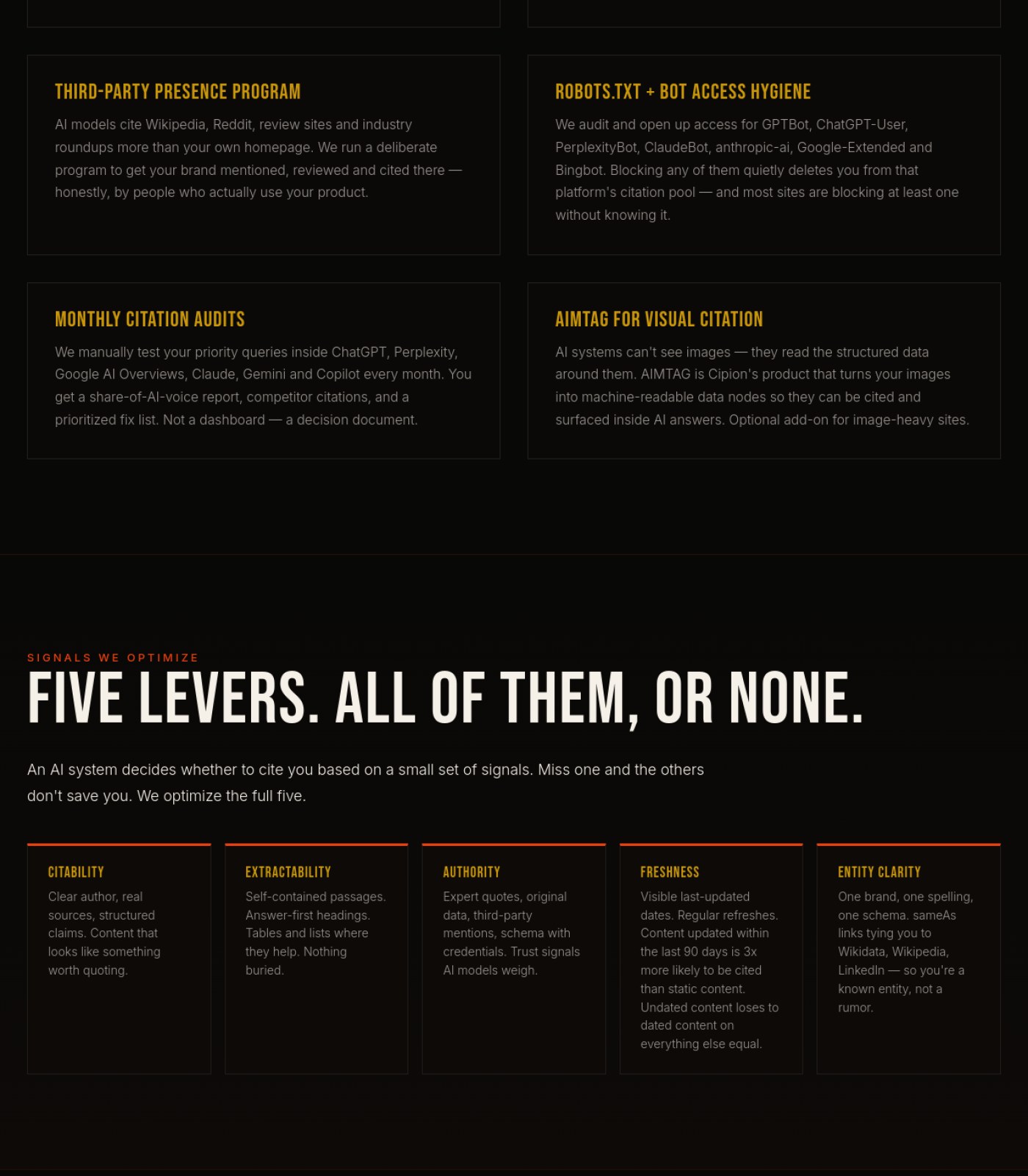
Keep the alternating card-grid rhythm (2-up, then 5-up) for the levers and services
It breaks up a very text-heavy page and makes each idea scannable.
why: Five Levers grid, section 4
Already good
Vary the SEO vs GEO comparison table with a highlight color on the GEO column
Right now both columns look equally weighted, so the 'this is the one that matters' message doesn't stand out visually.
why: comparison table, section 3
✏️

Words on the Page

2 to fix · 1 already good
Attribute the testimonial to a real name/company or a titled role with credentials
An anonymous quote is weak proof, and the page itself argues that 'author signals' and 'expert quotes' are what make content trustworthy.
why: testimonial block, section 1
Make the voice consistent between 'I've been doing marketing for 25 years' and the surrounding 'we/our' agency language
Switching between a founder's personal voice and a team voice in the same paragraph can confuse who the reader is actually hiring.
why: 'What This Actually Is' body copy, section 2
Keep citing sources next to every stat (SparkToro/Semrush, BrightEdge, etc.)
Sourced numbers build trust and match the credibility standard the page preaches.
why: stat cards, sections 1-2
Already good
🧭

Menu & Getting Around

2 to fix · 1 already good
Fix the 'SERVICES BE' label in the top navigation
It reads as a typo or a broken dropdown icon next to the word Services, which looks unpolished on a page selling technical polish.
why: top nav item, section 1
Keep the EN/ES language switch visible in the header
Clear, simple language toggle helps a bilingual client base find content easily.
why: header, section 1
Already good
Add a persistent 'back to top' or section jump-links for this long page
The page is six screen-lengths long with no shortcuts, so returning to the CTA at the top means a long scroll back up.
why: overall page length, sections 1-6
🔍

Being Found by AI & Google

2 to fix · 1 already good
Add visible author name and credentials to the '25 years of marketing' paragraph
This page is selling authority signals as a GEO tactic, but its own expert claim has no named, checkable author attached to it.
why: 'What This Actually Is' section, section 2
Turn the numbered '5-Step Audit' and 'Five Levers' sections into structured, citable passages (short definition-first blocks)
The page argues AI engines only cite short self-contained passages, so its own long paragraphs under each numbered step should follow that same 40-60 word answer-first pattern.
why: 5-step audit list, section 5
Keep freshness/date signals and sourced 2025 stats
This is exactly the 'freshness' and 'authority' signal the page tells visitors AI systems reward, and it's already being done well here.
why: dated stat sources, sections 1-2
Already good
⚖️

Legal & Accessibility Risk

3 to fix
Add a footer with Privacy Policy, Terms of Service and an accessibility statement
None of these legal pages or links appear anywhere on the page, which is a real compliance gap for an agency working with regulated clients like Bank of America.
why: no footer visible across all 6 sections
Confirm rights to display named client brands (Toyota, T-Mobile, Bank of America, Bvlgari, etc.) or add a 'trademarks belong to their respective owners' disclaimer
Listing well-known regulated brands as clients without visible permission or a disclaimer is a trademark and reputational risk.
why: 'Brands Cipion has worked on' list, section 1
Check contrast of the grey/beige body text against the black background
Long paragraphs in a muted grey on near-black can fall below accessible contrast minimums for readers with low vision.
why: body copy throughout, sections 2-6
For your boss / your team

One-line summary you can forward

This GEO service page scores a 64/100 today: the writing is sharp, the stats are sourced, and the CTAs are strong, but three things are dragging it down. First, there is no footer anywhere on the page — no privacy policy, terms, or contact info, which is a real legal gap for an agency courting regulated clients. Second, the 'brands worked with' list (Toyota, Bank of America, T-Mobile, etc.) is shown as plain text with no logos or visible permission, which is both a weak trust signal and a possible trademark risk. Third, the only client testimonial is anonymous, undercutting the page's own argument that named authority and credentials are what make content trustworthy. Fixing the footer, verifying/attributing the client claims, and naming the testimonial and author would push this to roughly 86/100.

Audit Brief

cipionmarketing.com

Services Ai Creative · generated automatically · https://cipionmarketing.com/services/ai-creative

61
Today
82
After fixes

This page is 61% ready to send traffic to. Fixing the items below gets it to an estimated 82%.

Do these 3 first
1

Caption the unlabeled sample imagesThe watch, car, and fashion/portrait images in the 'What We Typically Produce' grid have no labels, so visitors can't tell if they're real client work or stock samples, which undercuts the page's whole credibility argument.

2

Add Privacy Policy and Terms links to the footerNo legal links appear anywhere on the page, which is a standard expectation for any business site and a legal exposure gap.

3

Fix the unfinished-looking image gridThe 'What We Typically Produce' section has a large empty black area where a 4th image is missing from the grid, making the page look broken.

📍 The map

 — this page, with the fixes marked where they happen

Section 1 of 6
cipionmarketing.com screenshot
Section 2 of 6
cipionmarketing.com screenshot
Section 3 of 6
cipionmarketing.com screenshot
1
2
Section 4 of 6
cipionmarketing.com screenshot
Section 5 of 6
cipionmarketing.com screenshot
Section 6 of 6
cipionmarketing.com screenshot
3
1

Empty grid cell, no image

2

Uncaptioned sample images

3

No privacy/terms links

⚡ Ship the fixes

Send this page's fixes to whoever ships it

Check or uncheck items in the checklist below, then use the bar right above it: Copy prompt pastes into a chat-based AI agent (Claude, ChatGPT...). Download JSON or the Advanced API below hand it to an autonomous coding agent (Claude Code, Cursor...). Download checklist is a plain to-do list for a human developer. Or skip all of that — see "Path 2" below.

Or open the raw JSON (all pages) →
Path 2: let it apply fixes for you automatically (private beta)

Instead of you copying a prompt or downloading a file, a weekly check can do the finding-and-proposing part for you:

  1. Once a week, it re-reads your latest Audit Brief and picks out fixes that need no file and no judgment call from you (blocker-free ones only — anything marked "needs a file" or "ask before doing" is never touched by this).
  2. Nothing is written to your site at this point. Each fix is queued as a proposal, exactly like this one:
{ "domain": "yoursite.com", "file_path": "index.html", "pillar": "Words on the Page", "task": "Clarify what 'GEO' means on first mention", "why": "Visitors may not know the acronym.", "old_snippet": "GEO optimizes for citation...", "new_snippet": "GEO (Generative Engine Optimization) optimizes for citation...", "status": "pending" }
  1. You get notified that proposals are waiting. You open your review queue, see a before/after diff for each one, and click Accept or Reject individually — nothing ships to your live site without that click.
  2. You can reject anything, anytime, for any reason. There is no "auto-approve" setting — every single change needs your explicit yes.

This is a private pilot right now, not a self-serve toggle yet — ask us to turn it on for your site.

selected
🖼️

Photos & Images

2 to fix · 1 already good
Add a short caption/credit to each of the four sample images in the 'What We Typically Produce' grid (watch, car, fashion editorial, colorful portrait)
Without labels, visitors can't tell whether these are Cipion's actual AI-generated work or generic stock photos, weakening the trust the section is trying to build
why: consistency of trust cues; compare to captioned Nike image above
Keep the Nike concept image caption format ('AI CREATIVE BY CIPION + AIM WORLD') and apply it to all other example images
This is the one image on the page that models correctly and should be the template
why: n/a
Already good
Confirm the hero background video/image and all sample images have descriptive alt text
Screen reader users and search engines can't understand what's shown without it
why: WCAG 1.1.1 non-text content
🔘

Buttons & Actions

2 to fix · 1 already good
Repeat the primary 'Start a Project' button in the hero and the closing CTA banner
Consistent, unmissable primary action across the page makes it easy for a ready buyer to convert
why: n/a
Already good
Make the phone number shown in the footer contact block a tappable/clickable link
Visitors on mobile expect to tap a phone number to call directly instead of having to copy it
why: tap-to-call convention
Make sure the 'How We Work' button in the hero scrolls or links to the actual process section shown lower on the page
A secondary button with an unclear destination reduces its usefulness as a real choice for hesitant visitors
why: n/a
📐

Layout & Structure

2 to fix · 1 already good
Rebalance the image grid in 'What We Typically Produce' so there's no large empty black space where a 4th top-row or 2nd-row image should be
An uneven grid with visible empty cells makes the page look unfinished or broken to a first-time visitor
why: layout completeness heuristic
Reduce the large vertical black gaps that appear at the top of several sections before their headline
Excess empty space between sections can make the page feel slow to load or poorly spaced as people scroll
why: n/a
Keep the consistent card-based design system used in the 'Four Things' and 'What You Actually Get' sections
Repeating the same card style across sections makes the page feel organized and easy to scan
why: n/a
Already good
✏️

Words on the Page

2 to fix · 1 already good
Add a one-line plain-language explanation the first time 'Brand LoRA' is used
Marketing decision-makers reading this page likely don't know this technical AI term, and an unexplained acronym can make copy feel exclusionary or confusing
why: plain-language readability
Clarify or remove the small 'BE' text next to 'SERVICES' in the top navigation
It reads like a leftover label or typo and can confuse visitors about what it means
why: n/a
Keep naming specific real clients (Toyota, Audible, Bank of America, Maybelline, Nescafé, Bvlgari) and specific process details
Concrete names and specifics build more credibility than generic agency claims
why: n/a
Already good
🧭

Menu & Getting Around

2 to fix · 1 already good
Add Work, Blog, Books, and Services links to the footer's 'Navigate' column to match the top navigation
Visitors who scroll all the way to the footer looking for more to explore currently only find Home, About, FAQ, Contact
why: footer nav completeness
Keep the top navigation with visible EN | ES language toggle
Clear, simple language switching is good for a bilingual audience and easy to find
why: n/a
Already good
Add a small breadcrumb or page label indicating this is under Services (e.g., Services > AI Creative)
Helps visitors orient themselves within the site, especially if they land here directly from search or an ad
why: n/a
🔍

Being Found by AI & Google

2 to fix · 1 already good
Add at least one real client testimonial or a link to a case study proving the named clients (Toyota, Audible, etc.) actually used this AI Creative service
Search engines and AI answer tools favor pages with verifiable proof; right now the client names are unlinked claims with nothing to back them up
why: E-E-A-T trust signal
Write descriptive, keyword-relevant alt text for the sample images once they're captioned
Helps image search and AI crawlers understand and surface this page's actual work
why: n/a
Keep the single clear H1 ('AI Creative.') with a logical heading structure through the page
Clean heading hierarchy helps search engines and AI tools understand and summarize the page correctly
why: n/a
Already good
⚖️

Legal & Accessibility Risk

3 to fix · 1 already good
Add Privacy Policy and Terms of Service links to the footer
No legal or privacy links appear anywhere on the page, which is a standard expectation and a compliance gap for a business collecting contact information
why: footer legal-link convention
Verify the FAQ accordion items are keyboard-operable and announce their expanded/collapsed state to screen readers
Collapsed FAQ content needs to be accessible to keyboard and assistive-technology users, not just mouse clickers
why: WCAG 4.1.2 name/role/value
Check contrast of small all-caps orange labels (e.g. 'SERVICE · AI CREATIVE', 'USE CASES') against the black background
Small low-contrast text can be hard to read for visitors with low vision
why: WCAG 1.4.3 contrast minimum
Keep the explicit AI-content disclosure messaging ('no fake UGC, no stealth AI-as-human... your legal team can sleep')
Proactively addressing AI transparency and rights builds real trust and reduces legal risk for prospective clients
why: n/a
Already good
For your boss / your team

One-line summary you can forward

This AI Creative service page scores a 61/100 today: the writing and process structure are strong and confidently on-brand, but three fixable gaps are pulling the score down. First, the four sample images (watch, car, fashion editorial, portrait) have no captions explaining what they are or who made them, unlike the well-labeled Nike example above them, which weakens the very credibility argument the page is making. Second, that same image section has a visibly empty grid cell, making the page look unfinished. Third, there are no Privacy Policy or Terms links anywhere on the page, including the footer, which is a standard legal expectation missing here. Fixing these three items, plus tightening a few jargon terms and adding footer navigation links, should bring the page to roughly 82/100.

Audit Brief

cipionmarketing.com

Services Paid Media · generated automatically · https://cipionmarketing.com/services/paid-media

64
Today
86
After fixes

This page is 64% ready to send traffic to. Fixing the items below gets it to an estimated 86%.

Do these 3 first
1

Clean up the ghosted hero photoA second, half-visible ad ('FREE...ON EVERY...THAN VERIZON') is bleeding through the beach photo behind the headline, which looks like a rendering bug and undercuts a premium first impression.

2

Back up the '25 years / global brands' claim with real proofThe page repeats a big trust claim twice but shows no client logos, case study links, or a linked bio for 'Diego', so visitors and AI search tools have nothing to verify it against.

3

Add visible legal links to the footerAs an agency that touches client ad accounts and tracking data (CAPI, pixels), the footer should clearly show Privacy Policy and Terms links, and none are visible anywhere on the page.

📍 The map

 — this page, with the fixes marked where they happen

Section 1 of 6
cipionmarketing.com screenshot
1
2
Section 2 of 6
cipionmarketing.com screenshot
Section 3 of 6
cipionmarketing.com screenshot
Section 4 of 6
cipionmarketing.com screenshot
Section 5 of 6
cipionmarketing.com screenshot
Section 6 of 6
cipionmarketing.com screenshot
3
1

Ghosted text behind hero photo

2

Unclear 'BE' tag in nav

3

Footer missing legal links

⚡ Ship the fixes

Send this page's fixes to whoever ships it

Check or uncheck items in the checklist below, then use the bar right above it: Copy prompt pastes into a chat-based AI agent (Claude, ChatGPT...). Download JSON or the Advanced API below hand it to an autonomous coding agent (Claude Code, Cursor...). Download checklist is a plain to-do list for a human developer. Or skip all of that — see "Path 2" below.

Or open the raw JSON (all pages) →
Path 2: let it apply fixes for you automatically (private beta)

Instead of you copying a prompt or downloading a file, a weekly check can do the finding-and-proposing part for you:

  1. Once a week, it re-reads your latest Audit Brief and picks out fixes that need no file and no judgment call from you (blocker-free ones only — anything marked "needs a file" or "ask before doing" is never touched by this).
  2. Nothing is written to your site at this point. Each fix is queued as a proposal, exactly like this one:
{ "domain": "yoursite.com", "file_path": "index.html", "pillar": "Words on the Page", "task": "Clarify what 'GEO' means on first mention", "why": "Visitors may not know the acronym.", "old_snippet": "GEO optimizes for citation...", "new_snippet": "GEO (Generative Engine Optimization) optimizes for citation...", "status": "pending" }
  1. You get notified that proposals are waiting. You open your review queue, see a before/after diff for each one, and click Accept or Reject individually — nothing ships to your live site without that click.
  2. You can reject anything, anytime, for any reason. There is no "auto-approve" setting — every single change needs your explicit yes.

This is a private pilot right now, not a self-serve toggle yet — ask us to turn it on for your site.

selected
🖼️

Photos & Images

3 to fix · 1 already good
Remove or hide the ghosted second image/text layered behind the hero beach photo
The faint 'FREE / ON EVERY / THAN VERIZON' text bleeding through the woman-on-beach photo looks broken and distracts from the 'PAID MEDIA.' headline.
why: layered background image with visible bleed-through, low legibility
Replace or caption the hero beach photo so it clearly relates to paid media work
Right now the hero photo reads as generic stock imagery with no connection to advertising, which weakens the page's credibility compared to the well-labeled 'AI Cinematic' image further down.
why: uncaptioned stock-style hero photo vs. labeled example image below
Keep using clear photo captions like the 'AI CINEMATIC — PAID MEDIA CREATIVE BY CIPION + AIM WORLD' label
This caption tells visitors exactly what they're looking at and who made it, which builds trust.
why: captioned example image, section 3
Already good
Add client logos or campaign screenshots as proof images
The copy claims work for 'global brands' but no logos, screenshots, or case-study visuals appear anywhere on the page to back that up.
why: no client/brand proof imagery found across all 6 sections
🔘

Buttons & Actions

1 to fix · 2 already good
Keep the paired primary/secondary CTA pattern in the hero ('AUDIT MY AD ACCOUNT' solid, 'HOW WE WORK' outlined)
Having one strong filled button and one lighter outlined button makes it obvious which action is more important.
why: hero CTA pair, section 1
Already good
Fix or clarify the small 'BE' tag next to 'SERVICES' in the top navigation
It's unclear what 'BE' means next to the Services menu item, and it could confuse visitors trying to use the menu.
why: nav label 'SERVICES BE', section 1 header
Keep repeating the booking CTA at logical break points (hero, mid-page, and final banner)
Visitors are never far from a clear next step, which is good for conversion.
why: 'AUDIT MY AD ACCOUNT', 'BOOK A PAID AUDIT' CTAs across sections 1 and 6
Already good
📐

Layout & Structure

2 to fix · 1 already good
Give all four 'structural choices' cards the same visual treatment
The first choice ('Creative Velocity via AI') is paired with a large image while the other three are plain text-only cards, which makes the section feel unfinished or inconsistent.
why: mixed image/text card layout, sections 2-3
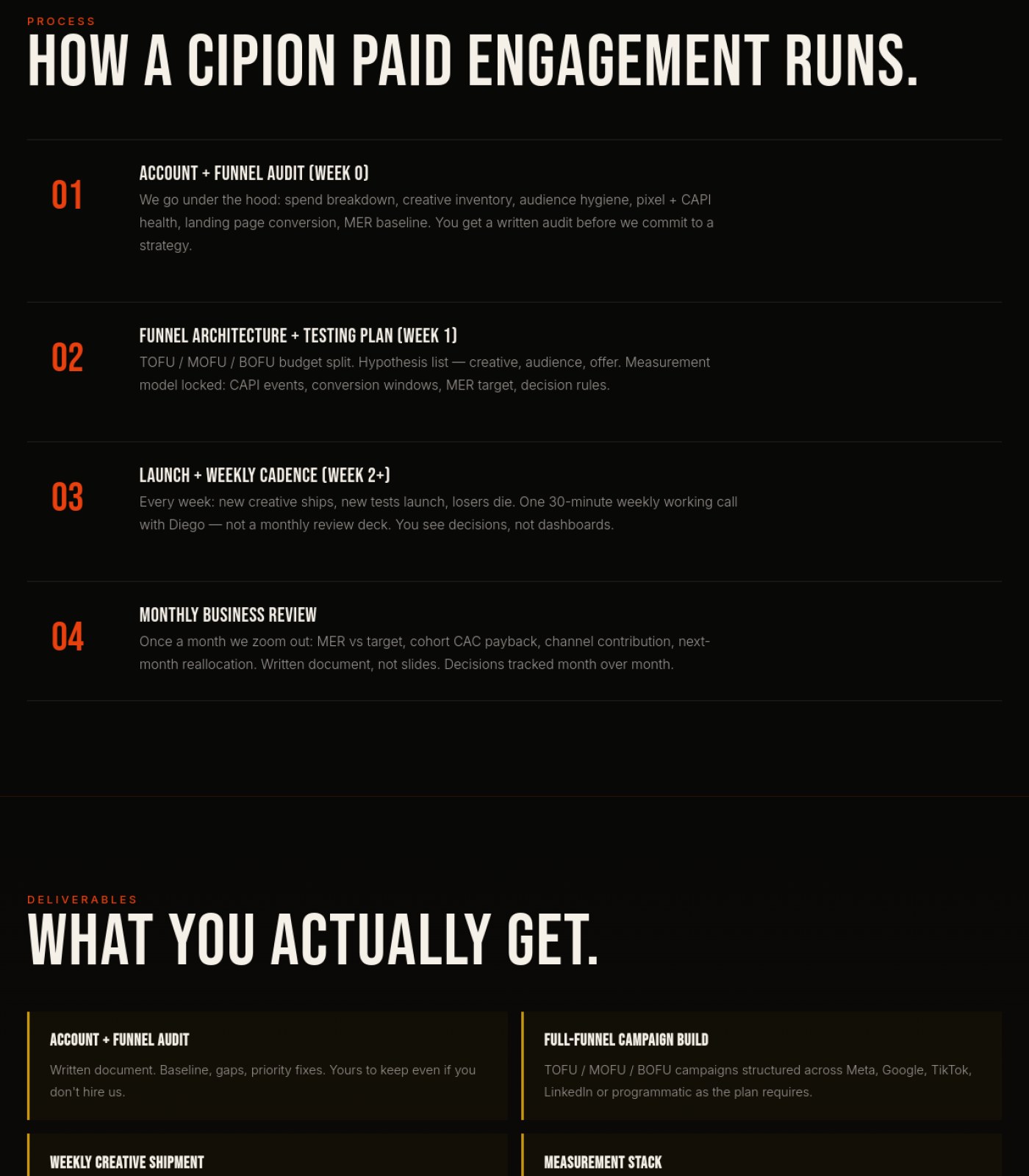
Keep the numbered 4-step process layout (01-04) for 'How a Cipion Paid Engagement Runs'
Numbered steps with short labels make a complex process easy to scan quickly.
why: process steps 01-04, section 4
Already good
Expand the footer to show a fuller set of links instead of a short, cut-off looking list
The footer only shows one or two items per column (e.g. 'GEO', 'Home'), which feels incomplete for a real company footer and limits easy navigation from the bottom of the page.
why: truncated footer columns, section 6
✏️

Words on the Page

2 to fix · 1 already good
Briefly explain acronyms like TOFU, MOFU, BOFU, CAPI, MER, ASC, and PMax the first time each appears
A prospective client evaluating an agency may not know these terms, and unexplained jargon can make the page feel harder to trust or act on.
why: unexplained acronyms, sections 2 and 3
Link the mention of 'Diego' to his bio on the About page
The page leans on '25 years of budget discipline' from a named person but gives no way to verify who he is or see his background.
why: 'Diego on the account' text with no link, section 3
Keep the confident, specific brand voice ('Losers die fast', 'no spend reports disguised as strategy')
This distinct, plain-spoken tone makes the agency feel experienced rather than generic.
why: copy tone throughout sections 1-4
Already good
🧭

Menu & Getting Around

2 to fix · 1 already good
Add a simple breadcrumb like 'Services > Paid Media' near the top of the page
This is a deep sub-page under Services, and a breadcrumb would help visitors understand where they are and get back to other services easily.
why: no breadcrumb visible below main nav, section 1
Keep the top navigation simple and consistent (Services, Work, Blog, Books, About, language toggle, Let's Talk)
A short, clearly labeled main menu makes the site easy to explore.
why: top navigation bar, section 1
Already good
Clarify the 'SERVICES BE' nav label so visitors know if it opens a submenu
An unclear label in the main menu can make people hesitate to click it.
why: nav item 'SERVICES BE', section 1
🔍

Being Found by AI & Google

2 to fix · 1 already good
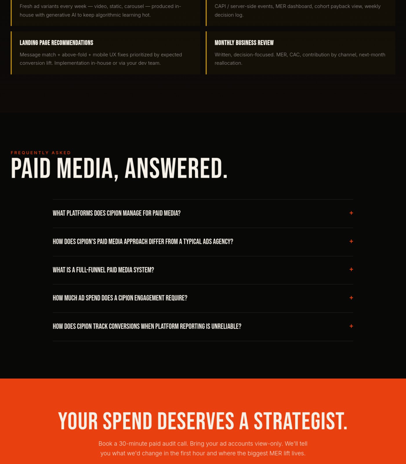
Keep the FAQ section with specific, real questions ('What is a full-funnel paid media system?', etc.)
Direct question-and-answer content like this is exactly what Google and AI answer engines look for when matching search queries to pages.
why: FAQ accordion, section 5
Already good
Link the named expert ('Diego') to a credentialed bio page
Search engines and AI tools increasingly check for real, verifiable experience behind expertise claims, and an unlinked name doesn't provide that proof.
why: 'Diego' mention with no linked bio, section 3
Add visible proof elements (client names, results, or case study links) referenced by this page
Claims like 'managed budgets for global brands for 25 years' need supporting evidence somewhere on the page to be credible to both readers and AI-driven search evaluation.
why: no proof content across sections 1-6
⚖️

Legal & Accessibility Risk

4 to fix
Add clearly visible Privacy Policy and Terms of Service links in the footer
This agency touches client ad accounts, tracking pixels, and CAPI data, so a visible legal/privacy link is expected and currently isn't shown anywhere on the page.
why: no privacy/terms link found in footer, section 6
Add a darker overlay or scrim behind the hero headline text over the beach photo
Text placed directly over a busy, bright photo (plus the ghosted second image) can be hard to read for some visitors, including those with low vision.
why: hero text-over-photo contrast, section 1
Confirm all images have descriptive alt text for screen readers
None of the images (hero photo, structural-choice photo, AI cinematic image) show visible alt text, and this can't be confirmed from the page, so it should be checked and added where missing.
why: unknown alt attributes, all image instances
Verify the FAQ accordion is keyboard- and screen-reader-accessible
None of the FAQ answers are shown expanded, so it's worth confirming the accordion can be opened without a mouse and announces its state properly.
why: collapsed FAQ accordion, section 5
For your boss / your team

One-line summary you can forward

This Paid Media service page scores a 64 out of 100 today: the copy is confident and the process/FAQ sections are genuinely strong for both readers and search engines, but a few fixable issues are dragging down trust and polish. The hero photo has a distracting ghosted second image bleeding through it, the page repeats big trust claims ('25 years', 'global brands') without any client logos, case studies, or a linked bio for the named expert to back them up, and the footer doesn't show any visible Privacy Policy or Terms link even though this agency handles client ad accounts and tracking data. Fixing the hero image, adding real proof points, and shoring up the footer's legal links would bring this page to an estimated 86.

Audit Brief

cipionmarketing.com

Services Content Strategy · generated automatically · https://cipionmarketing.com/services/content-strategy

64
Today
85
After fixes

This page is 64% ready to send traffic to. Fixing the items below gets it to an estimated 85%.

Do these 3 first
1

Replace the irrelevant hero image and fill the empty case-study boxThe homepage hero shows a fantasy fashion photo that has nothing to do with content strategy, and the Nescafé example card is empty, both of which undercut trust in an agency selling content work.

2

Add a Privacy Policy / Terms link to the footerThe footer collects contact info (phone, email) but shows no legal links anywhere on the page, which is a basic compliance gap for any business site.

3

Fix the low-contrast grey text and the '© 2026' copyright dateSeveral body paragraphs use dim grey text on black that's hard to read, and the footer shows a future copyright year, both of which hurt readability and credibility.

📍 The map

 — this page, with the fixes marked where they happen

Section 1 of 6
cipionmarketing.com screenshot
1
Section 2 of 6
cipionmarketing.com screenshot
2
Section 3 of 6
cipionmarketing.com screenshot
Section 4 of 6
cipionmarketing.com screenshot
Section 5 of 6
cipionmarketing.com screenshot
Section 6 of 6
cipionmarketing.com screenshot
3
1

Hero image unrelated to content

2

Empty Nescafé case study box

3

No privacy policy link

⚡ Ship the fixes

Send this page's fixes to whoever ships it

Check or uncheck items in the checklist below, then use the bar right above it: Copy prompt pastes into a chat-based AI agent (Claude, ChatGPT...). Download JSON or the Advanced API below hand it to an autonomous coding agent (Claude Code, Cursor...). Download checklist is a plain to-do list for a human developer. Or skip all of that — see "Path 2" below.

Or open the raw JSON (all pages) →
Path 2: let it apply fixes for you automatically (private beta)

Instead of you copying a prompt or downloading a file, a weekly check can do the finding-and-proposing part for you:

  1. Once a week, it re-reads your latest Audit Brief and picks out fixes that need no file and no judgment call from you (blocker-free ones only — anything marked "needs a file" or "ask before doing" is never touched by this).
  2. Nothing is written to your site at this point. Each fix is queued as a proposal, exactly like this one:
{ "domain": "yoursite.com", "file_path": "index.html", "pillar": "Words on the Page", "task": "Clarify what 'GEO' means on first mention", "why": "Visitors may not know the acronym.", "old_snippet": "GEO optimizes for citation...", "new_snippet": "GEO (Generative Engine Optimization) optimizes for citation...", "status": "pending" }
  1. You get notified that proposals are waiting. You open your review queue, see a before/after diff for each one, and click Accept or Reject individually — nothing ships to your live site without that click.
  2. You can reject anything, anytime, for any reason. There is no "auto-approve" setting — every single change needs your explicit yes.

This is a private pilot right now, not a self-serve toggle yet — ask us to turn it on for your site.

selected
🖼️

Photos & Images

3 to fix · 1 already good
Swap the hero image for something that actually represents content strategy work (editorial calendars, brand voice docs, real campaign shots) instead of the fantasy-style photo of a woman in a gown on a rainy street.
Visitors judge relevance in seconds, and an unrelated moody fashion image makes the page feel disconnected from the service being sold.
why: hero visual relevance
Fill the 'NESCAFÉ — Editorial Content by Cipion Marketing' box with an actual screenshot or thumbnail of that work instead of leaving it as empty space with just a headline and an orange line.
An empty case-study card next to fully-written text cards looks broken and removes the proof this section is trying to give.
why: missing case-study image placeholder
Add client logos, team photos, or work samples somewhere on the page, since the copy repeatedly promises 'real brands named' and 'proof over claim' but no visual proof appears anywhere on the page.
An agency page that only shows text and one unrelated hero image misses an easy trust-building opportunity.
why: no supporting proof imagery across full page
Keep the consistent dark, high-contrast color treatment across sections.
The black background with orange and cream accents is used consistently, giving the page a cohesive, on-brand look.
why: consistent color system
Already good
🔘

Buttons & Actions

1 to fix · 2 already good
Keep the bold orange 'BUILD MY CONTENT ENGINE' as the clearly dominant call-to-action in the hero.
It stands out sharply against the dark background and is easy to spot as the main next step.
why: primary CTA contrast/hierarchy
Already good
Standardize the call-to-action wording across the page (currently 'Let's Talk', 'Build My Content Engine', and 'Start The Conversation' all point to the same action).
Using three different phrases for what is likely the same booking action can make visitors unsure if they lead to different things.
why: CTA label consistency
Keep the outlined 'HOW WE WORK' button visually secondary to the filled orange button.
Good use of a lighter, outlined style correctly signals it's a lower-priority action than the main CTA.
why: secondary button styling
Already good
📐

Layout & Structure

2 to fix · 1 already good
Fix the nav item that currently reads 'SERVICES BE' — the trailing 'BE' looks like a leftover label or typo.
A garbled menu label right at the top of the page looks unfinished and confuses first-time visitors.
why: nav label text error
Keep the repeating card grid pattern used for the five pillars and the four/eight deliverable blocks.
The consistent card structure makes dense information easy to scan section to section.
why: grid/card consistency
Already good
Give the empty Nescafé case-study card the same visual weight (padding, content, image) as its neighboring text cards.
Right now it reads as noticeably shorter and mostly blank, which breaks the visual rhythm of an otherwise tidy grid.
why: card height/content imbalance
✏️

Words on the Page

2 to fix · 1 already good
Correct the footer copyright, which currently shows '© 2026' — a future date.
A copyright year in the future looks like a factual mistake and can quietly damage credibility.
why: footer date error
Make the hero headline more descriptive than just 'CONTENT.' by working in the actual service name.
A one-word headline is stylish but doesn't tell a skimming visitor (or a search engine) what the page is actually about.
why: vague H1 copy
Keep the confident, specific brand voice used throughout (e.g. 'Same brain, predictable rhythm, distinct voice, measurable output').
The copy is distinctive, concrete, and avoids generic marketing filler, which is rare and a real strength.
why: copywriting quality
Already good
🧭

Menu & Getting Around

2 to fix · 1 already good
Align the footer 'Navigate' list with the header menu — the footer only shows Home, About, FAQ, and Contact, dropping Work, Blog, Books, and Services that appear in the top nav.
Visitors scrolling to the bottom expect the same set of links as the top, and missing ones force them to scroll back up.
why: footer/header nav mismatch
Add a visible indicator (e.g. highlighted state) showing 'Content Strategy' is the current page within the Services menu.
Without this, visitors landing directly on this sub-page have no cue where they are inside the site structure.
why: no active-state wayfinding
Keep the compact top navigation with the EN/ES language toggle visible at all times.
A short, clear menu plus an easy language switch makes the site simple to navigate for a bilingual audience.
why: concise header nav
Already good
🔍

Being Found by AI & Google

2 to fix · 1 already good
Rewrite the H1 from just 'CONTENT.' to something that includes the actual keyword phrase, such as 'Content Strategy'.
Search engines and AI answer tools weigh the main heading heavily to understand what a page is about, and a single vague word wastes that signal.
why: H1 keyword clarity
Make sure the five visible FAQ questions are marked up as structured FAQ content so AI tools like ChatGPT or Google's AI Overviews can pull them directly.
The page's own pitch is about being 'citable inside AI answers,' so its own FAQ should be set up to actually get cited.
why: FAQ schema markup
Keep the plain-language FAQ section addressing real buyer questions ('What is content strategy?', 'How often should a brand publish content?').
Short, direct Q&A pairs are exactly the format AI answer engines and search snippets favor.
why: FAQ content format
Already good
⚖️

Legal & Accessibility Risk

3 to fix · 1 already good
Add a Privacy Policy and Terms of Service link to the footer — none is visible anywhere on the page despite phone and email contact details being displayed.
A site collecting or displaying contact information without a visible privacy link is a common legal gap that's easy to flag and expensive to ignore.
why: missing footer legal links
Increase the contrast of the muted grey body text used in process steps and descriptions (light grey on near-black background).
Lower-contrast text is harder to read for visitors with low vision and risks failing basic accessibility contrast guidelines.
why: WCAG 2.1 contrast ratio (AA)
Correct the future-dated '© 2026' copyright notice.
An incorrect legal date on a footer is a small but real accuracy issue that can be flagged in a compliance review.
why: outdated/incorrect legal notice
Keep the EN/ES language toggle, which supports accessibility for non-English speakers.
Offering a language switch is a solid accessibility and inclusivity practice already in place.
why: language accessibility option
Already good
For your boss / your team

One-line summary you can forward

This Content Strategy page scores 64/100 today — the copywriting is strong and the primary buttons are clear, but three issues drag down trust and compliance: the hero photo doesn't relate to content strategy at all, the Nescafé case-study box is left empty instead of showing real proof of work, and there's no Privacy Policy or Terms link anywhere on the page despite showing phone and email contact details. Low-contrast grey body text and a footer copyright date of '© 2026' add smaller but visible polish and accuracy problems. None of these fixes require new components — mostly swapping/adding real assets, restyling text color, and correcting copy — so addressing them should lift the score to roughly 85.

Audit Brief

cipionmarketing.com

Services Automations · generated automatically · https://cipionmarketing.com/services/automations

71
Today
86
After fixes

This page is 71% ready to send traffic to. Fixing the items below gets it to an estimated 86%.

Do these 3 first
1

Add real trust signalsThe entire page has zero testimonials, client logos, or case-study proof, which makes a bold sales pitch about reliability harder to believe.

2

Add legal links and cookie noticeThere is no Privacy Policy, Terms link, or cookie consent banner anywhere on the page, which is a real legal exposure for a business collecting lead info through forms.

3

Fix the odd 'SERVICES BE' nav label and low-contrast orange labelsAn unexplained tag next to 'Services' looks like a leftover bug, and thin orange all-caps labels on black may be too hard for some visitors to read.

📍 The map

 — this page, with the fixes marked where they happen
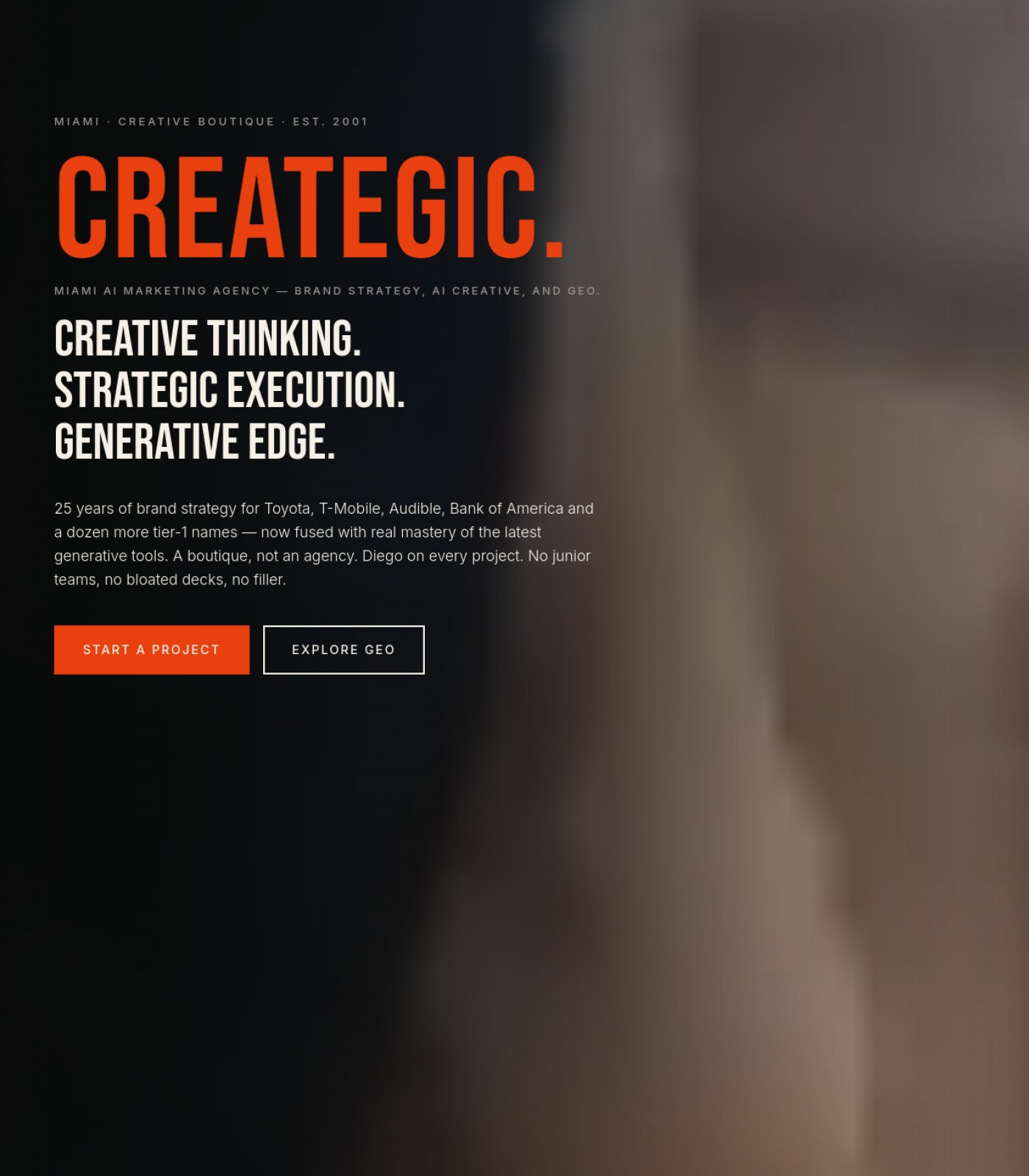
Section 1 of 6
cipionmarketing.com screenshot
1
Section 2 of 6
cipionmarketing.com screenshot
2
Section 3 of 6
cipionmarketing.com screenshot
Section 4 of 6
cipionmarketing.com screenshot
Section 5 of 6
cipionmarketing.com screenshot
Section 6 of 6
cipionmarketing.com screenshot
3
1

Unexplained 'BE' nav tag

2

Large empty gap before content

3

No privacy policy link in footer

⚡ Ship the fixes

Send this page's fixes to whoever ships it

Check or uncheck items in the checklist below, then use the bar right above it: Copy prompt pastes into a chat-based AI agent (Claude, ChatGPT...). Download JSON or the Advanced API below hand it to an autonomous coding agent (Claude Code, Cursor...). Download checklist is a plain to-do list for a human developer. Or skip all of that — see "Path 2" below.

Or open the raw JSON (all pages) →
Path 2: let it apply fixes for you automatically (private beta)

Instead of you copying a prompt or downloading a file, a weekly check can do the finding-and-proposing part for you:

  1. Once a week, it re-reads your latest Audit Brief and picks out fixes that need no file and no judgment call from you (blocker-free ones only — anything marked "needs a file" or "ask before doing" is never touched by this).
  2. Nothing is written to your site at this point. Each fix is queued as a proposal, exactly like this one:
{ "domain": "yoursite.com", "file_path": "index.html", "pillar": "Words on the Page", "task": "Clarify what 'GEO' means on first mention", "why": "Visitors may not know the acronym.", "old_snippet": "GEO optimizes for citation...", "new_snippet": "GEO (Generative Engine Optimization) optimizes for citation...", "status": "pending" }
  1. You get notified that proposals are waiting. You open your review queue, see a before/after diff for each one, and click Accept or Reject individually — nothing ships to your live site without that click.
  2. You can reject anything, anytime, for any reason. There is no "auto-approve" setting — every single change needs your explicit yes.

This is a private pilot right now, not a self-serve toggle yet — ask us to turn it on for your site.

selected
🖼️

Photos & Images

2 to fix · 1 already good
Add descriptive alt text to the hero rhino photo
Screen reader users and Google Images currently have no way to know what this large stylized photo shows or why it's there.
why: WCAG 1.1.1 non-text content
Consider adding small supporting icons or visuals to the Spine, Engineering Choices, and Deliverables sections
After the hero, the entire rest of the page is text and colored boxes only, which makes long sections feel monotonous to scan.
why: visual scanning / picture superiority effect
Hero photo creates a strong, on-brand first impression
The bold stylized rhino image immediately signals a distinct creative brand rather than generic stock photography.
why: brand differentiation
Already good
🔘

Buttons & Actions

1 to fix · 2 already good
Pick one consistent name for the main action across the page
The nav says 'Let's Talk' while the hero and footer say 'Map My Pipeline,' which can make visitors unsure which is the 'real' next step.
why: single clear call-to-action principle
Hero uses a clear filled primary button and an outlined secondary button
This visually tells visitors which action matters most (Map My Pipeline) versus optional (How We Work).
why: visual hierarchy for CTAs
Already good
Primary CTA is repeated at the very bottom of the page
Visitors who scroll all the way through don't have to scroll back up to take action.
why: conversion path reinforcement
Already good
📐

Layout & Structure

1 to fix · 2 already good
Reduce or fill the large empty black space at the top of 'The Spine' section
There's a noticeably tall gap of blank space before the section heading appears, which can look like a loading error rather than intentional design.
why: visual continuity
Process, Deliverables, and Engineering Choices sections use consistent card/grid layouts
Repeating the same visual pattern makes the long page easier to skim.
why: consistency principle
Already good
Footer is organized into clear labeled columns
Services, Contact, and Navigate are easy to tell apart at a glance.
why: footer information architecture
Already good
✏️

Words on the Page

2 to fix · 1 already good
Add at least one real testimonial, client result, or named case study
The page makes strong claims about reliability and 'infrastructure not duct tape' but offers no proof from an actual client anywhere on the page.
why: social proof / conversion copywriting
Add a short plain-language explainer for technical terms like ICP, UTM, GoHighLevel, and n8n
A founder or non-technical buyer reading this may not know what these acronyms mean, which can cause them to bounce.
why: plain language accessibility
Copy has a strong, distinctive, non-generic voice
Lines like 'not a Zapier tower' and 'duct tape and prayed' make the brand memorable instead of sounding like every other agency.
why: brand voice differentiation
Already good
🧭

Menu & Getting Around

2 to fix · 1 already good
Investigate and fix the unexplained 'BE' label next to 'Services' in the main nav
This small tag doesn't correspond to any visible meaning and looks like a leftover placeholder or bug to visitors.
why: UI cleanliness / trust signal
Align footer navigation with header navigation (Work, Blog, Books are missing from the footer)
Visitors who scroll to the bottom lose easy access to pages that were available in the header.
why: navigation consistency
Language toggle (EN/ES) is clearly visible in the header
Bilingual visitors can immediately see the site supports their language.
why: internationalization UX
Already good
🔍

Being Found by AI & Google

2 to fix · 1 already good
Confirm the FAQ section uses structured FAQ data so Google and AI assistants can pull answers directly
The FAQ content is well-written and answer-shaped, which is exactly what AI search tools look for, but only works fully if it's marked up correctly.
why: FAQPage schema / AEO
Add descriptive alt text to the hero image mentioning the service context
Without alt text, this image contributes nothing to image search rankings for automation-related queries.
why: image SEO
Heading structure is clear and logical (one big H1, distinct H2 section titles)
This makes it easy for search engines and AI tools to understand what each part of the page is about.
why: semantic heading hierarchy
Already good
⚖️

Legal & Accessibility Risk

3 to fix · 1 already good
Add a visible Privacy Policy and Terms of Service link in the footer
The page collects leads through forms and CTAs but has no visible link to legal terms anywhere, which is a compliance gap for an agency.
why: basic web legal disclosure requirement
Add a cookie consent notice
The site offers a Spanish-language toggle suggesting an international audience, and there's no visible cookie/consent banner anywhere on the page.
why: GDPR / cookie consent requirement
Increase contrast on small orange all-caps section labels against the black background
Thin orange text on black (like 'THE SPINE' and section eyebrows) may be hard to read for visitors with low vision.
why: WCAG 1.4.3 contrast minimum
Footer includes a proper copyright line with legal entity name
Naming 'Cipion Marketing, a Cantueso Corp brand' with a year gives visitors clear legal ownership information.
why: footer legal disclosure
Already good
For your boss / your team

One-line summary you can forward

This Automations service page scores about 71/100 today: the writing is sharp and on-brand, the process/deliverables sections are clearly organized, and the hero image and CTA buttons make a strong first impression. The biggest gaps are trust and legal risk — there isn't a single testimonial, client logo, or case study anywhere on the page, and there's no visible Privacy Policy, Terms link, or cookie notice despite the site offering a Spanish-language option. There's also a small but confusing 'BE' label sitting next to 'Services' in the main navigation that looks like a leftover bug. Fixing these three things, plus tightening color contrast on the orange section labels, should push the score up to around 86/100.

Audit Brief

cipionmarketing.com

Blog · generated automatically · https://cipionmarketing.com/blog

61
Today
85
After fixes

This page is 61% ready to send traffic to. Fixing the items below gets it to an estimated 85%.

Do these 3 first
1

Fix the two blog post blocks stuck below the footerContent about credit unions and medical practices appears after the footer instead of in the blog grid, which looks broken and confuses visitors.

2

Add legal and privacy links to the footerThe site collects emails and phone contact but has no visible Privacy Policy or Terms link, which is a real legal exposure for the agency and its clients.

3

Make the newsletter box actually collect an emailThe footer promises 'one email a month' but shows no input field or subscribe button, so visitors who want to sign up can't.

📍 The map

 — this page, with the fixes marked where they happen
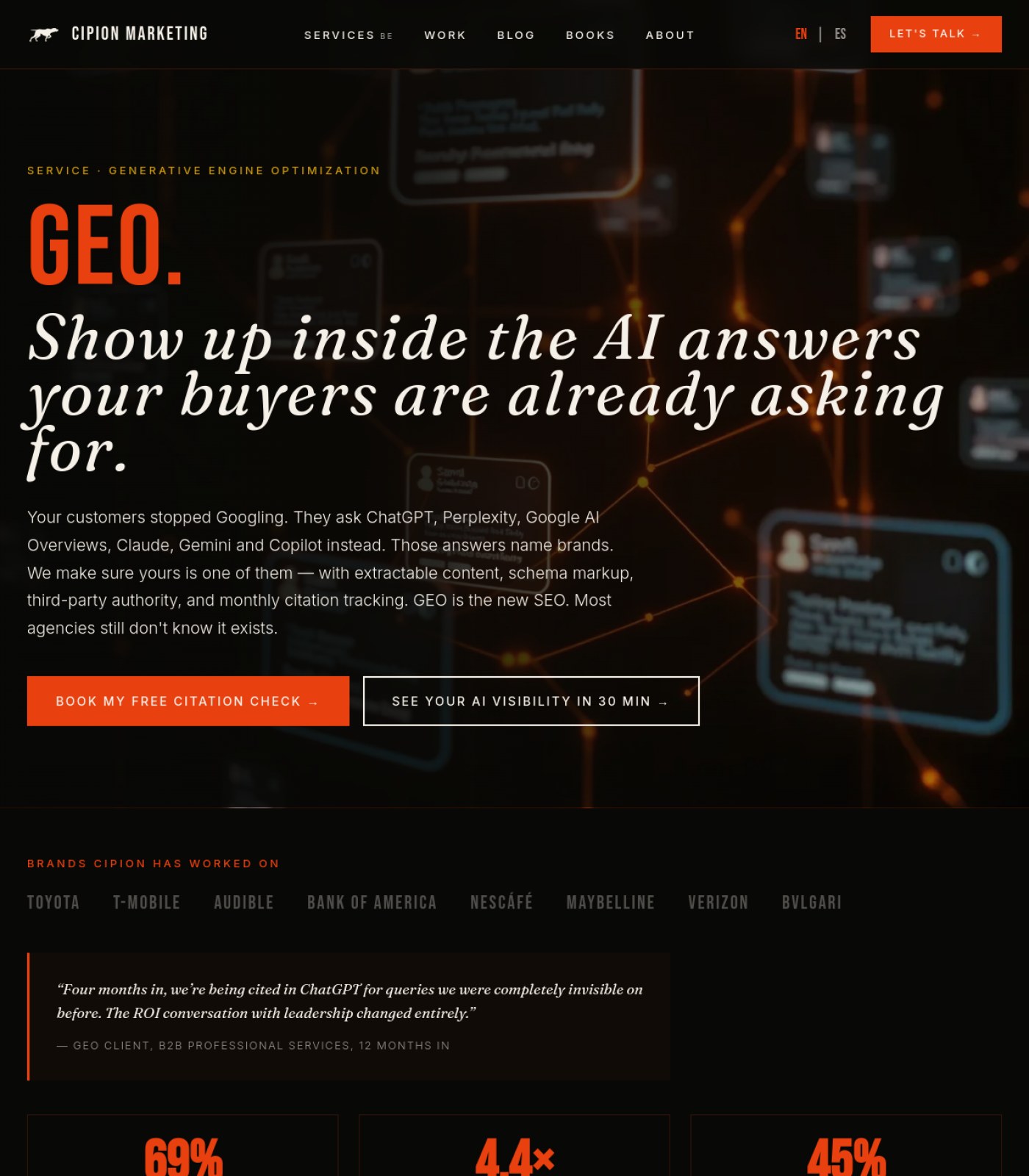
Section 1 of 6
cipionmarketing.com screenshot
3
Section 2 of 6
cipionmarketing.com screenshot
Section 3 of 6
cipionmarketing.com screenshot
Section 4 of 6
cipionmarketing.com screenshot
Section 5 of 6
cipionmarketing.com screenshot
Section 6 of 6
cipionmarketing.com screenshot
1
2
1

Post stuck below footer

2

Newsletter missing input field

3

Confusing 'BE' nav label

⚡ Ship the fixes

Send this page's fixes to whoever ships it

Check or uncheck items in the checklist below, then use the bar right above it: Copy prompt pastes into a chat-based AI agent (Claude, ChatGPT...). Download JSON or the Advanced API below hand it to an autonomous coding agent (Claude Code, Cursor...). Download checklist is a plain to-do list for a human developer. Or skip all of that — see "Path 2" below.

Or open the raw JSON (all pages) →
Path 2: let it apply fixes for you automatically (private beta)

Instead of you copying a prompt or downloading a file, a weekly check can do the finding-and-proposing part for you:

  1. Once a week, it re-reads your latest Audit Brief and picks out fixes that need no file and no judgment call from you (blocker-free ones only — anything marked "needs a file" or "ask before doing" is never touched by this).
  2. Nothing is written to your site at this point. Each fix is queued as a proposal, exactly like this one:
{ "domain": "yoursite.com", "file_path": "index.html", "pillar": "Words on the Page", "task": "Clarify what 'GEO' means on first mention", "why": "Visitors may not know the acronym.", "old_snippet": "GEO optimizes for citation...", "new_snippet": "GEO (Generative Engine Optimization) optimizes for citation...", "status": "pending" }
  1. You get notified that proposals are waiting. You open your review queue, see a before/after diff for each one, and click Accept or Reject individually — nothing ships to your live site without that click.
  2. You can reject anything, anytime, for any reason. There is no "auto-approve" setting — every single change needs your explicit yes.

This is a private pilot right now, not a self-serve toggle yet — ask us to turn it on for your site.

selected
🖼️

Photos & Images

2 to fix · 1 already good
Replace generic AI-generated abstract graphics on blog cards with real photos of the team's work, clients, or campaign results where available
An agency that sells strategy and 'showing the work' loses credibility when every article thumbnail is the same type of synthetic stock art instead of proof of real work.
why: trust signals / social proof imagery
Swap the large hero graphic (the glowing infinity light-trail image) for a real photo or screenshot tied to Cipion's actual work
The hero visual is decorative and generic, so it doesn't reinforce the personal, 25-years-of-experience story told in the text next to it.
why: relevance of hero imagery to copy
Keep using consistent aspect ratios and framing across all blog card thumbnails
Every card image is cropped to the same size and style, which keeps the grid looking tidy and professional.
why: visual consistency
Already good
🔘

Buttons & Actions

2 to fix · 2 already good
Add a working email input field and subscribe button to the Newsletter box in the footer
Right now the footer just says 'One email a month' with no way to actually type an email in or hit subscribe, so interested visitors can't sign up.
why: missing form control for stated CTA
Add a 'Load more' or pagination control at the bottom of the blog grid
With dozens of posts stacked in one long scroll and no way to jump ahead or filter, visitors have to scroll a very long way to find older or newer posts.
why: long single-page list without pagination
Keep the single bright 'LET'S TALK' button as the one primary call-to-action in the header
Having one consistent, high-contrast action button makes it obvious what the site wants visitors to do next.
why: single primary CTA pattern
Already good
Keep the 'READ THE GUIDE/ESSAY/CHECKLIST' link style consistent on every card
Using the same label pattern and color for every article link makes the whole grid easy to scan.
why: consistent secondary action styling
Already good
📐

Layout & Structure

3 to fix
Move the 'GEO for Credit Unions' and 'AI Marketing for Medical Practices' post entries back into the main blog grid instead of leaving them stranded below the footer
These two posts currently render after the footer, outside the site's normal layout, which looks like a broken page to anyone who scrolls that far.
why: content rendered outside main container / footer
Remove or clarify what the hamburger icon in the header opens, since the full menu (Services, Work, Blog, Books, About) is already visible
Showing both a complete visible menu and a hamburger icon side by side is confusing — visitors won't know if the icon opens something different.
why: duplicate navigation controls
Fix or relabel the stray 'BE' text sitting next to 'SERVICES' in the top navigation
That extra 'BE' next to Services looks like a leftover label or bug and makes the menu look unfinished.
why: unexplained text fragment in nav
✏️

Words on the Page

1 to fix · 2 already good
Change large uppercase headlines (hero title and all blog post titles) to normal sentence or title case
Long stretches of all-capital-letter text are harder for people to read quickly and can feel like shouting.
why: WCAG 1.4.8 / all-caps readability
Keep writing tight, specific post descriptions like the current ones (e.g. '7 moves in order of impact...')
The short summaries under each title clearly explain what the reader will get, which helps people pick the right article fast.
why: clear, benefit-led summary copy
Already good
Keep the consistent byline format (author, month, read time) on every post
Repeating the same author/date/read-time pattern builds trust and helps readers judge how long an article will take.
why: consistent metadata pattern
Already good
🧭

Menu & Getting Around

3 to fix
Make the existing category tags (GEO, GUIDE, ESSAY, CHECKLIST, etc.) clickable filters for the blog grid
With so many posts, letting people click a tag they already see to filter the list would make it much easier to find topics they care about, without adding any new visual element.
why: underused taxonomy tags as filters
Add Work and Books links to the footer 'Navigate' list to match the top navigation
The footer menu only repeats some of the top menu items (Services, GEO, About, Blog, Contact) and drops Work and Books, so footer visitors can't reach those pages.
why: inconsistent footer nav vs header nav
Link the author name 'Diego Cipion' on posts to an author bio if one exists on the site
Right now the author name is plain text with no link, so readers can't learn more about who wrote the article.
why: author entity linking for trust
🔍

Being Found by AI & Google

1 to fix · 2 already good
Keep using specific, keyword-rich titles and category labels (GEO, AEO, CMO Briefing, Paid Media, etc.) on every post
Clear topic-specific titles and tags help both Google and AI answer engines understand and cite exactly what each article covers.
why: topical relevance / entity clarity for GEO
Already good
Keep showing author, publish date, and read time on every article card
These visible signals (who wrote it, when, how long) are exactly the kind of trust and freshness signals AI search tools and Google look for.
why: E-E-A-T signals
Already good
Add a visible breadcrumb (e.g. Home > Blog) above the blog title
A simple breadcrumb reinforces the page's place in the site structure for both users and search/AI crawlers, and it's a low-effort addition using existing page names.
why: breadcrumb navigation for crawlability
⚖️

Legal & Accessibility Risk

4 to fix
Add a Privacy Policy and Terms of Service link to the footer
The site collects emails through the newsletter and lists a phone number and email, but there is no visible privacy or terms link anywhere on the page, which is a real legal gap.
why: missing privacy/terms disclosure
Confirm whether a cookie consent banner is needed and add one if the site uses tracking cookies
The site offers both English and Spanish, suggesting international visitors, but no cookie consent notice appears anywhere on the page, which can be a compliance risk in the EU and some US states.
why: GDPR/CCPA cookie consent requirement
Check that the orange link and tag text meets minimum contrast against the near-black background, especially at smaller sizes
Small orange category labels and links on a dark background can be hard to read for users with low vision if the contrast isn't strong enough.
why: WCAG 2.1 contrast ratio (AA)
Restore the two blog posts that currently render below the footer into the normal page flow
Content sitting outside the main layout after the footer breaks the logical reading order that screen reader users rely on to navigate the page.
why: logical reading order for assistive tech
For your boss / your team

One-line summary you can forward

This blog page scores 61/100 today. It's visually consistent and well-organized, with clear post titles, tags, and a strong content pipeline, but it has one clear technical bug — two blog posts render below the footer, outside the normal page — plus real gaps that matter for a marketing agency's own credibility: no functioning newsletter signup field, no Privacy Policy or Terms link anywhere on the page, and every post thumbnail is generic AI stock art rather than real proof of work. Fixing the footer bug, adding legal links, and wiring up the newsletter form are the fastest wins and would bring the page to an estimated 85/100.

Audit Brief

cipionmarketing.com

Libros · generated automatically · https://cipionmarketing.com/libros

57
Today
81
After fixes

This page is 57% ready to send traffic to. Fixing the items below gets it to an estimated 81%.

Do these 3 first
1

Fill or remove the giant empty black sectionThere's a huge gap with no text, image, or button between the intro and the book showcase, which makes the page feel broken and makes visitors scroll for nothing.

2

Add a real footer with legal and contact linksAcross the whole page there's no privacy policy, terms, or contact info, which is a legal exposure for an agency operating in the EU (EN/ES).

3

Match the 'Books · Guides · Resources' promise with actual contentThe eyebrow tag promises multiple books, guides and resources, but only one book is shown, which can feel misleading.

📍 The map

 — this page, with the fixes marked where they happen
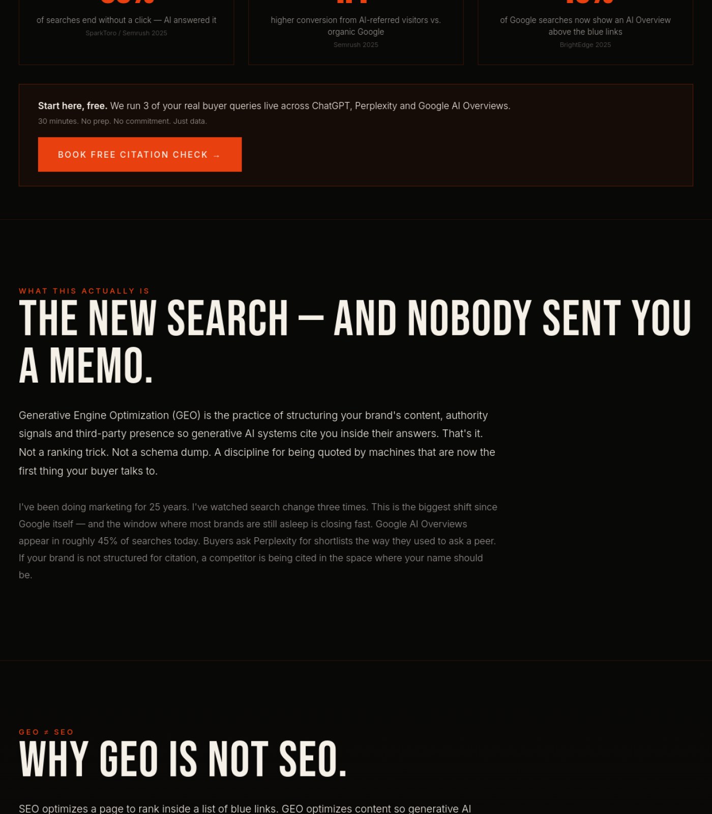
Section 1 of 3
cipionmarketing.com screenshot
2
Section 2 of 3
cipionmarketing.com screenshot
1
Section 3 of 3
cipionmarketing.com screenshot
3
1

Large empty section, no content

2

Stray 'BE' text in menu

3

Missing footer legal links

⚡ Ship the fixes

Send this page's fixes to whoever ships it

Check or uncheck items in the checklist below, then use the bar right above it: Copy prompt pastes into a chat-based AI agent (Claude, ChatGPT...). Download JSON or the Advanced API below hand it to an autonomous coding agent (Claude Code, Cursor...). Download checklist is a plain to-do list for a human developer. Or skip all of that — see "Path 2" below.

Or open the raw JSON (all pages) →
Path 2: let it apply fixes for you automatically (private beta)

Instead of you copying a prompt or downloading a file, a weekly check can do the finding-and-proposing part for you:

  1. Once a week, it re-reads your latest Audit Brief and picks out fixes that need no file and no judgment call from you (blocker-free ones only — anything marked "needs a file" or "ask before doing" is never touched by this).
  2. Nothing is written to your site at this point. Each fix is queued as a proposal, exactly like this one:
{ "domain": "yoursite.com", "file_path": "index.html", "pillar": "Words on the Page", "task": "Clarify what 'GEO' means on first mention", "why": "Visitors may not know the acronym.", "old_snippet": "GEO optimizes for citation...", "new_snippet": "GEO (Generative Engine Optimization) optimizes for citation...", "status": "pending" }
  1. You get notified that proposals are waiting. You open your review queue, see a before/after diff for each one, and click Accept or Reject individually — nothing ships to your live site without that click.
  2. You can reject anything, anytime, for any reason. There is no "auto-approve" setting — every single change needs your explicit yes.

This is a private pilot right now, not a self-serve toggle yet — ask us to turn it on for your site.

selected
🖼️

Photos & Images

2 to fix · 1 already good
Brighten or crop the hero background image so the camera/lens is actually recognizable
Right now the image is so dark it's almost impossible to tell what it shows, wasting a strong visual moment.
why: low luminance/contrast on hero background image, section 1
Add a photo of Diego Cipion near the personal bio text
The copy talks about him personally ('marketing director, father of two, Spaniard'), and a real photo would build trust faster than text alone.
why: missing author headshot near bio paragraph, section 2
Keep the book cover image as-is
The cover photo is sharp, well-lit, and clearly communicates the book's theme.
why: book cover image, section 3
Already good
🔘

Buttons & Actions

1 to fix · 2 already good
Keep the 'LET'S TALK' header button as the primary call-to-action
It's high-contrast, clearly labeled, and easy to find in the top right on every screen.
why: orange CTA button, header, section 1
Already good
Keep the two 'BUY ON AMAZON' buttons styled identically
Consistent button styling for the same action (buying) makes the page easier to scan and trust.
why: buy buttons, section 3
Already good
Add working links or buttons for the 'Guides' and 'Resources' mentioned in the eyebrow tag
The page teases guides and resources but gives no way to click through to them, which is a dead-end for interested visitors.
why: eyebrow tag 'BOOKS · GUIDES · RESOURCES' with no matching links, section 1
📐

Layout & Structure

2 to fix · 1 already good
Remove or fill the large empty black area between the intro text and the book showcase
This blank stretch takes up most of the middle of the page and looks like a loading error rather than intentional design.
why: empty black block, section 2 lower half into section 3 top
Align the plural 'Diego Writes'/'Books · Guides · Resources' framing with the single book actually shown
Visitors are set up to expect a library of content but only find one product, which can feel like a bait-and-switch.
why: content mismatch, sections 1 and 3
Keep the book detail section's two-column layout (cover + description)
It's a clean, standard layout that makes the book easy to evaluate at a glance.
why: two-column book layout, section 3
Already good
✏️

Words on the Page

2 to fix · 1 already good
Fix or remove the stray 'BE' text next to 'SERVICES' in the main menu
It reads like a leftover label or typo and makes the navigation look unfinished.
why: 'SERVICES BE' menu item, header, section 1
Keep the personal, first-person tone in the intro copy
Lines like 'Not a guru. Not a motivational speaker' feel authentic and differentiate Diego from generic marketing content.
why: intro paragraph, section 2
Already good
Add a short testimonial or review quote near the book description
There's currently no third-party proof (reviews, quotes, ratings) that the book delivers value, which weakens the pitch.
why: no testimonial/review content, section 3
🧭

Menu & Getting Around

2 to fix · 1 already good
Keep the top navigation visible with clear section names (Services, Work, Blog, Books, About)
It gives visitors an easy, familiar way to explore the rest of the site.
why: header nav, section 1
Already good
Add a footer navigation menu mirroring the header links
There is no navigation of any kind at the bottom of the page, so visitors who scroll all the way down have no easy way back to other sections.
why: no footer nav visible, bottom of section 3
Highlight 'BOOKS' as the active menu item since the visitor is on that page
Showing which section you're currently in helps people orient themselves, and it's not visibly indicated here.
why: header nav, section 1
🔍

Being Found by AI & Google

1 to fix · 1 already good
Keep the descriptive book title and summary text as real, readable text (not baked into an image)
This lets Google and AI tools actually read and index what the book is about.
why: book title/description, section 3
Already good
Add visible pricing, format, or rating info near the book for richer search/AI snippets
Search engines and AI assistants favor pages with concrete product details like price and format, which aren't shown here.
why: no price/rating shown, section 3
⚖️

Legal & Accessibility Risk

3 to fix
Add a visible privacy policy and terms of service link somewhere on the page
None appear anywhere across the top, middle, or bottom of the page, which is a legal gap for a business operating in the EU (EN/ES site).
why: no privacy/terms links, entire page including footer area, section 3
Add a cookie consent notice if the site uses tracking cookies
No cookie banner is visible, and EU visitors (Spanish content is offered) legally need to be asked for consent before tracking.
why: no cookie consent UI visible, entire page
Add basic contact information (email, address, or company details) in the footer
There's no way for a visitor to find contact details other than the 'Let's Talk' button, which limits transparency and trust.
why: no contact info visible, bottom of section 3
For your boss / your team

One-line summary you can forward

This page scores 57/100 today: the book showcase itself is clean and the buy buttons work well, but a huge blank section in the middle makes the page feel broken, and there's no footer with privacy policy, terms, or contact details anywhere on the page — a real legal gap for a business serving EU clients. The page also promises 'Books · Guides · Resources' but only delivers one book, which can feel misleading. Fixing the empty section, adding a proper footer with legal links, and aligning the messaging with the actual content on offer would bring this to roughly 81/100.

Tracked automatically, every week

We check 8 pages weekly and only email when something changes, plus a monthly check-in either way.