Audit Brief

ozemback.com

All 8 pages combined · generated automatically

69
Today
87
After fixes

Your site is 69% ready on average across all 8 pages. Fixing everything below gets it to an estimated 87%.

⚡ Ship the fixes

Send 107 fixes to whoever ships it

Check or uncheck items in the checklist below, then use the bar right above it: Copy prompt pastes into a chat-based AI agent (Claude, ChatGPT...). Download JSON or the Advanced API below hand it to an autonomous coding agent (Claude Code, Cursor...). Download checklist is a plain to-do list for a human developer. Or skip all of that — see "Path 2" below.

Or open the raw JSON (all pages) →
Advanced: my agent has internet access, skip the files

Your site's API key (keep it private):

33192620780cd86a4c44b0da68888e39408b429b

Give your agent this command — it always fetches your latest saved findings for ALL pages, live:

curl "https://vislumbra.com/agent-fetch.php?api_key=33192620780cd86a4c44b0da68888e39408b429b"
Path 2: let it apply fixes for you automatically (private beta)

Instead of you copying a prompt or downloading a file, a weekly check can do the finding-and-proposing part for you:

  1. Once a week, it re-reads your latest Audit Brief and picks out fixes that need no file and no judgment call from you (blocker-free ones only — anything marked "needs a file" or "ask before doing" is never touched by this).
  2. Nothing is written to your site at this point. Each fix is queued as a proposal, exactly like this one:
{ "domain": "yoursite.com", "file_path": "index.html", "pillar": "Words on the Page", "task": "Clarify what 'GEO' means on first mention", "why": "Visitors may not know the acronym.", "old_snippet": "GEO optimizes for citation...", "new_snippet": "GEO (Generative Engine Optimization) optimizes for citation...", "status": "pending" }
  1. You get notified that proposals are waiting. You open your review queue, see a before/after diff for each one, and click Accept or Reject individually — nothing ships to your live site without that click.
  2. You can reject anything, anytime, for any reason. There is no "auto-approve" setting — every single change needs your explicit yes.

This is a private pilot right now, not a self-serve toggle yet — ask us to turn it on for your site.

selected
🖼️

Photos & Images

15 to fix
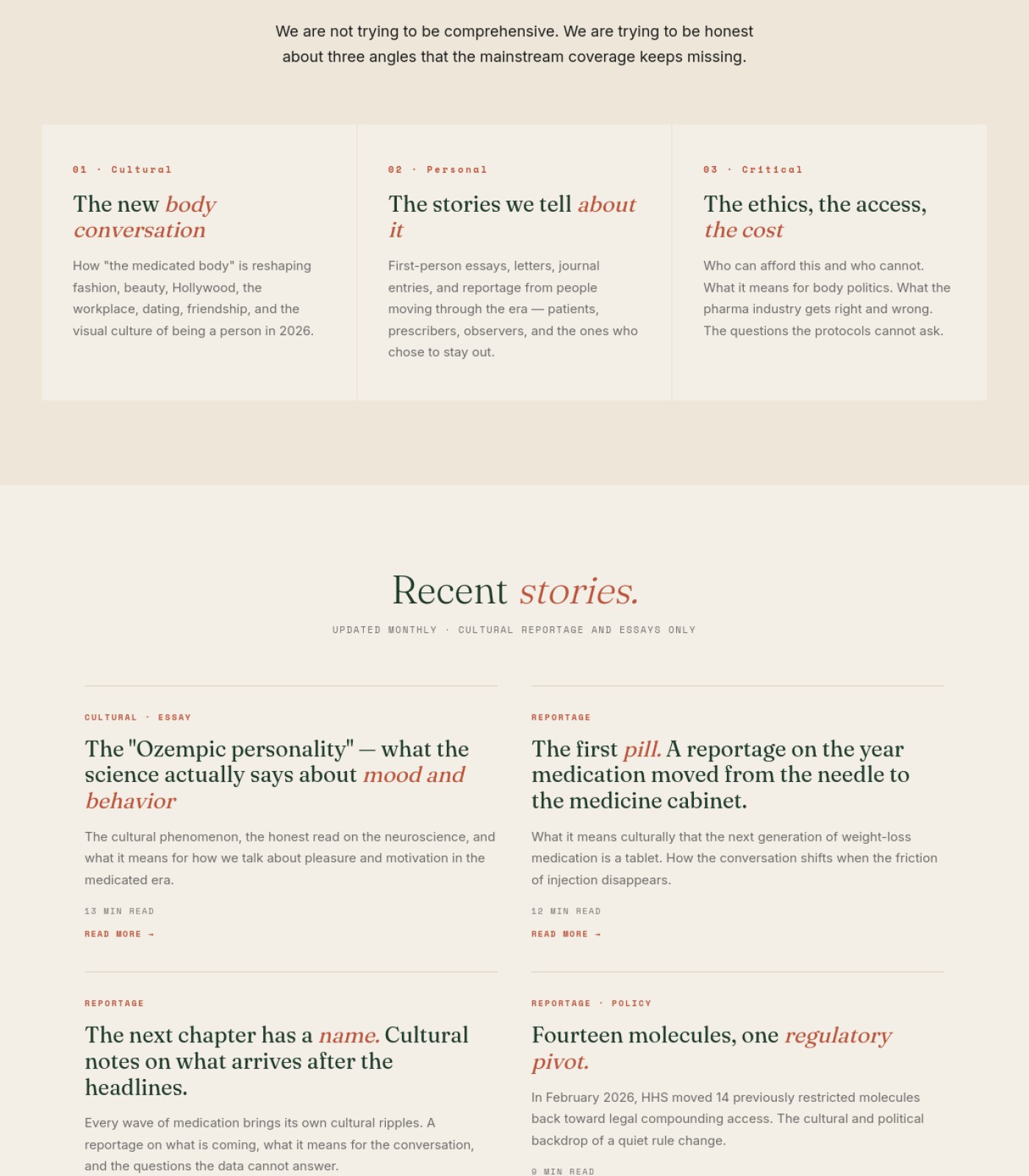
Add a photo or visual to each of the four 'Recent stories' cards Home
Right now the story grid is text-only, which makes the page feel less like a real magazine and less scannable for readers deciding what to read.
why: content engagement / visual scanning
Add descriptive alt text to the featured essay photo of the woman reading Home
Screen reader users currently have no way to know what this image shows unless alt text is written for it.
why: WCAG 1.1.1 non-text content
Add a photo/thumbnail to each of the 12 story cards in the 'All stories' grid Blog
Right now only the top featured essay has an image; every other card is text-only, which makes scanning the archive feel monotonous and less inviting to click.
why: visual hierarchy / scannability
Confirm the featured hero photo has descriptive alt text Blog
Screen reader users and Google image search both rely on alt text, and there's no visible caption to confirm one exists.
why: WCAG 1.1.1 alt text
Add at least one real photo (founder, editorial team, or a relevant cultural image) to the About page About
An about page with only text makes the magazine feel anonymous and less trustworthy, especially for a sensitive health-adjacent topic.
why: trust signals / E-E-A-T for about pages
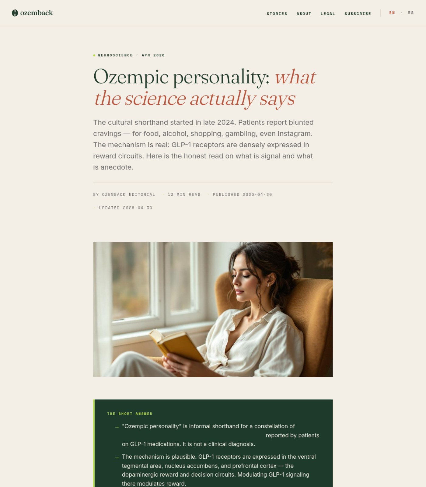
Add a simple diagram or chart to break up the science section (e.g. a brain-regions graphic near the VTA/nucleus accumbens/prefrontal cortex text). Blog Ozempic Personality What Science Says
A 13-minute read about brain chemistry with zero supporting visuals after the intro photo is harder to follow and skim.
why: no supporting visuals in sections 2-5
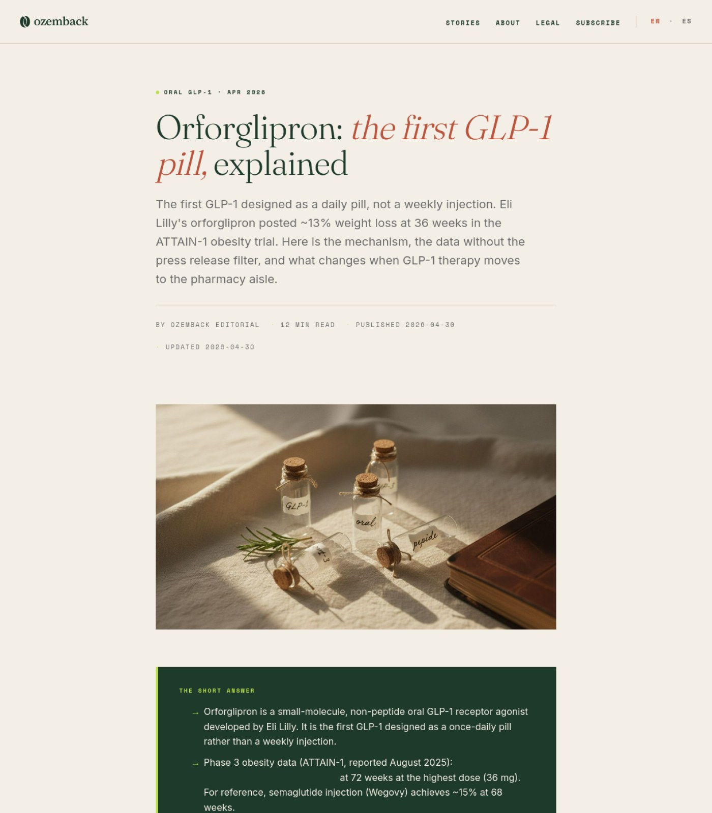
Swap the staged vial/cork-stopper photo for an image that actually shows the oral tablet or a clinical/pharmacy setting Blog Orforglipron First Glp1 Pill 2026
Readers land on an article about 'the first GLP-1 pill' and see labeled glass bottles instead of a pill, which undercuts credibility on a medical topic.
why: content-image mismatch reduces perceived accuracy on YMYL topics
Add descriptive alt text to the hero image describing it as a staged/stock photo, not a product photo Blog Orforglipron First Glp1 Pill 2026
Screen reader users need to know what the image actually shows so they aren't misled about what's pictured.
why: WCAG 1.1.1 non-text content
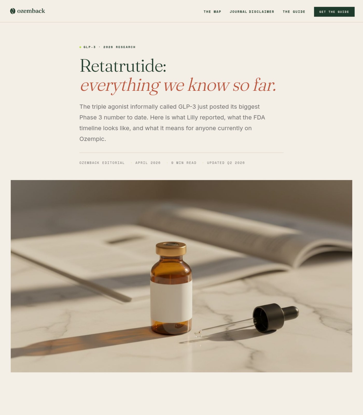
Replace the dropper-bottle hero photo with an image that matches how retatrutide is actually administered (injectable pen/vial, not a dropper serum) Blog Retatrutide Glp3 What We Know
Showing the wrong drug format on a medical article damages credibility and could mislead readers about how the product works.
why: hero image, section 1
Add cover images to the two book recommendation cards Blog Retatrutide Glp3 What We Know
Book cards with only text and no cover art look unfinished and get fewer clicks than cards with a visual.
why: Books on the Shelf cards, section 6
Confirm the hero photo has descriptive alt text Blog Retatrutide Glp3 What We Know
Screen reader users need a text description of what the image shows, especially since the image is decorative stock photography rather than informative.
why: hero <img>, section 1
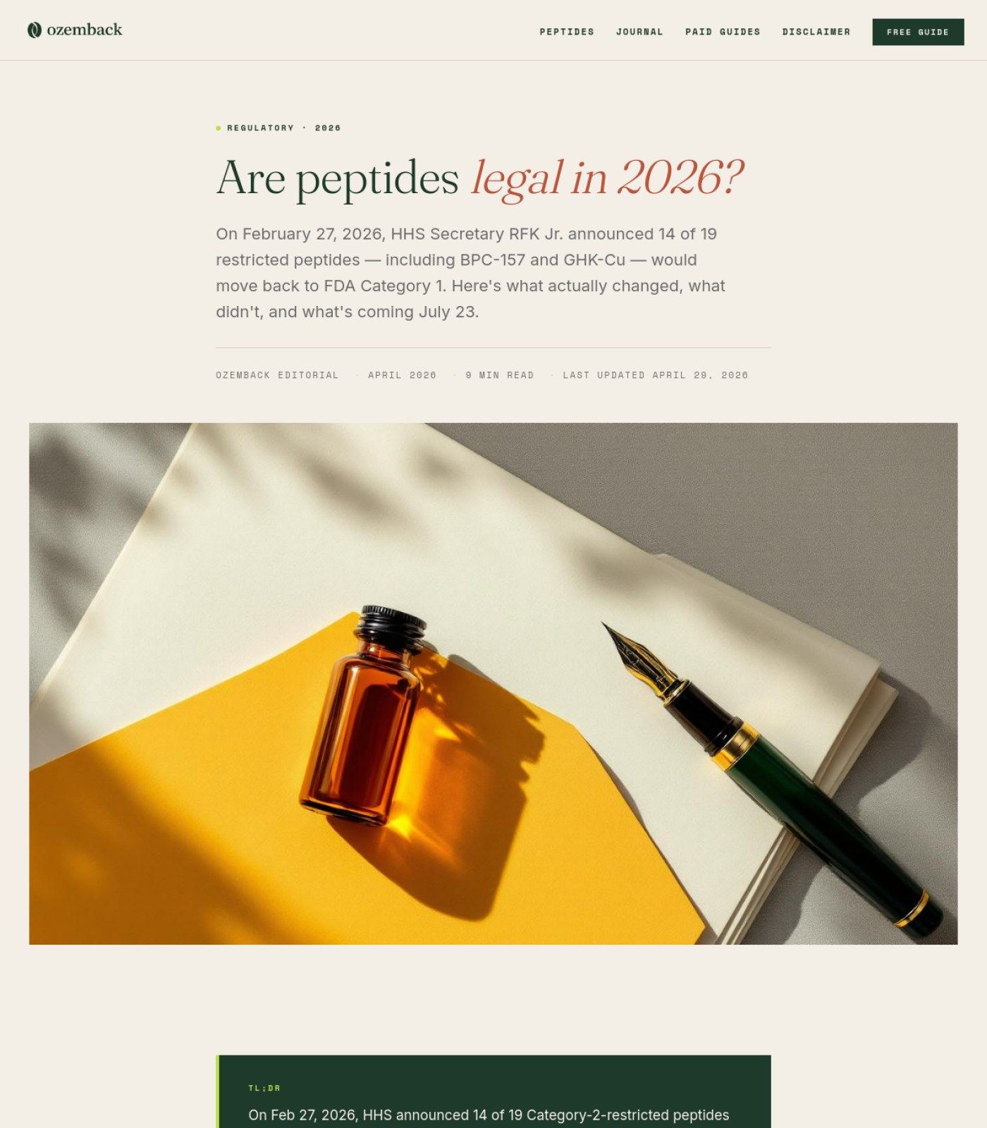
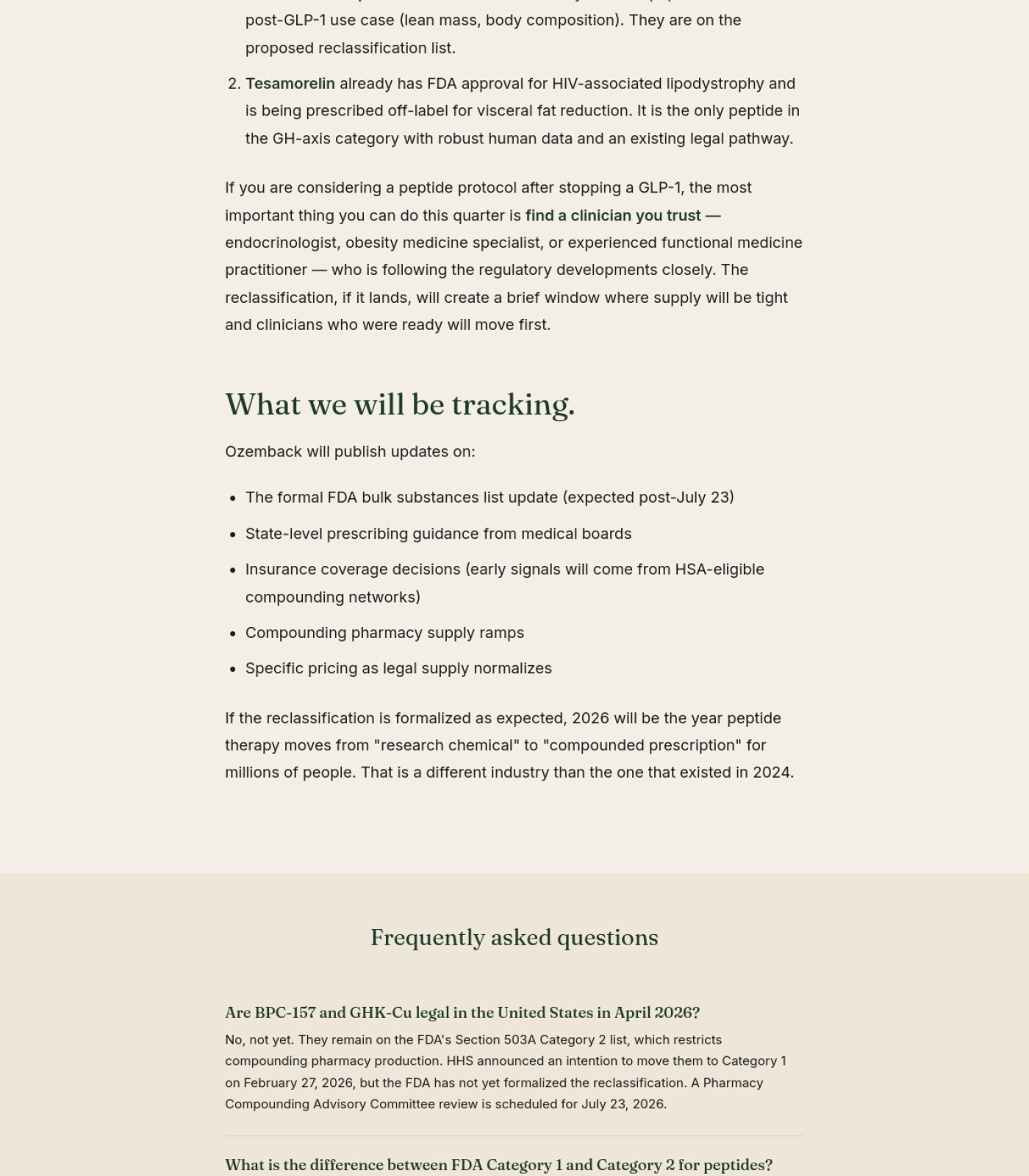
Add descriptive alt text to the hero photo of the bottle and pen Blog Fda Peptide Reclassification 2026
Screen reader users and Google both need a text description of what the image shows.
why: WCAG 1.1.1 non-text content
Add a small author photo or avatar next to the byline Blog Fda Peptide Reclassification 2026
A face next to 'Ozemback Editorial' makes the article feel more trustworthy, especially for medical/regulatory content.
why: E-E-A-T trust signals for YMYL content
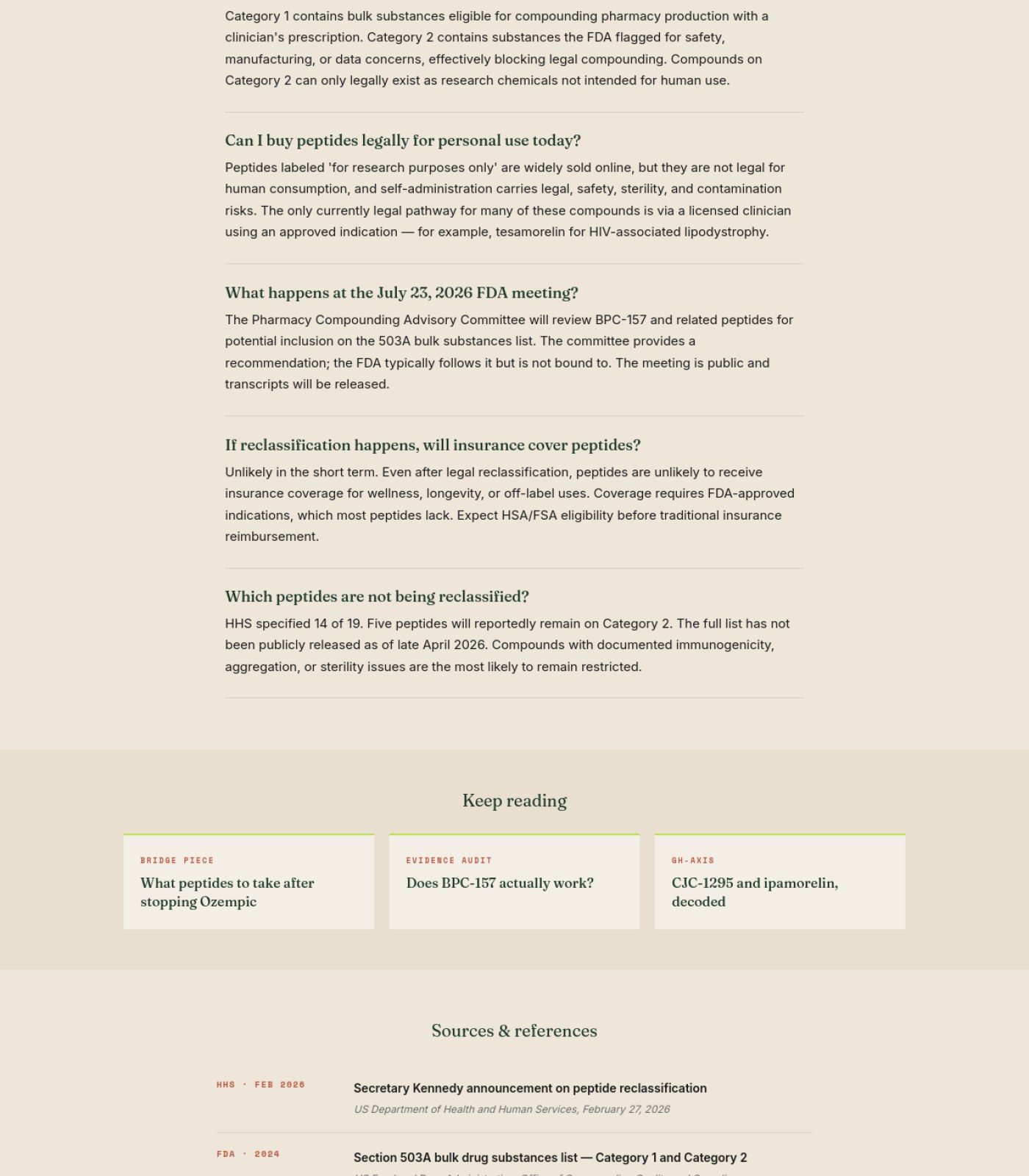
Add a thumbnail image to each 'Keep reading' card Blog Fda Peptide Reclassification 2026
The three related-article cards are currently text-only, which makes them easy to skip past.
why: visual scanning / recognition over recall
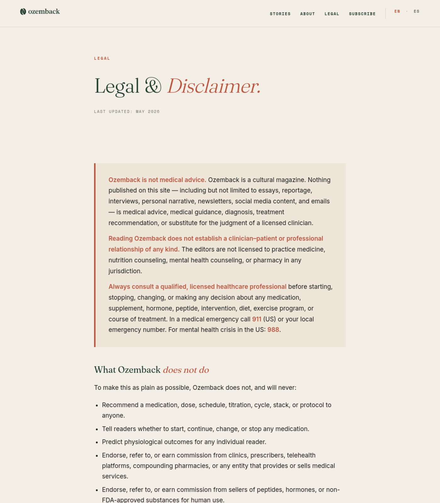
Confirm the small logo icon has descriptive alt text Legal
Screen reader users need to know this icon represents the Ozemback brand mark, not just a decorative circle.
why: img alt attribute
🔘

Buttons & Actions

17 to fix
Confirm and clarify where the header 'Subscribe' button goes Home
It sits next to nav items like a paid action, but the only visible subscription on the page is a free monthly newsletter — readers may expect something different.
why: CTA intent clarity
Restyle 'Read the essay' as a filled or outlined button instead of a plain underlined link Blog
It's the main call-to-action for the top featured story, but it currently looks the same weight as a footnote.
why: CTA contrast/affordance
Add a visible 'Read more' label or arrow to each of the 12 story cards Blog
Right now it's not obvious the whole card is clickable — visitors may not realize they can open the full article.
why: click affordance
Verify the ES language toggle actually switches content, not just a dead link Blog
If Spanish content doesn't exist yet, offering the toggle without it will frustrate visitors and looks broken.
why: functional link check
Style 'Subscribe' in the header as a visually distinct button, not a plain nav link About
It currently looks identical to 'About' and 'Legal', so readers don't notice it's the main thing you want them to click.
why: primary CTA visual weight
Style the contact email (info@ozemback.com) as a button or highlighted contact card About
A plain inline text link is easy to miss for readers who want to pitch a story or write in.
why: affordance clarity
Style 'Subscribe' in the top navigation as an actual button (background color, contrast) instead of plain text next to Stories/About/Legal. Blog Ozempic Personality What Science Says
Right now Subscribe looks identical to the other menu links, so it doesn't stand out as the one action you actually want visitors to take.
why: header nav, section 1
Reuse the same 'Subscribe' styling to add one more subscribe prompt near the end of the article, after the FAQ. Blog Ozempic Personality What Science Says
A long, thoughtful health article is exactly the kind of content that earns a newsletter signup, but the only ask is buried in the top nav.
why: no mid/end-of-article CTA visible in sections 4-6
Style the 'Subscribe' nav item as a distinct button instead of a plain text link Blog Orforglipron First Glp1 Pill 2026
Subscribe is the main action you want readers to take, so it should stand out visually from 'Stories,' 'About,' and 'Legal,' which are just navigation.
why: primary CTA visual weight
Add a clear next-step link at the end of the article (e.g. back to Stories or 'read more like this') Blog Orforglipron First Glp1 Pill 2026
After a 12-minute read, readers are given no obvious next step and may just leave the site.
why: end-of-content dead end
Make each entry in 'Sources cited in this article' a clickable link to its source Blog Retatrutide Glp3 What We Know
Right now the five citations are just bold text with no way to click through and verify them, which weakens trust in the data.
why: Sources cited block, section 5
Hyperlink the in-body mentions of 'Drugs.com's pipeline page' and 'the Lilly investor relations site' Blog Retatrutide Glp3 What We Know
The article tells readers to bookmark these pages but doesn't give them a clickable way to get there.
why: 'What to actually do, now' list item 3, section 4
Style the three 'Further Reading' article titles as clear links (underline or arrow) Blog Retatrutide Glp3 What We Know
As plain dark text they look like headings, not clickable links, so readers may not realize they can click through.
why: Further Reading list, section 6
Add one clear call-to-action inside the article body (e.g. link to a Paid Guide or the Free Guide) Blog Fda Peptide Reclassification 2026
Right now a reader has to scroll all the way back to the top header to take any action after reading 9 minutes of content.
why: conversion path / calls-to-action per scroll depth
Make the 'Keep reading' cards look more clickable (e.g. add a visible arrow or underline on the title) Blog Fda Peptide Reclassification 2026
As shown, they read like plain text blocks rather than obvious links.
why: affordance cues for interactive elements
Style 'SUBSCRIBE' as a distinct button, not a plain nav link Legal
It's the site's main conversion action but visually blends in with informational links like Stories and About.
why: visual hierarchy / primary CTA affordance
Add a small 'Subscribe to the newsletter' link near the Contact section Legal
The page mentions a monthly newsletter twice but gives readers no easy way to act on it right there.
why: call-to-action placement
📐

Layout & Structure

10 to fix
Trim the repeated 'not medical advice / not affiliated' disclaimer that appears near-identically three times (hero, manifesto, footer) Home
Repeating the exact same sentence three times can feel redundant to readers and weakens the impact of the one that matters most in the footer.
why: content redundancy
Add a 'load more' or pagination control at the bottom of the story grid Blog
The archive stops abruptly right into the footer with no way to see older stories beyond what's shown.
why: content discoverability
Break up the long opening paragraphs ('We started Ozemback because...') with a subhead or pull-quote About
Two dense paragraphs in a row before the first section heading make readers skim past key points.
why: text chunking for scannability
Switch the justified text inside the dark-green 'Short Answer' and 'controlled-trial' callout boxes to left-aligned. Blog Ozempic Personality What Science Says
Justified text is stretching some lines and creating large empty gaps that look like missing words, hurting readability.
why: justified paragraph text, sections 1-2
Add a simple in-page table of contents or jump links using the existing section headings (Where the term came from, The neuroscience..., What the evidence shows, etc.). Blog Ozempic Personality What Science Says
This is a 13-minute read with many sections; readers have no way to jump straight to the part they care about.
why: no anchor navigation across sections 1-5
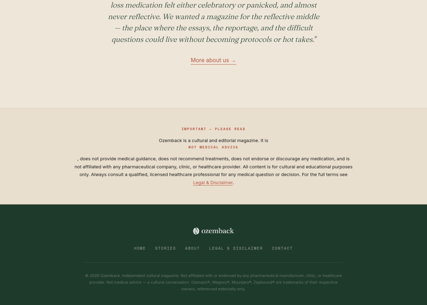
Add a footer with privacy policy, terms, contact info, and company details after the FAQ Blog Orforglipron First Glp1 Pill 2026
The page ends abruptly right after the FAQ with no footer at all, even though a 'Legal' link exists in the header, so there's nowhere at the bottom of the page for standard legal/contact info.
why: missing site footer
Add a short jump-to-section list near the top using the existing headings (Naming, Data, Timeline, What to do) Blog Retatrutide Glp3 What We Know
This is a long 9-minute article; letting readers jump to the part they care about keeps them from bouncing.
why: H2 structure across sections 2-4
Add a short jump-to-section list (using the existing H2 headings) near the top of the article Blog Fda Peptide Reclassification 2026
Readers skimming a long regulatory piece need to jump straight to 'July 23 meeting' or 'FAQ' without scrolling through everything.
why: long-form content navigation aids
Add a breadcrumb trail above the headline (Home > Journal > Article) Blog Fda Peptide Reclassification 2026
It orients readers to where they are in the site and gives them an easy way back.
why: breadcrumb navigation for content hierarchy
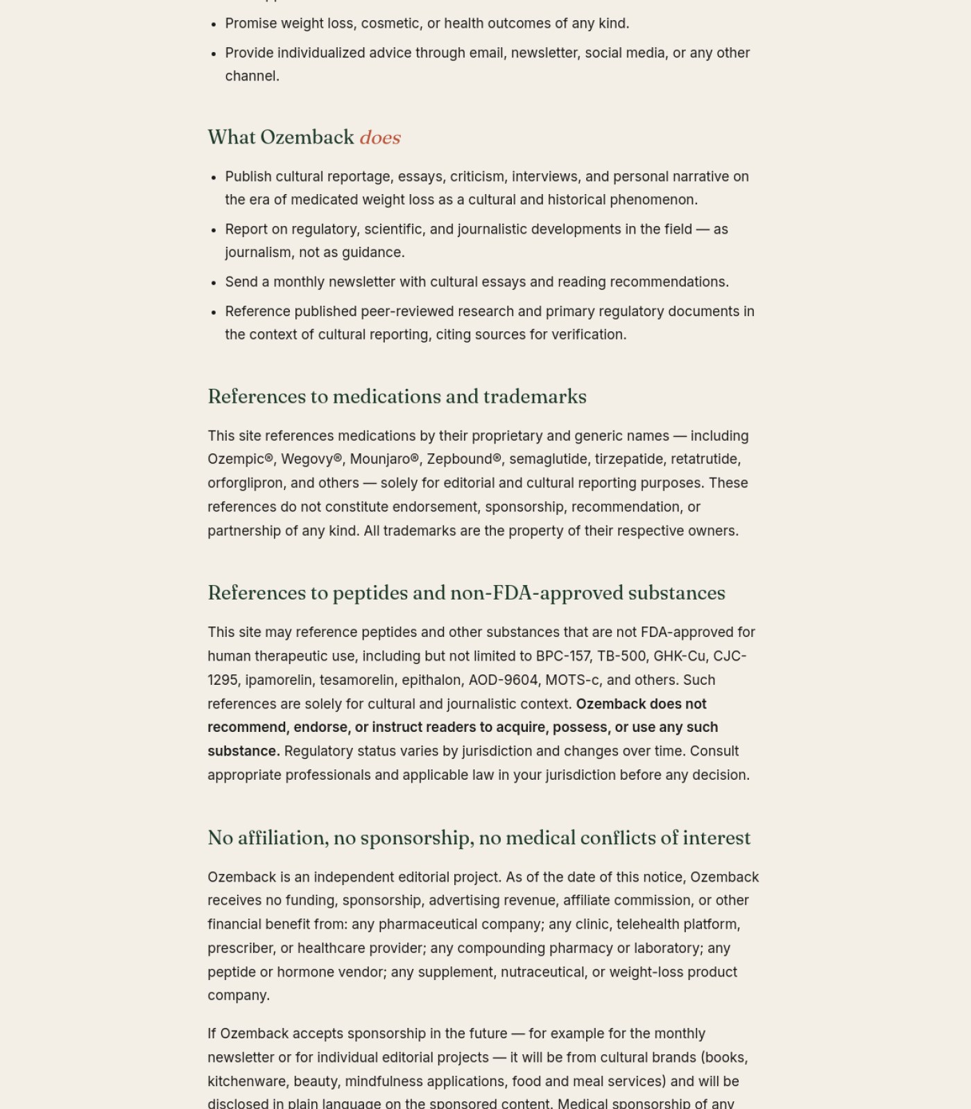
Add anchor/jump links for each section heading (What Ozemback does, References, Editorial standards, etc.) Legal
The page is very long with 15+ headings and no way to skip straight to the one you need.
why: long-document in-page navigation
✏️

Words on the Page

13 to fix
Replace the generic 'BY OZEMBACK EDITORIAL' byline with a named writer or contributor bio where possible Home
A named author with relevant background builds more trust than an anonymous 'editorial' credit, especially for content that touches on medication and science.
why: author trust signals
Add a visible source or citation next to specific claims like 'GLP-1 receptors are densely expressed in reward circuits' Home
Stating a precise physiological claim without a visible source raises legal exposure even on a site that positions itself as cultural commentary, not medical advice.
why: YMYL claim substantiation
Add an author name or byline to each article/card Blog
For content about medications, FDA actions, and clinical trials, showing who wrote it builds trust that anonymous text can't.
why: E-E-A-T trust signal
Make the hero subheading mention the core topic (GLP-1/Ozempic) instead of only 'personal essays' Blog
The current tagline is generic and doesn't tell new visitors what the site actually covers at a glance.
why: clarity/SEO relevance
Add one closing line near the bottom nudging readers toward subscribing or reading a story About
The page ends on legal disclaimer language with no soft invitation to do anything next.
why: closing CTA copy
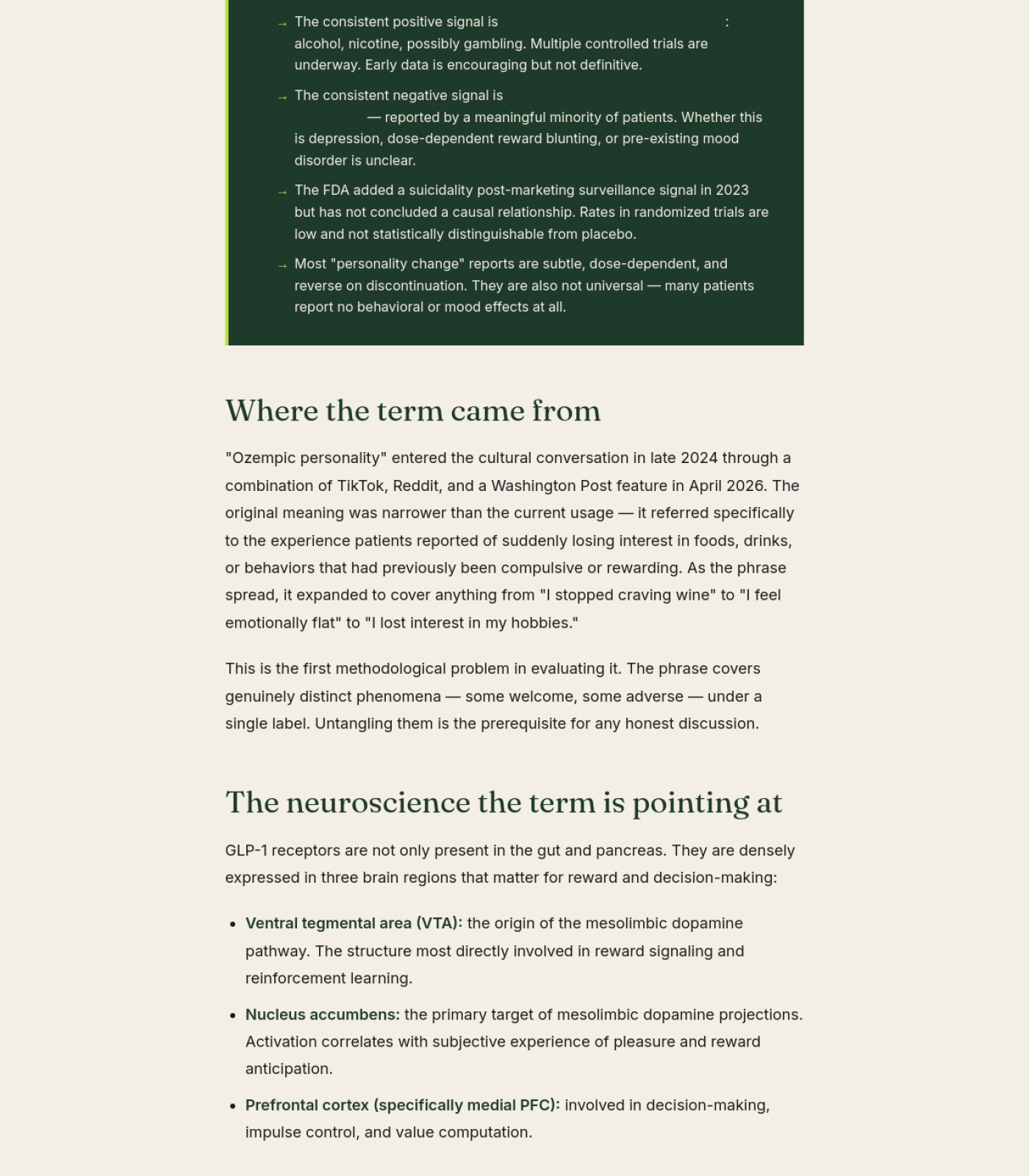
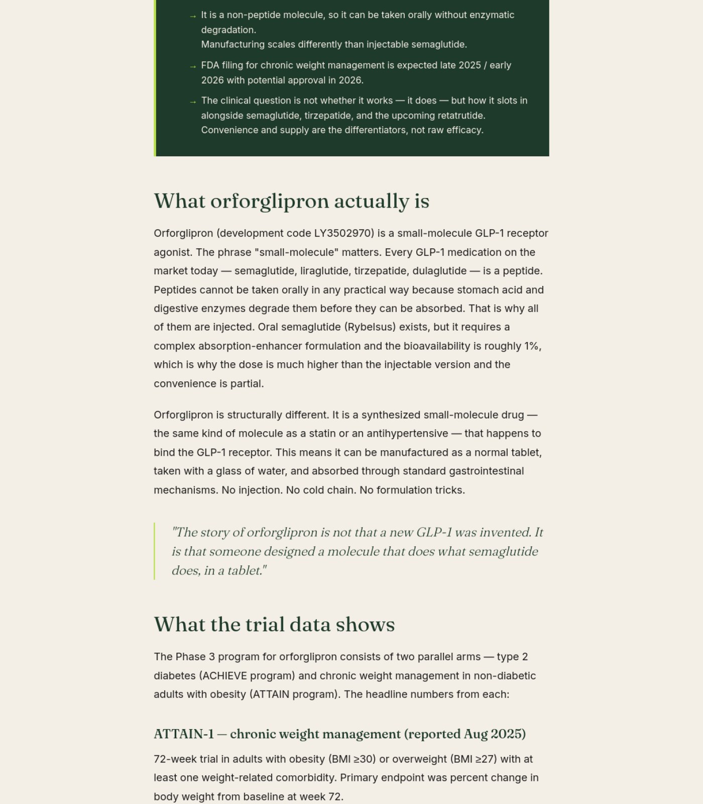
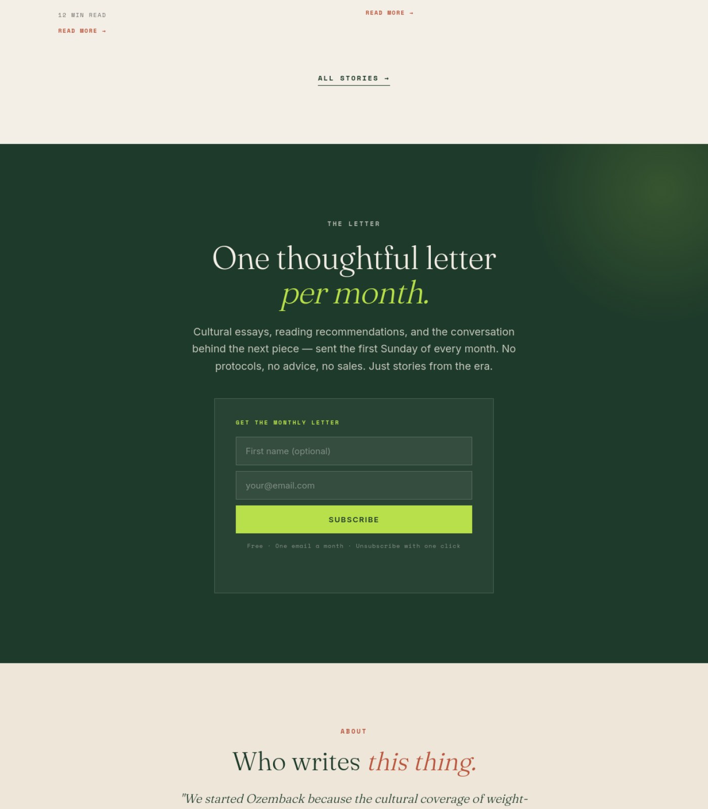
Fill in the missing phrase in 'The consistent positive signal is ___:' and 'a constellation of ___ reported by patients' — both currently show an odd gap instead of text. Blog Ozempic Personality What Science Says
These read as broken or unfinished sentences, which undercuts the credibility of an otherwise carefully written piece.
why: callout bullets, section 1 bottom and section 2 top
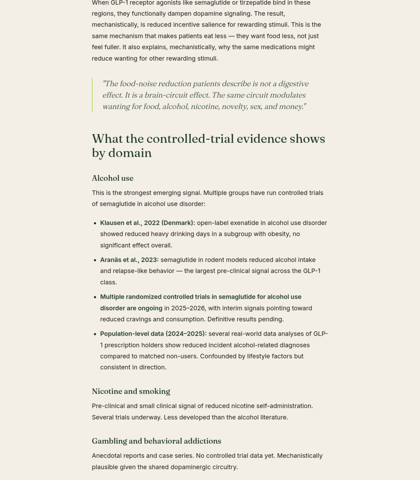
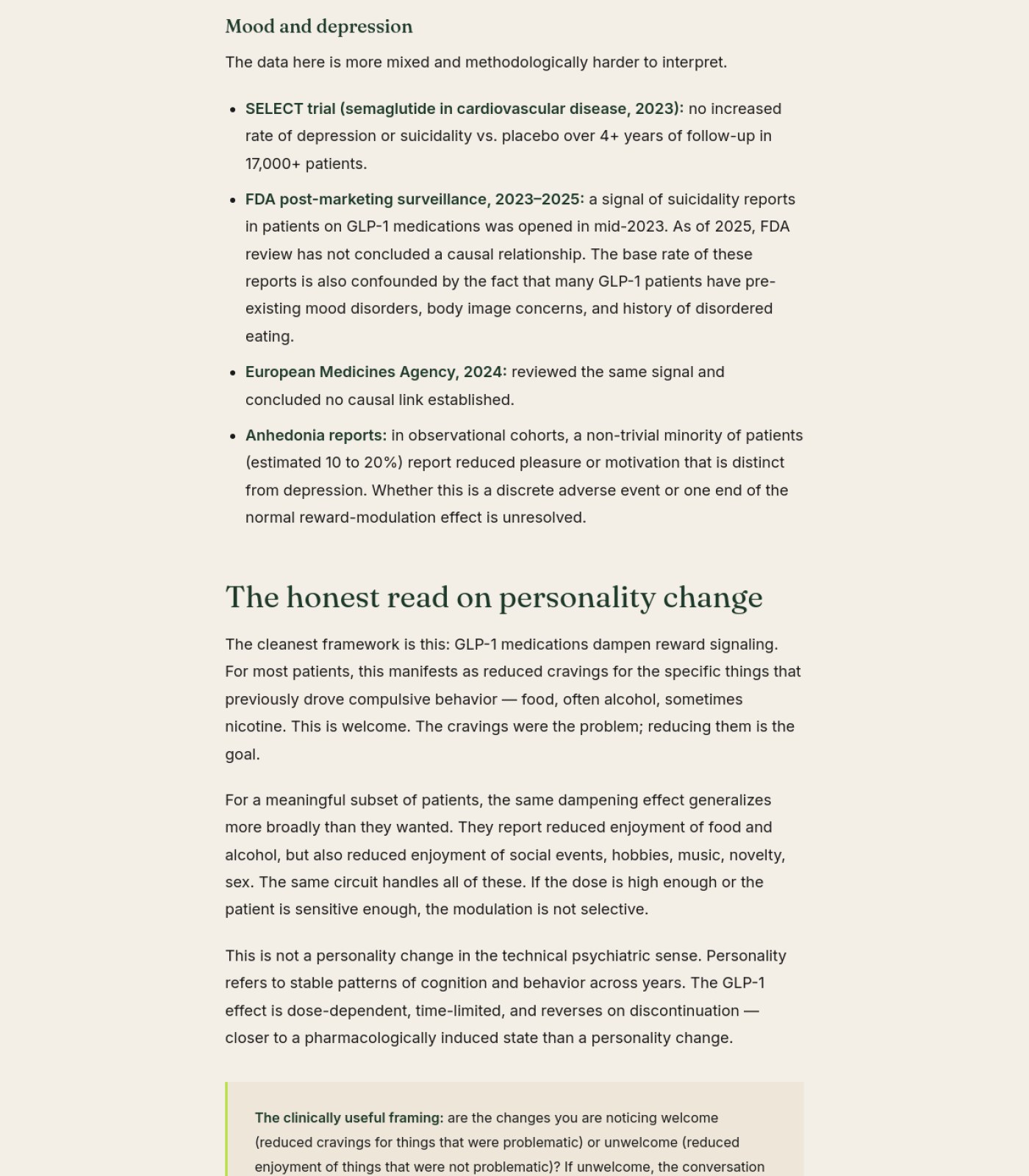
Hyperlink the named studies (Klausen et al. 2022, Aranäs et al. 2023, SELECT trial, FDA and EMA reviews) to their actual sources. Blog Ozempic Personality What Science Says
Naming studies without linking them makes claims hard to verify and looks less authoritative for a medical topic.
why: citations, section 3-4
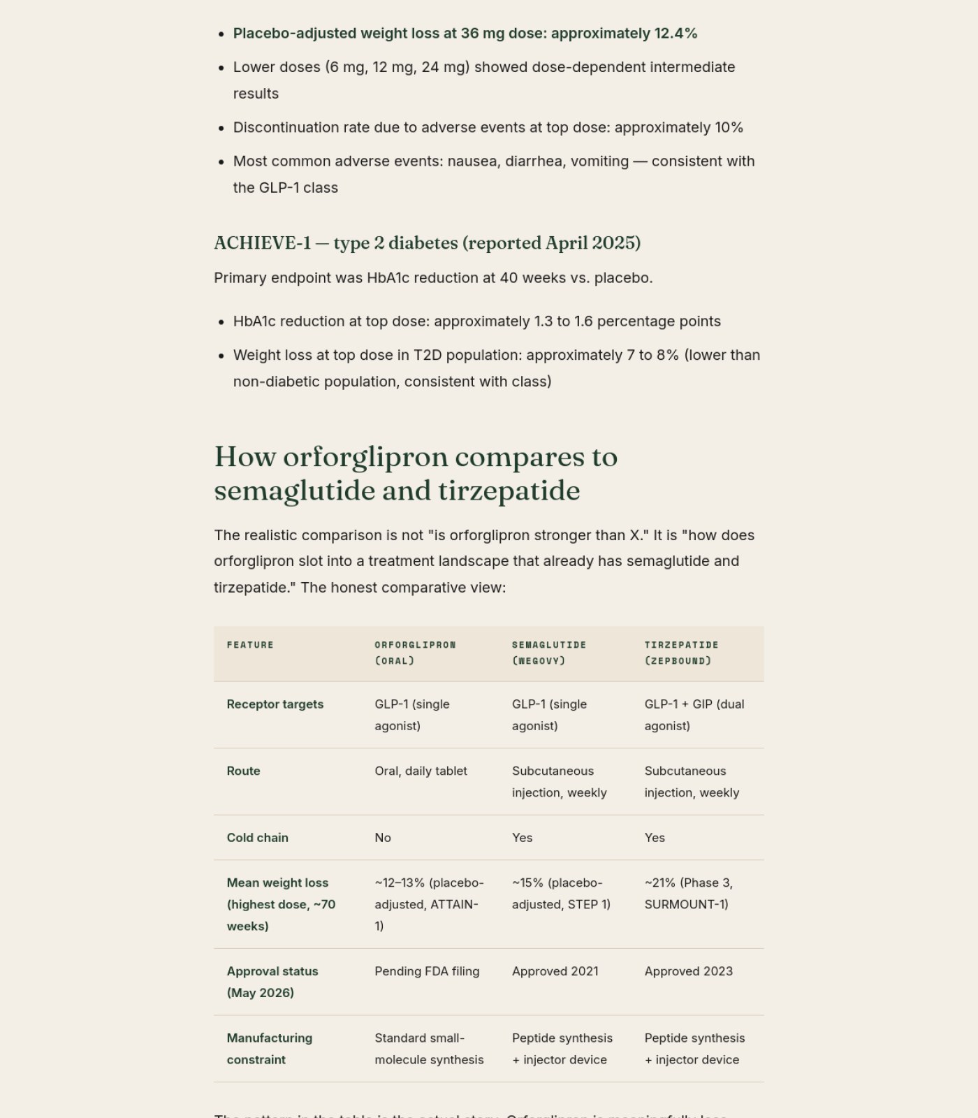
Add inline citations or a references list linking to the actual ATTAIN-1 and ACHIEVE-1 trial data and FDA filings Blog Orforglipron First Glp1 Pill 2026
The article states specific percentages (12.4% weight loss, 1.3–1.6 point HbA1c drop) with no source link, which weakens trust in the numbers.
why: unsourced statistical claims in health content
Replace the generic 'OZEMBACK EDITORIAL' byline with a named author and, ideally, a medical reviewer with credentials Blog Orforglipron First Glp1 Pill 2026
Health content without a named expert reviewer is harder for readers (and Google) to trust as accurate medical information.
why: E-E-A-T author signals for YMYL content
Add a named author or medically-reviewed-by credit near the byline Blog Retatrutide Glp3 What We Know
For health content, readers and search engines trust a real name and credentials more than an anonymous editorial team.
why: byline 'OZEMBACK EDITORIAL', section 1
Add a one- or two-line disclaimer directly in the article body (e.g. right after the intro paragraph) Blog Fda Peptide Reclassification 2026
The article discusses drug legality and dosing pathways; a visible reminder that this isn't medical/legal advice belongs in the story itself.
why: YMYL content disclosure best practice
Replace generic 'Ozemback Editorial' byline with a named author and their credentials Blog Fda Peptide Reclassification 2026
Google and readers trust health-adjacent content more when a real, qualified person is attached to it.
why: E-E-A-T author expertise signals
Double check the 'LAST UPDATED: MAY 2026' date is correct Legal
A future-dated 'last updated' stamp can look like an error and undermine trust in the document's accuracy.
why: content accuracy check
🧭

Menu & Getting Around

12 to fix
Use matching wording for the 'STORIES' nav link and the 'ALL STORIES' link so readers know they lead to the same place Home
Slightly different labels for what is likely the same destination can create small moments of doubt while browsing.
why: navigation labeling consistency
Add a way to filter or search the story archive by the existing category tags Blog
There are already several repeated categories (Market & Pricing, Regulatory + Policy, Clinical Data) but no way to click a tag and see just that group.
why: faceted navigation
Confirm whether a search or filter exists for the Stories section and surface it from here if so About
A reader who wants to explore past essays has no visible way to search or browse topics from this page.
why: findability of archive content
Add a breadcrumb trail (e.g. Stories > Neuroscience > this article) using the existing category tag. Blog Ozempic Personality What Science Says
Readers arriving from search have no quick way to see where this article sits in the site or browse the same category.
why: no breadcrumb near category tag, section 1
Add a 'related articles' or 'read next' section at the very end of the piece. Blog Ozempic Personality What Science Says
The article ends after the FAQ with no path to keep reading, which loses engaged visitors right when they're most interested.
why: no related-content links visible, section 6
Add a breadcrumb trail (e.g. Home > Stories > Orforglipron) above the headline Blog Orforglipron First Glp1 Pill 2026
Readers arriving from search have no visual cue for where this article sits within the site.
why: missing breadcrumb navigation
Add related-article or 'back to Stories' links at the bottom of the page Blog Orforglipron First Glp1 Pill 2026
Right now the article just stops after the FAQ, giving readers no path to keep browsing the site.
why: no internal linking at content end
Add a simple text breadcrumb (Home > Journal > Retatrutide) above the headline Blog Retatrutide Glp3 What We Know
A breadcrumb helps readers understand where they are in the site and makes it easy to back out to the full journal.
why: top of article, section 1
Style the Sources & References links (and any other real links) so they look different from bold body text Blog Fda Peptide Reclassification 2026
Right now bold citation text looks the same as bold emphasis elsewhere, so readers can't tell what's clickable.
why: link affordance / discoverability
Add anchor links from each FAQ question straight down to its own answer Blog Fda Peptide Reclassification 2026
Helps readers who arrive from a search result looking for one specific question jump right to it.
why: in-page anchor navigation
Add a short table of contents near the top of this legal page Legal
With this many sections, a simple list of links at the top would save readers a lot of scrolling.
why: in-page navigation for long content
Add a visible 'Privacy Policy' or 'Cookie Policy' footer link if one exists separately Legal
Currently only 'Legal & Disclaimer' is listed, so shoppers can't tell if privacy terms are covered elsewhere or bundled here.
why: footer link completeness
🔍

Being Found by AI & Google

16 to fix
Add a visible publish or last-updated date to each story card Home
Search engines and AI tools use freshness dates to judge how current cultural commentary is; none of the individual story previews show one.
why: content freshness signals
Add named author credentials across essays discussing health-adjacent topics Home
Google and AI answer engines weigh expertise and authorship more heavily for topics that touch health, even when framed as cultural writing.
why: E-E-A-T / YMYL guidance
Rewrite the main H1 to include the site's real subject (GLP-1/Ozempic culture) rather than the generic 'Cultural reportage and personal essays' Blog
Search engines weigh the main headline heavily, and right now it doesn't say what topic the site actually covers.
why: on-page SEO / H1 relevance
Add visible publish dates and authors consistently to every article, not just some Blog
Freshness and authorship are signals AI and Google use to trust health-adjacent content; dates are shown but authors are missing everywhere.
why: YMYL/E-E-A-T signals
Add named bylines, credentials, or an editorial team bio linked from this page About
Google and AI tools weigh 'who wrote this' heavily for health-adjacent topics, and right now there's no named author or team anywhere.
why: E-E-A-T authorship signals
Link to the Stories archive or a sitemap from this page About
Right now the About page is a dead end that doesn't route readers or crawlers deeper into the site's content.
why: internal linking for crawlability
Link the author byline 'Ozemback Editorial' to the existing About page and, if possible, note any medical reviewer. Blog Ozempic Personality What Science Says
For health topics, search engines and AI tools weigh author credibility heavily; right now the byline is just plain text with no way to check who wrote it.
why: byline, section 1
Add real hyperlinks to the studies mentioned in the text (see Words on the Page). Blog Ozempic Personality What Science Says
Linked, citable sources are one of the strongest signals AI answer engines use to trust and quote medical content.
why: unlinked citations, sections 3-4
Link out to authoritative sources (FDA, ClinicalTrials.gov, journal publications) for the trial data cited Blog Orforglipron First Glp1 Pill 2026
Outbound links to trusted medical sources boost how much Google and AI models trust and cite this page.
why: outbound authority linking for E-E-A-T
Add a visible author/reviewer bio with medical credentials near the byline Blog Orforglipron First Glp1 Pill 2026
Search engines and AI systems weigh named expertise heavily for health topics, and right now the byline is just a generic editorial name.
why: author expertise signal for YMYL ranking
Hyperlink every source in the citations list to its real source page Blog Retatrutide Glp3 What We Know
Search engines and AI tools reward health content that clearly links to verifiable primary sources; unlinked citations look unverified.
why: Sources cited block, section 5
Add visible author credentials or a medical reviewer line Blog Retatrutide Glp3 What We Know
Google's guidance for health topics puts heavy weight on who wrote or reviewed the content; an anonymous 'Editorial' byline is a weak signal.
why: byline, section 1
Confirm the FAQ section is marked up as structured FAQ data Blog Fda Peptide Reclassification 2026
This content is already formatted as clean Q&A, which is exactly what Google and AI answer engines look for to feature it directly in results.
why: FAQPage schema for rich results
Add author credentials/bio block to strengthen the page's trust signals for search and AI citation Blog Fda Peptide Reclassification 2026
Named expertise on regulatory health content makes it more likely to be cited as a trustworthy source.
why: author-level E-E-A-T signals
Add hreflang tags to support the EN/ES language toggle Legal
Without this, Google may not correctly show Spanish-speaking users the Spanish version in search results.
why: international SEO / hreflang
Add a meta description summarizing this is a legal/medical disclaimer for a cultural magazine Legal
A good meta description improves how this page appears in Google search results and AI answer summaries.
why: meta description / snippet optimization
⚖️

Legal & Accessibility Risk

24 to fix
Add permanent visible labels above the 'First name' and email fields in the newsletter form, not just placeholder text Home
Placeholder-only fields disappear once someone starts typing, which fails accessibility guidance and can confuse screen reader users.
why: WCAG 3.3.2 labels or instructions
Check and increase contrast on the small gray disclaimer and fine-print text on cream backgrounds Home
Light gray text on a pale cream background may be too low-contrast for readers with low vision to read comfortably.
why: WCAG 1.4.3 contrast minimum
Add a visible citation for the GLP-1 receptor claim in the featured essay teaser Home
Making a specific physiological claim without a source increases legal exposure even when the site disclaims itself as non-medical.
why: claim substantiation risk
Move the 'Not medical advice — a cultural conversation' disclaimer higher up, near the featured essay or top of the story grid, not only in the small footer copyright line Blog
Given every article discusses real drugs, dosing, and regulatory news, burying the disclaimer at the very bottom is a real liability and trust risk.
why: YMYL disclosure placement
Increase contrast/size of the footer disclaimer text Blog
It's currently small light-gray text on a dark green background, which is hard to read and may not meet accessibility contrast minimums.
why: WCAG 1.4.3 contrast
Confirm whether a cookie/privacy consent notice is required given the ES/EN toggle suggesting international visitors Blog
If European visitors are targeted, a missing consent banner could be a compliance gap; this isn't visible anywhere in the page.
why: GDPR cookie consent
Increase contrast on footer copyright text (pale gray on dark green) About
That text is hard to read for many users and likely fails minimum contrast guidelines.
why: WCAG 1.4.3 contrast minimum
Check contrast of orange body-text links (e.g. email address, 'Legal & Disclaimer') against the cream background About
Orange-on-cream at small text sizes often falls below accessible contrast ratios, making links hard to read for low-vision users.
why: WCAG 1.4.3 contrast minimum
Add a skip-to-content link for keyboard and screen-reader users About
The page has a long header and this would let assistive-technology users jump straight to the main content.
why: WCAG 2.4.1 bypass blocks
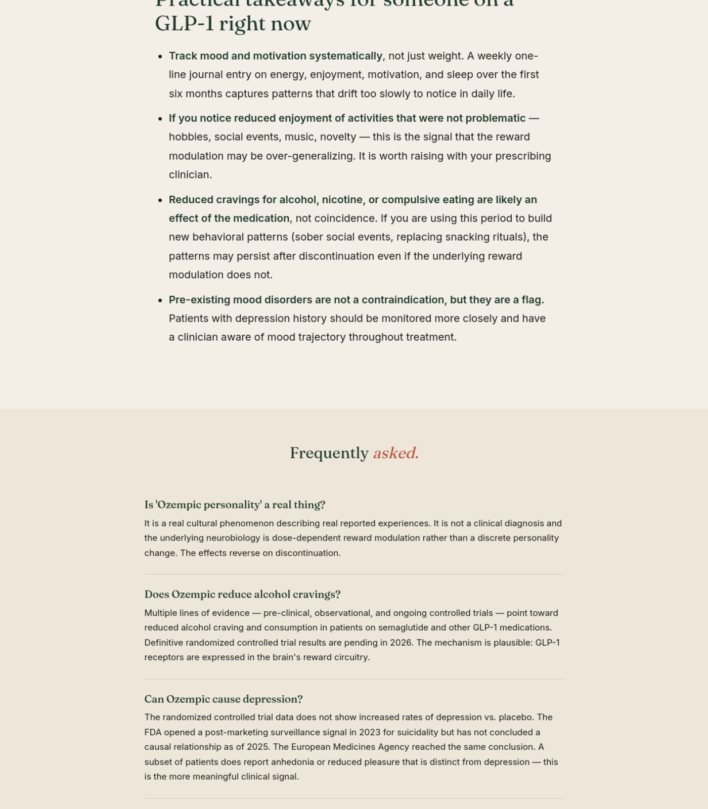
Add a clear medical disclaimer stating the content is informational, not medical advice, and to consult a prescribing clinician. Blog Ozempic Personality What Science Says
The article discusses medication side effects, mood changes, and a suicidality signal without any visible disclaimer, which is a real legal exposure for this kind of content.
why: no disclaimer visible across sections 1-6
Check and increase the contrast of the small green label text ('THE SHORT ANSWER') against the dark green background. Blog Ozempic Personality What Science Says
Light text on a similarly dark background can fail minimum contrast standards, making it hard to read for people with low vision.
why: label text, section 1 dark callout box
Fix the justified-text gaps described above, since they also affect readability for users with dyslexia or low vision. Blog Ozempic Personality What Science Says
Uneven word spacing from justified text is a known accessibility issue, not just a cosmetic one.
why: WCAG 1.4.8, sections 1-2 callout boxes
Confirm the footer (or the 'Legal' nav link) actually contains Privacy Policy, Terms, and an Accessibility statement. Blog Ozempic Personality What Science Says
No dedicated footer with these links is visible anywhere on the page, and relying on a single 'Legal' link may not be enough for a site discussing medication.
why: no footer legal links visible, section 6
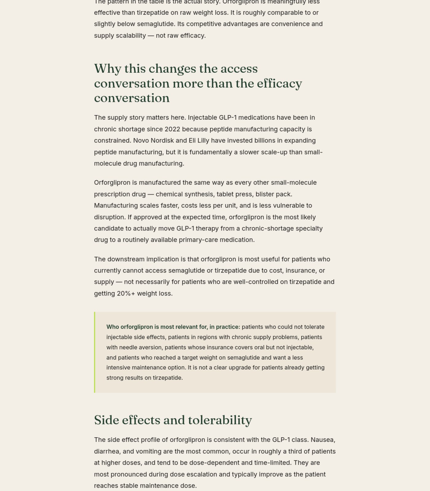
Add a clear medical disclaimer (e.g. 'This is not medical advice; talk to your doctor before starting or stopping any medication') Blog Orforglipron First Glp1 Pill 2026
The article compares prescription drug dosing and efficacy without any disclaimer, which is a meaningful legal risk for content discussing medications.
why: lack of medical disclaimer on drug-comparison content
Increase contrast of the yellow-green arrow bullets and small labels against the dark green callout boxes Blog Orforglipron First Glp1 Pill 2026
Light olive text on dark green may be hard to read for readers with low vision.
why: WCAG 1.4.3 contrast minimum
Darken the small gray byline/date text against the cream background Blog Orforglipron First Glp1 Pill 2026
Light gray text on an off-white background can fall below readable contrast levels for some readers.
why: WCAG 1.4.3 contrast minimum
Add footer legal links (privacy policy, terms of use, cookie notice) since a 'Legal' nav item exists but no footer is present anywhere on the page Blog Orforglipron First Glp1 Pill 2026
A completely missing footer means there's no easy, expected place for legal and compliance links, which matters for a site publishing medical content.
why: missing standard footer legal links
Add a named, credentialed medical reviewer or author bio Blog Retatrutide Glp3 What We Know
For content making direct drug efficacy comparisons, an anonymous byline increases legal and reputational risk if claims are ever challenged.
why: byline, section 1
Check the orange link color against the cream background for contrast Blog Retatrutide Glp3 What We Know
Light orange text on a light cream background may not meet accessibility contrast standards for readers with low vision.
why: orange hyperlinks, sections 4-5
Add a visible disclaimer inside the article body given the subject is FDA drug classification and compounding legality Blog Fda Peptide Reclassification 2026
Relying on a separate nav 'Disclaimer' page is a weaker legal protection than a disclaimer readers actually see while reading claims about drug legality.
why: health/legal content disclosure risk
Check color contrast on the orange/terracotta italic headline text and the pale green text inside the dark decorative divider band Blog Fda Peptide Reclassification 2026
Both of those color combinations look like they could fall short of readable contrast for users with low vision.
why: WCAG 1.4.3 contrast minimum
Increase contrast of the orange/red highlighted text against the tan callout background Legal
This color combination likely fails accessibility contrast standards, making the most critical disclaimer text hard to read for many people.
why: WCAG 2.1 AA contrast ratio (4.5:1)
Add a visible cookie consent notice if any tracking/analytics is used Legal
None of the four page sections show a cookie banner, which is a compliance gap if the site collects data from EU or other regulated visitors.
why: cookie consent / GDPR-style compliance
Add a skip-to-content link for keyboard and screen reader users Legal
None is visible across any part of the page, and it would help users skip the repeated navigation on such a long page.
why: WCAG 2.4.1 bypass blocks
Audit Brief

ozemback.com

Home · generated automatically · https://ozemback.com

71
Today
89
After fixes

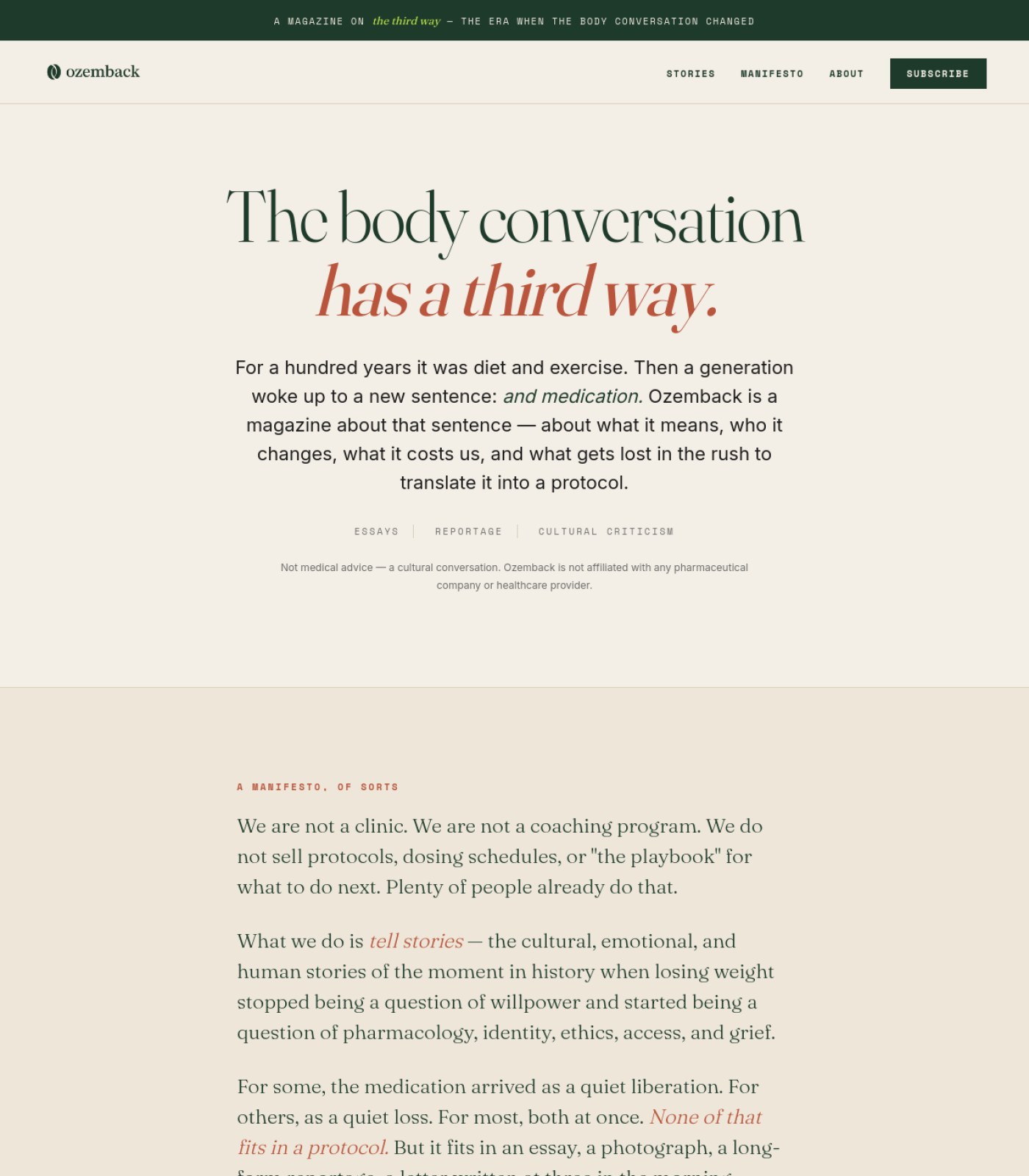
This page is 71% ready to send traffic to. Fixing the items below gets it to an estimated 89%.

Do these 3 first
1

Name real authors with credentials on essaysThe essays make specific science claims (like GLP-1 receptor effects) but are only credited to 'Ozemback Editorial,' which weakens reader trust and hurts how Google and AI tools rank health-adjacent content.

2

Add photos to the story preview cardsEvery 'Recent stories' card is plain text with no image, which makes a magazine site feel flat and less inviting to click into.

3

Give the newsletter form real, permanent field labelsThe name and email boxes only show placeholder text that vanishes once someone starts typing, which is a known accessibility problem for screen reader and low-vision users.

📍 The map

 — this page, with the fixes marked where they happen
Section 1 of 5
ozemback.com screenshot
Section 2 of 5
ozemback.com screenshot
3
Section 3 of 5
ozemback.com screenshot
1
Section 4 of 5
ozemback.com screenshot
2
Section 5 of 5
ozemback.com screenshot
1

Story card has no image

2

Placeholder-only form labels

3

Generic 'Editorial' byline

⚡ Ship the fixes

Send this page's fixes to whoever ships it

Check or uncheck items in the checklist below, then use the bar right above it: Copy prompt pastes into a chat-based AI agent (Claude, ChatGPT...). Download JSON or the Advanced API below hand it to an autonomous coding agent (Claude Code, Cursor...). Download checklist is a plain to-do list for a human developer. Or skip all of that — see "Path 2" below.

Or open the raw JSON (all pages) →
Path 2: let it apply fixes for you automatically (private beta)

Instead of you copying a prompt or downloading a file, a weekly check can do the finding-and-proposing part for you:

  1. Once a week, it re-reads your latest Audit Brief and picks out fixes that need no file and no judgment call from you (blocker-free ones only — anything marked "needs a file" or "ask before doing" is never touched by this).
  2. Nothing is written to your site at this point. Each fix is queued as a proposal, exactly like this one:
{ "domain": "yoursite.com", "file_path": "index.html", "pillar": "Words on the Page", "task": "Clarify what 'GEO' means on first mention", "why": "Visitors may not know the acronym.", "old_snippet": "GEO optimizes for citation...", "new_snippet": "GEO (Generative Engine Optimization) optimizes for citation...", "status": "pending" }
  1. You get notified that proposals are waiting. You open your review queue, see a before/after diff for each one, and click Accept or Reject individually — nothing ships to your live site without that click.
  2. You can reject anything, anytime, for any reason. There is no "auto-approve" setting — every single change needs your explicit yes.

This is a private pilot right now, not a self-serve toggle yet — ask us to turn it on for your site.

selected
🖼️

Photos & Images

2 to fix · 1 already good
Add a photo or visual to each of the four 'Recent stories' cards
Right now the story grid is text-only, which makes the page feel less like a real magazine and less scannable for readers deciding what to read.
why: content engagement / visual scanning
Add descriptive alt text to the featured essay photo of the woman reading
Screen reader users currently have no way to know what this image shows unless alt text is written for it.
why: WCAG 1.1.1 non-text content
Keep the warm, editorial tone of the one photo used
The featured essay photo is high quality and matches the reflective, literary voice of the brand well.
why: brand consistency
Already good
🔘

Buttons & Actions

1 to fix · 2 already good
Confirm and clarify where the header 'Subscribe' button goes
It sits next to nav items like a paid action, but the only visible subscription on the page is a free monthly newsletter — readers may expect something different.
why: CTA intent clarity
Keep the consistent orange arrow style on 'Read the essay' and 'Read more' links
Using the same color and arrow icon for every article link makes it instantly clear what's clickable across the whole page.
why: interaction consistency
Already good
Keep the high-contrast lime-green 'Subscribe' button in the newsletter block
It stands out clearly against the dark green background, making the main email signup easy to find.
why: contrast / CTA visibility
Already good
📐

Layout & Structure

1 to fix · 1 already good
Trim the repeated 'not medical advice / not affiliated' disclaimer that appears near-identically three times (hero, manifesto, footer)
Repeating the exact same sentence three times can feel redundant to readers and weakens the impact of the one that matters most in the footer.
why: content redundancy
Keep the alternating cream/beige/dark-green section backgrounds
This creates clear visual breaks between the hero, manifesto, stories, newsletter, and footer sections, helping readers know where one topic ends and the next begins.
why: visual rhythm
Already good
✏️

Words on the Page

2 to fix · 1 already good
Replace the generic 'BY OZEMBACK EDITORIAL' byline with a named writer or contributor bio where possible
A named author with relevant background builds more trust than an anonymous 'editorial' credit, especially for content that touches on medication and science.
why: author trust signals
Add a visible source or citation next to specific claims like 'GLP-1 receptors are densely expressed in reward circuits'
Stating a precise physiological claim without a visible source raises legal exposure even on a site that positions itself as cultural commentary, not medical advice.
why: YMYL claim substantiation
Keep the manifesto's clear statement of what the magazine is and isn't (not a clinic, no protocols sold)
This upfront honesty about the site's purpose is exactly what builds reader trust and reduces confusion about intent.
why: positioning clarity
Already good
🧭

Menu & Getting Around

1 to fix · 1 already good
Use matching wording for the 'STORIES' nav link and the 'ALL STORIES' link so readers know they lead to the same place
Slightly different labels for what is likely the same destination can create small moments of doubt while browsing.
why: navigation labeling consistency
Keep the short, matching header and footer navigation (Stories, About, Legal, Contact)
Having the same core links in both places makes the site easy to navigate no matter where a reader is on the page.
why: navigation redundancy best practice
Already good
🔍

Being Found by AI & Google

2 to fix · 1 already good
Add a visible publish or last-updated date to each story card
Search engines and AI tools use freshness dates to judge how current cultural commentary is; none of the individual story previews show one.
why: content freshness signals
Add named author credentials across essays discussing health-adjacent topics
Google and AI answer engines weigh expertise and authorship more heavily for topics that touch health, even when framed as cultural writing.
why: E-E-A-T / YMYL guidance
Keep the clear, specific hero headline ('The body conversation has a third way')
A distinct, quotable headline gives search engines and AI tools a strong, unique topic signal to associate with the site.
why: headline clarity for indexing
Already good
⚖️

Legal & Accessibility Risk

3 to fix · 1 already good
Add permanent visible labels above the 'First name' and email fields in the newsletter form, not just placeholder text
Placeholder-only fields disappear once someone starts typing, which fails accessibility guidance and can confuse screen reader users.
why: WCAG 3.3.2 labels or instructions
Check and increase contrast on the small gray disclaimer and fine-print text on cream backgrounds
Light gray text on a pale cream background may be too low-contrast for readers with low vision to read comfortably.
why: WCAG 1.4.3 contrast minimum
Add a visible citation for the GLP-1 receptor claim in the featured essay teaser
Making a specific physiological claim without a source increases legal exposure even when the site disclaims itself as non-medical.
why: claim substantiation risk
Keep the repeated 'not medical advice / not affiliated' disclaimers and proper trademark attribution in the footer
Clearly and repeatedly stating the site is not medical advice and not affiliated with any pharmaceutical company, plus correctly crediting trademarks, shows strong legal diligence.
why: disclaimer and trademark best practice
Already good
For your boss / your team

One-line summary you can forward

Ozemback scores 71/100 today: the writing, disclaimers, and overall layout are thoughtfully built, but the page is missing the kind of trust and visual signals that turn casual readers into subscribers. The three biggest wins are naming real authors with credentials on essays that make health-related claims (right now everything is credited to 'Ozemback Editorial'), adding photos to the story preview cards so the page feels like a real magazine instead of a text list, and fixing the newsletter signup form so its name and email fields have permanent labels instead of disappearing placeholder text. None of these require rebuilding the site — they're refinements to what's already there — and addressing them should lift the score to roughly 89/100.

Audit Brief

ozemback.com

Blog · generated automatically · https://ozemback.com/blog

66
Today
84
After fixes

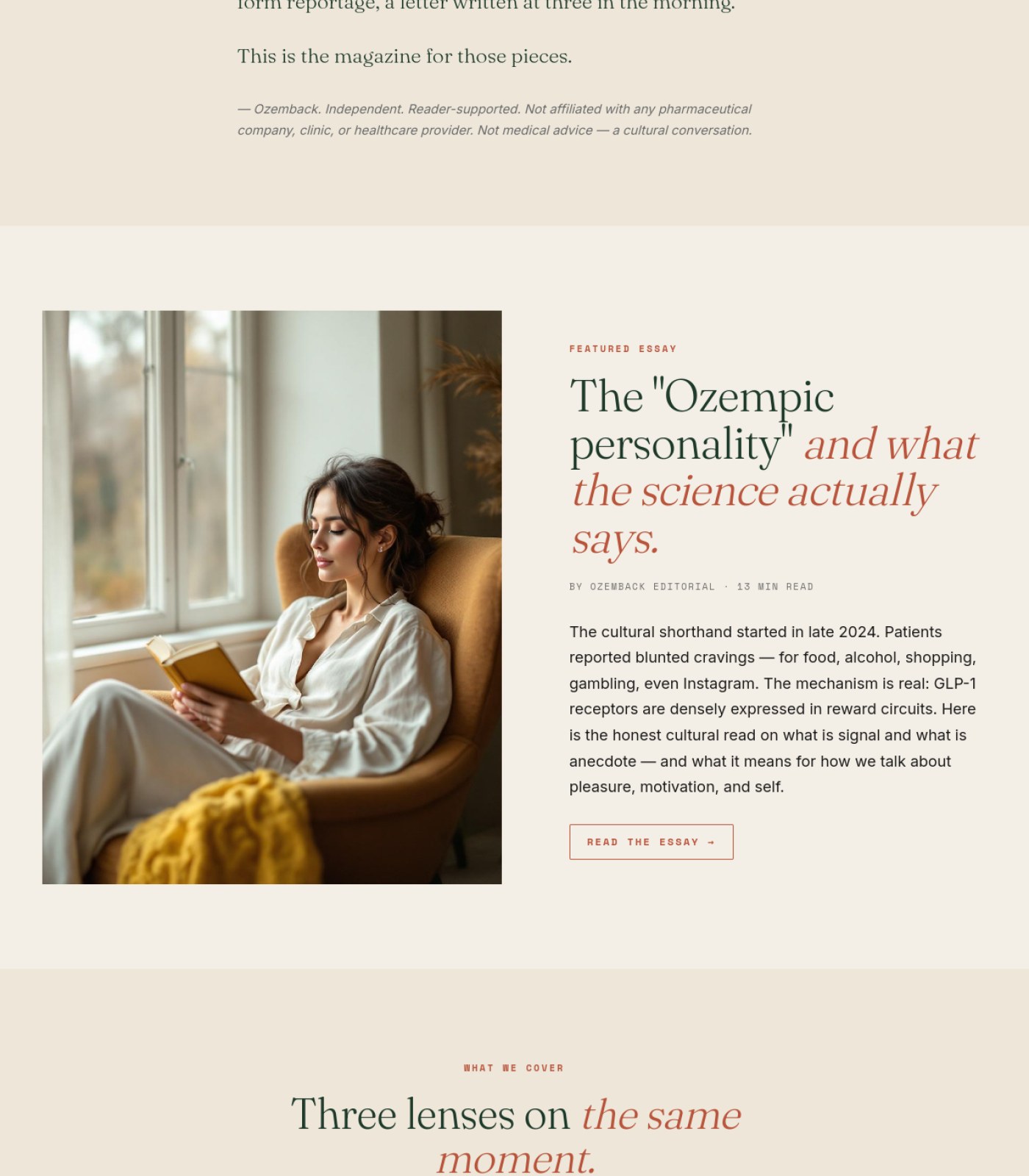
This page is 66% ready to send traffic to. Fixing the items below gets it to an estimated 84%.

Do these 3 first
1

Make the medical disclaimer visible, not just footer fine printThe only 'this isn't medical advice' text is tiny gray copy at the very bottom, which is risky when every article discusses real drugs, dosing, and FDA/DEA action.

2

Add a photo or thumbnail to every story cardOnly the featured essay has an image — the other 9 story cards are pure text blocks, which makes the archive feel flat and reduces clicks.

3

Turn 'Read the essay' into a real buttonThe only CTA on the page besides Subscribe is a plain underlined text link, so the featured story's next step doesn't stand out.

📍 The map

 — this page, with the fixes marked where they happen
Section 1 of 3
ozemback.com screenshot
1
Section 2 of 3
ozemback.com screenshot
2
Section 3 of 3
ozemback.com screenshot
3
1

Weak text-link CTA

2

Card missing image

3

Tiny medical disclaimer

⚡ Ship the fixes

Send this page's fixes to whoever ships it

Check or uncheck items in the checklist below, then use the bar right above it: Copy prompt pastes into a chat-based AI agent (Claude, ChatGPT...). Download JSON or the Advanced API below hand it to an autonomous coding agent (Claude Code, Cursor...). Download checklist is a plain to-do list for a human developer. Or skip all of that — see "Path 2" below.

Or open the raw JSON (all pages) →
Path 2: let it apply fixes for you automatically (private beta)

Instead of you copying a prompt or downloading a file, a weekly check can do the finding-and-proposing part for you:

  1. Once a week, it re-reads your latest Audit Brief and picks out fixes that need no file and no judgment call from you (blocker-free ones only — anything marked "needs a file" or "ask before doing" is never touched by this).
  2. Nothing is written to your site at this point. Each fix is queued as a proposal, exactly like this one:
{ "domain": "yoursite.com", "file_path": "index.html", "pillar": "Words on the Page", "task": "Clarify what 'GEO' means on first mention", "why": "Visitors may not know the acronym.", "old_snippet": "GEO optimizes for citation...", "new_snippet": "GEO (Generative Engine Optimization) optimizes for citation...", "status": "pending" }
  1. You get notified that proposals are waiting. You open your review queue, see a before/after diff for each one, and click Accept or Reject individually — nothing ships to your live site without that click.
  2. You can reject anything, anytime, for any reason. There is no "auto-approve" setting — every single change needs your explicit yes.

This is a private pilot right now, not a self-serve toggle yet — ask us to turn it on for your site.

selected
🖼️

Photos & Images

2 to fix · 1 already good
Add a photo/thumbnail to each of the 12 story cards in the 'All stories' grid
Right now only the top featured essay has an image; every other card is text-only, which makes scanning the archive feel monotonous and less inviting to click.
why: visual hierarchy / scannability
Confirm the featured hero photo has descriptive alt text
Screen reader users and Google image search both rely on alt text, and there's no visible caption to confirm one exists.
why: WCAG 1.1.1 alt text
Keep using one strong, well-composed lifestyle photo for the featured story
The reading-by-the-window photo is warm, on-brand, and clearly tied to the essay topic.
why: n/a
Already good
🔘

Buttons & Actions

3 to fix · 1 already good
Restyle 'Read the essay' as a filled or outlined button instead of a plain underlined link
It's the main call-to-action for the top featured story, but it currently looks the same weight as a footnote.
why: CTA contrast/affordance
Add a visible 'Read more' label or arrow to each of the 12 story cards
Right now it's not obvious the whole card is clickable — visitors may not realize they can open the full article.
why: click affordance
Keep the 'Subscribe to the letter' button high-contrast and centered in the footer band
Bright green on dark green with clear spacing makes it the easiest thing to find on the whole page.
why: n/a
Already good
Verify the ES language toggle actually switches content, not just a dead link
If Spanish content doesn't exist yet, offering the toggle without it will frustrate visitors and looks broken.
why: functional link check
📐

Layout & Structure

1 to fix · 1 already good
Add a 'load more' or pagination control at the bottom of the story grid
The archive stops abruptly right into the footer with no way to see older stories beyond what's shown.
why: content discoverability
Keep the consistent 3-column card grid with matching spacing for tags, title, excerpt, and date
Every story card follows the same clean pattern, which makes the archive easy to scan.
why: n/a
Already good
✏️

Words on the Page

2 to fix · 1 already good
Add an author name or byline to each article/card
For content about medications, FDA actions, and clinical trials, showing who wrote it builds trust that anonymous text can't.
why: E-E-A-T trust signal
Make the hero subheading mention the core topic (GLP-1/Ozempic) instead of only 'personal essays'
The current tagline is generic and doesn't tell new visitors what the site actually covers at a glance.
why: clarity/SEO relevance
Keep the consistent category tagging style (Analysis · Market & Pricing, etc.)
Clear topic labels above each headline make it fast to tell what kind of piece you're about to read.
why: n/a
Already good
🧭

Menu & Getting Around

1 to fix · 1 already good
Add a way to filter or search the story archive by the existing category tags
There are already several repeated categories (Market & Pricing, Regulatory + Policy, Clinical Data) but no way to click a tag and see just that group.
why: faceted navigation
Keep matching Home/Stories/About/Legal/Contact links in both header and footer
Having the same core navigation repeated at the bottom makes it easy to move around after a long scroll.
why: n/a
Already good
🔍

Being Found by AI & Google

2 to fix · 1 already good
Rewrite the main H1 to include the site's real subject (GLP-1/Ozempic culture) rather than the generic 'Cultural reportage and personal essays'
Search engines weigh the main headline heavily, and right now it doesn't say what topic the site actually covers.
why: on-page SEO / H1 relevance
Add visible publish dates and authors consistently to every article, not just some
Freshness and authorship are signals AI and Google use to trust health-adjacent content; dates are shown but authors are missing everywhere.
why: YMYL/E-E-A-T signals
Good use of specific, descriptive headlines with real numbers (e.g. '6.5 points', '$499')
Specific, factual headlines tend to perform well in both search and AI summarization.
why: n/a
Already good
⚖️

Legal & Accessibility Risk

3 to fix
Move the 'Not medical advice — a cultural conversation' disclaimer higher up, near the featured essay or top of the story grid, not only in the small footer copyright line
Given every article discusses real drugs, dosing, and regulatory news, burying the disclaimer at the very bottom is a real liability and trust risk.
why: YMYL disclosure placement
Increase contrast/size of the footer disclaimer text
It's currently small light-gray text on a dark green background, which is hard to read and may not meet accessibility contrast minimums.
why: WCAG 1.4.3 contrast
Confirm whether a cookie/privacy consent notice is required given the ES/EN toggle suggesting international visitors
If European visitors are targeted, a missing consent banner could be a compliance gap; this isn't visible anywhere in the page.
why: GDPR cookie consent
For your boss / your team

One-line summary you can forward

This blog page scores 66/100 today: it's well-organized and on-brand, but has a few fixable gaps. The biggest issue is that the 'not medical advice' disclaimer only appears as tiny gray text at the very bottom of the page, which is a real risk given every article discusses actual medications, FDA decisions, and dosing. Second, only the top featured story has a photo — the other 12 articles are plain text cards, which flattens the browsing experience. Third, the main call-to-action ('Read the essay') is just an underlined link instead of a real button, so it doesn't stand out. Fixing these three things — surfacing the disclaimer, adding thumbnails to story cards, and strengthening the CTA button — could realistically push the score to around 84.

Audit Brief

ozemback.com

About · generated automatically · https://ozemback.com/about

74
Today
89
After fixes

This page is 74% ready to send traffic to. Fixing the items below gets it to an estimated 89%.

Do these 3 first
1

Turn 'Subscribe' into a real buttonRight now it sits as plain text in the menu next to 'About' and 'Legal', so visitors don't realize it's the one action you actually want them to take.

2

Fix low-contrast text in links and footerThe orange links on the cream background and the pale gray copyright line in the footer are hard to read and risk failing accessibility standards.

3

Add a human face or team credential to the About pageA page that explains 'who we are' with zero photos or bylines makes it harder for readers (and Google) to trust the people behind the magazine.

📍 The map

 — this page, with the fixes marked where they happen
Section 1 of 3
ozemback.com screenshot
1
Section 2 of 3
ozemback.com screenshot
2
Section 3 of 3
ozemback.com screenshot
3
1

Subscribe not styled as button

2

Orange link contrast risk

3

Low-contrast footer copyright text

⚡ Ship the fixes

Send this page's fixes to whoever ships it

Check or uncheck items in the checklist below, then use the bar right above it: Copy prompt pastes into a chat-based AI agent (Claude, ChatGPT...). Download JSON or the Advanced API below hand it to an autonomous coding agent (Claude Code, Cursor...). Download checklist is a plain to-do list for a human developer. Or skip all of that — see "Path 2" below.

Or open the raw JSON (all pages) →
Path 2: let it apply fixes for you automatically (private beta)

Instead of you copying a prompt or downloading a file, a weekly check can do the finding-and-proposing part for you:

  1. Once a week, it re-reads your latest Audit Brief and picks out fixes that need no file and no judgment call from you (blocker-free ones only — anything marked "needs a file" or "ask before doing" is never touched by this).
  2. Nothing is written to your site at this point. Each fix is queued as a proposal, exactly like this one:
{ "domain": "yoursite.com", "file_path": "index.html", "pillar": "Words on the Page", "task": "Clarify what 'GEO' means on first mention", "why": "Visitors may not know the acronym.", "old_snippet": "GEO optimizes for citation...", "new_snippet": "GEO (Generative Engine Optimization) optimizes for citation...", "status": "pending" }
  1. You get notified that proposals are waiting. You open your review queue, see a before/after diff for each one, and click Accept or Reject individually — nothing ships to your live site without that click.
  2. You can reject anything, anytime, for any reason. There is no "auto-approve" setting — every single change needs your explicit yes.

This is a private pilot right now, not a self-serve toggle yet — ask us to turn it on for your site.

selected
🖼️

Photos & Images

1 to fix · 1 already good
Add at least one real photo (founder, editorial team, or a relevant cultural image) to the About page
An about page with only text makes the magazine feel anonymous and less trustworthy, especially for a sensitive health-adjacent topic.
why: trust signals / E-E-A-T for about pages
No images means no risk of missing alt-text
Since there are no images on the page at all, there's currently no accessibility debt from unlabeled photos.
why: WCAG 1.1.1 non-text content
Already good
🔘

Buttons & Actions

2 to fix · 1 already good
Style 'Subscribe' in the header as a visually distinct button, not a plain nav link
It currently looks identical to 'About' and 'Legal', so readers don't notice it's the main thing you want them to click.
why: primary CTA visual weight
Style the contact email (info@ozemback.com) as a button or highlighted contact card
A plain inline text link is easy to miss for readers who want to pitch a story or write in.
why: affordance clarity
Language toggle (EN/ES) is simple and clearly placed
It's easy to find in the top corner and doesn't compete with other actions.
why: consistent nav placement
Already good
📐

Layout & Structure

1 to fix · 2 already good
Heading hierarchy is clear and consistent (About > A magazine for the reflective middle > section heads)
Readers and search engines can easily tell what each section is about.
why: H1/H2 structure
Already good
The pulled quote block is visually separated with a colored border
It breaks up long text and highlights the most important line on the page.
why: visual hierarchy / blockquote styling
Already good
Break up the long opening paragraphs ('We started Ozemback because...') with a subhead or pull-quote
Two dense paragraphs in a row before the first section heading make readers skim past key points.
why: text chunking for scannability
✏️

Words on the Page

1 to fix · 2 already good
Mission statement is clear, confident, and specific ('a magazine for the reflective middle')
It immediately tells readers what the publication is for and who it's not for.
why: clarity of value proposition
Already good
'What we are' / 'What we are not' framing is a strong, scannable contrast
It removes ambiguity fast, which matters for a topic surrounded by scams and misinformation.
why: content structure
Already good
Add one closing line near the bottom nudging readers toward subscribing or reading a story
The page ends on legal disclaimer language with no soft invitation to do anything next.
why: closing CTA copy
🧭

Menu & Getting Around

1 to fix · 1 already good
Header and footer navigation match and stay consistent
Readers can always find Stories, About, Legal, and Subscribe no matter where they are on the page.
why: consistent global nav
Already good
Confirm whether a search or filter exists for the Stories section and surface it from here if so
A reader who wants to explore past essays has no visible way to search or browse topics from this page.
why: findability of archive content
🔍

Being Found by AI & Google

2 to fix · 1 already good
Page content directly and explicitly explains what the site is and isn't
This kind of plain-language self-description is exactly what AI answer engines and Google favor when summarizing a brand.
why: explicit entity definition for LLM answer engines
Already good
Add named bylines, credentials, or an editorial team bio linked from this page
Google and AI tools weigh 'who wrote this' heavily for health-adjacent topics, and right now there's no named author or team anywhere.
why: E-E-A-T authorship signals
Link to the Stories archive or a sitemap from this page
Right now the About page is a dead end that doesn't route readers or crawlers deeper into the site's content.
why: internal linking for crawlability
⚖️

Legal & Accessibility Risk

3 to fix · 2 already good
Medical disclaimer section is explicit, thorough, and clearly separates content from medical advice
This is exactly the kind of clear disclaimer needed for a publication covering medication topics.
why: editorial/medical disclaimer best practice
Already good
Footer clearly states no pharmaceutical affiliation
This protects the brand from being mistaken for a sponsored or clinical source.
why: disclosure transparency
Already good
Increase contrast on footer copyright text (pale gray on dark green)
That text is hard to read for many users and likely fails minimum contrast guidelines.
why: WCAG 1.4.3 contrast minimum
Check contrast of orange body-text links (e.g. email address, 'Legal & Disclaimer') against the cream background
Orange-on-cream at small text sizes often falls below accessible contrast ratios, making links hard to read for low-vision users.
why: WCAG 1.4.3 contrast minimum
Add a skip-to-content link for keyboard and screen-reader users
The page has a long header and this would let assistive-technology users jump straight to the main content.
why: WCAG 2.4.1 bypass blocks
For your boss / your team

One-line summary you can forward

This About page scores 74/100 today — the writing is clear, confident, and the medical/legal disclaimers are genuinely well done for a topic this sensitive. The three highest-value fixes are: make 'Subscribe' look like an actual button instead of blending into the menu, fix low-contrast text (the orange links and the pale footer copyright line) so it's easier to read, and add a real photo or named team bio so the page feels like it's written by real people rather than an anonymous account. None of these require new content systems — just restyling and small text additions — and doing them should push the score to roughly 89/100.

Audit Brief

ozemback.com

Blog Ozempic Personality What Science Says · generated automatically · https://ozemback.com/blog/ozempic-personality-what-science-says

64
Today
85
After fixes

This page is 64% ready to send traffic to. Fixing the items below gets it to an estimated 85%.

Do these 3 first
1

Fix the broken sentences in the green callout boxesTwo bullet points have visible gaps where a word or phrase is missing, which makes the page look unfinished and confuses readers right at the top of the article.

2

Add a visible medical disclaimerThe article discusses medication side effects, mood changes, and suicidality data without a clear 'this is not medical advice' notice, which is a real legal exposure for health content.

3

Turn the cited studies into real linksNames like 'Klausen et al., 2022' and 'SELECT trial' are mentioned but not linked to a source, which weakens reader trust and hurts how credible AI tools and Google will rate this medical content.

📍 The map

 — this page, with the fixes marked where they happen
Section 1 of 6
ozemback.com screenshot
1
3
Section 2 of 6
ozemback.com screenshot
2
Section 3 of 6
ozemback.com screenshot
Section 4 of 6
ozemback.com screenshot
Section 5 of 6
ozemback.com screenshot
Section 6 of 6
ozemback.com screenshot
1

Missing phrase in callout bullet

2

Gap before colon in bullet

3

Subscribe not styled as button

⚡ Ship the fixes

Send this page's fixes to whoever ships it

Check or uncheck items in the checklist below, then use the bar right above it: Copy prompt pastes into a chat-based AI agent (Claude, ChatGPT...). Download JSON or the Advanced API below hand it to an autonomous coding agent (Claude Code, Cursor...). Download checklist is a plain to-do list for a human developer. Or skip all of that — see "Path 2" below.

Or open the raw JSON (all pages) →
Path 2: let it apply fixes for you automatically (private beta)

Instead of you copying a prompt or downloading a file, a weekly check can do the finding-and-proposing part for you:

  1. Once a week, it re-reads your latest Audit Brief and picks out fixes that need no file and no judgment call from you (blocker-free ones only — anything marked "needs a file" or "ask before doing" is never touched by this).
  2. Nothing is written to your site at this point. Each fix is queued as a proposal, exactly like this one:
{ "domain": "yoursite.com", "file_path": "index.html", "pillar": "Words on the Page", "task": "Clarify what 'GEO' means on first mention", "why": "Visitors may not know the acronym.", "old_snippet": "GEO optimizes for citation...", "new_snippet": "GEO (Generative Engine Optimization) optimizes for citation...", "status": "pending" }
  1. You get notified that proposals are waiting. You open your review queue, see a before/after diff for each one, and click Accept or Reject individually — nothing ships to your live site without that click.
  2. You can reject anything, anytime, for any reason. There is no "auto-approve" setting — every single change needs your explicit yes.

This is a private pilot right now, not a self-serve toggle yet — ask us to turn it on for your site.

selected
🖼️

Photos & Images

1 to fix · 1 already good
Keep the lifestyle photo of the woman reading — it fits the calm, editorial tone well.
A relevant, well-lit photo at the top gives the article a human, trustworthy feel.
why: hero photograph, section 1
Already good
Add a simple diagram or chart to break up the science section (e.g. a brain-regions graphic near the VTA/nucleus accumbens/prefrontal cortex text).
A 13-minute read about brain chemistry with zero supporting visuals after the intro photo is harder to follow and skim.
why: no supporting visuals in sections 2-5
🔘

Buttons & Actions

2 to fix
Style 'Subscribe' in the top navigation as an actual button (background color, contrast) instead of plain text next to Stories/About/Legal.
Right now Subscribe looks identical to the other menu links, so it doesn't stand out as the one action you actually want visitors to take.
why: header nav, section 1
Reuse the same 'Subscribe' styling to add one more subscribe prompt near the end of the article, after the FAQ.
A long, thoughtful health article is exactly the kind of content that earns a newsletter signup, but the only ask is buried in the top nav.
why: no mid/end-of-article CTA visible in sections 4-6
📐

Layout & Structure

2 to fix · 1 already good
Switch the justified text inside the dark-green 'Short Answer' and 'controlled-trial' callout boxes to left-aligned.
Justified text is stretching some lines and creating large empty gaps that look like missing words, hurting readability.
why: justified paragraph text, sections 1-2
Add a simple in-page table of contents or jump links using the existing section headings (Where the term came from, The neuroscience..., What the evidence shows, etc.).
This is a 13-minute read with many sections; readers have no way to jump straight to the part they care about.
why: no anchor navigation across sections 1-5
Use clear H2/H3 structure throughout the piece.
Headings are consistent and scannable, which makes a long article easier to follow.
why: heading hierarchy, sections 2-5
Already good
✏️

Words on the Page

2 to fix · 1 already good
Fill in the missing phrase in 'The consistent positive signal is ___:' and 'a constellation of ___ reported by patients' — both currently show an odd gap instead of text.
These read as broken or unfinished sentences, which undercuts the credibility of an otherwise carefully written piece.
why: callout bullets, section 1 bottom and section 2 top
Hyperlink the named studies (Klausen et al. 2022, Aranäs et al. 2023, SELECT trial, FDA and EMA reviews) to their actual sources.
Naming studies without linking them makes claims hard to verify and looks less authoritative for a medical topic.
why: citations, section 3-4
Keep the FAQ section written as direct question-and-answer pairs.
Clear, plainly-worded questions and answers are easy for readers to scan and easy for search engines to quote.
why: FAQ section, section 6
Already good
🧭

Menu & Getting Around

2 to fix · 1 already good
Add a breadcrumb trail (e.g. Stories > Neuroscience > this article) using the existing category tag.
Readers arriving from search have no quick way to see where this article sits in the site or browse the same category.
why: no breadcrumb near category tag, section 1
Add a 'related articles' or 'read next' section at the very end of the piece.
The article ends after the FAQ with no path to keep reading, which loses engaged visitors right when they're most interested.
why: no related-content links visible, section 6
Keep the top navigation simple and consistent (Stories, About, Legal, Subscribe, language toggle).
A short, uncluttered main menu is easy to scan and understand at a glance.
why: header nav, section 1
Already good
🔍

Being Found by AI & Google

2 to fix · 1 already good
Link the author byline 'Ozemback Editorial' to the existing About page and, if possible, note any medical reviewer.
For health topics, search engines and AI tools weigh author credibility heavily; right now the byline is just plain text with no way to check who wrote it.
why: byline, section 1
Add visible published/updated dates and a clear category tag.
These freshness and topic signals are already present and help both readers and search engines trust the content is current.
why: date/category metadata, section 1
Already good
Add real hyperlinks to the studies mentioned in the text (see Words on the Page).
Linked, citable sources are one of the strongest signals AI answer engines use to trust and quote medical content.
why: unlinked citations, sections 3-4
⚖️

Legal & Accessibility Risk

4 to fix
Add a clear medical disclaimer stating the content is informational, not medical advice, and to consult a prescribing clinician.
The article discusses medication side effects, mood changes, and a suicidality signal without any visible disclaimer, which is a real legal exposure for this kind of content.
why: no disclaimer visible across sections 1-6
Check and increase the contrast of the small green label text ('THE SHORT ANSWER') against the dark green background.
Light text on a similarly dark background can fail minimum contrast standards, making it hard to read for people with low vision.
why: label text, section 1 dark callout box
Fix the justified-text gaps described above, since they also affect readability for users with dyslexia or low vision.
Uneven word spacing from justified text is a known accessibility issue, not just a cosmetic one.
why: WCAG 1.4.8, sections 1-2 callout boxes
Confirm the footer (or the 'Legal' nav link) actually contains Privacy Policy, Terms, and an Accessibility statement.
No dedicated footer with these links is visible anywhere on the page, and relying on a single 'Legal' link may not be enough for a site discussing medication.
why: no footer legal links visible, section 6
For your boss / your team

One-line summary you can forward

This article scores 64/100 today: the writing and structure are genuinely strong (clear headings, a well-organized FAQ, good dates and author byline), but three things are dragging it down. First, two of the highlighted 'short answer' bullets have visible gaps where text appears to be missing, making the page look broken right at the top. Second, this is a health article about medication side effects and a suicidality data signal with no visible medical disclaimer anywhere on the page, which is a real legal risk. Third, the studies referenced by name (Klausen et al., the SELECT trial, FDA/EMA reviews) aren't linked to sources, which weakens both reader trust and how AI tools and Google will rate the content's credibility. Fixing these three issues, plus tightening button styling and text alignment, should bring the page to roughly 85/100.

Audit Brief

ozemback.com

Blog Orforglipron First Glp1 Pill 2026 · generated automatically · https://ozemback.com/blog/orforglipron-first-glp1-pill-2026

64
Today
85
After fixes

This page is 64% ready to send traffic to. Fixing the items below gets it to an estimated 85%.

Do these 3 first
1

Add a visible medical disclaimerThe page discusses prescription drug dosing and comparisons but nowhere tells readers to consult a doctor, which is a real legal exposure for health content.

2

Replace or caption the mismatched hero photoThe article is about a daily pill, but the only photo on the page shows glass vials and cork stoppers, not a tablet, so the main image doesn't match the story.

3

Name a credentialed reviewer and link real trial sourcesHealth articles need a named expert and citations to actual studies (ATTAIN-1, ACHIEVE-1) to be trusted by readers, Google, and AI answer engines.

📍 The map

 — this page, with the fixes marked where they happen
Section 1 of 6
ozemback.com screenshot
1
2
Section 2 of 6
ozemback.com screenshot
Section 3 of 6
ozemback.com screenshot
Section 4 of 6
ozemback.com screenshot
Section 5 of 6
ozemback.com screenshot
Section 6 of 6
ozemback.com screenshot
3
1

Hero photo doesn't show pill

2

No named reviewer in byline

3

Page ends, no footer/disclaimer

⚡ Ship the fixes

Send this page's fixes to whoever ships it

Check or uncheck items in the checklist below, then use the bar right above it: Copy prompt pastes into a chat-based AI agent (Claude, ChatGPT...). Download JSON or the Advanced API below hand it to an autonomous coding agent (Claude Code, Cursor...). Download checklist is a plain to-do list for a human developer. Or skip all of that — see "Path 2" below.

Or open the raw JSON (all pages) →
Path 2: let it apply fixes for you automatically (private beta)

Instead of you copying a prompt or downloading a file, a weekly check can do the finding-and-proposing part for you:

  1. Once a week, it re-reads your latest Audit Brief and picks out fixes that need no file and no judgment call from you (blocker-free ones only — anything marked "needs a file" or "ask before doing" is never touched by this).
  2. Nothing is written to your site at this point. Each fix is queued as a proposal, exactly like this one:
{ "domain": "yoursite.com", "file_path": "index.html", "pillar": "Words on the Page", "task": "Clarify what 'GEO' means on first mention", "why": "Visitors may not know the acronym.", "old_snippet": "GEO optimizes for citation...", "new_snippet": "GEO (Generative Engine Optimization) optimizes for citation...", "status": "pending" }
  1. You get notified that proposals are waiting. You open your review queue, see a before/after diff for each one, and click Accept or Reject individually — nothing ships to your live site without that click.
  2. You can reject anything, anytime, for any reason. There is no "auto-approve" setting — every single change needs your explicit yes.

This is a private pilot right now, not a self-serve toggle yet — ask us to turn it on for your site.

selected
🖼️

Photos & Images

2 to fix · 1 already good
Swap the staged vial/cork-stopper photo for an image that actually shows the oral tablet or a clinical/pharmacy setting
Readers land on an article about 'the first GLP-1 pill' and see labeled glass bottles instead of a pill, which undercuts credibility on a medical topic.
why: content-image mismatch reduces perceived accuracy on YMYL topics
Add descriptive alt text to the hero image describing it as a staged/stock photo, not a product photo
Screen reader users need to know what the image actually shows so they aren't misled about what's pictured.
why: WCAG 1.1.1 non-text content
Keep the soft, warm styling of the hero photo consistent with the site's editorial tone
The lighting and color palette match the rest of the page nicely and give the brand a calm, trustworthy feel.
why: n/a
Already good
🔘

Buttons & Actions

2 to fix · 1 already good
Style the 'Subscribe' nav item as a distinct button instead of a plain text link
Subscribe is the main action you want readers to take, so it should stand out visually from 'Stories,' 'About,' and 'Legal,' which are just navigation.
why: primary CTA visual weight
Add a clear next-step link at the end of the article (e.g. back to Stories or 'read more like this')
After a 12-minute read, readers are given no obvious next step and may just leave the site.
why: end-of-content dead end
Keep the EN/ES language toggle simple and visible in the header
It's clearly labeled and easy to find, which is good for reaching Spanish-speaking readers.
why: n/a
Already good
📐

Layout & Structure

1 to fix · 2 already good
Add a footer with privacy policy, terms, contact info, and company details after the FAQ
The page ends abruptly right after the FAQ with no footer at all, even though a 'Legal' link exists in the header, so there's nowhere at the bottom of the page for standard legal/contact info.
why: missing site footer
Continue using the colored callout boxes (dark green 'Short Answer', tan 'Who this is for') to break up long text sections
These boxes make a long article easier to scan and highlight the most important takeaways.
why: n/a
Already good
Maintain the clear serif-headline / sans-body typographic hierarchy used throughout
Section headers are easy to spot, which helps readers navigate a long article.
why: n/a
Already good
✏️

Words on the Page

2 to fix · 1 already good
Add inline citations or a references list linking to the actual ATTAIN-1 and ACHIEVE-1 trial data and FDA filings
The article states specific percentages (12.4% weight loss, 1.3–1.6 point HbA1c drop) with no source link, which weakens trust in the numbers.
why: unsourced statistical claims in health content
Replace the generic 'OZEMBACK EDITORIAL' byline with a named author and, ideally, a medical reviewer with credentials
Health content without a named expert reviewer is harder for readers (and Google) to trust as accurate medical information.
why: E-E-A-T author signals for YMYL content
Keep explaining technical concepts (small-molecule vs. peptide) in plain language as done in the 'What orforglipron actually is' section
This section makes a complex pharmacology distinction easy to understand for a general reader.
why: n/a
Already good
🧭

Menu & Getting Around

2 to fix · 1 already good
Add a breadcrumb trail (e.g. Home > Stories > Orforglipron) above the headline
Readers arriving from search have no visual cue for where this article sits within the site.
why: missing breadcrumb navigation
Add related-article or 'back to Stories' links at the bottom of the page
Right now the article just stops after the FAQ, giving readers no path to keep browsing the site.
why: no internal linking at content end
Keep the top navigation short and uncluttered (Stories, About, Legal, Subscribe)
A simple four-item menu is easy to scan and doesn't overwhelm the reader.
why: n/a
Already good
🔍

Being Found by AI & Google

2 to fix · 1 already good
Keep the direct Q&A 'Frequently asked' section formatted as clear question-then-answer pairs
This format is exactly what AI answer engines and Google's featured snippets look for, and it's already done well here.
why: n/a
Already good
Link out to authoritative sources (FDA, ClinicalTrials.gov, journal publications) for the trial data cited
Outbound links to trusted medical sources boost how much Google and AI models trust and cite this page.
why: outbound authority linking for E-E-A-T
Add a visible author/reviewer bio with medical credentials near the byline
Search engines and AI systems weigh named expertise heavily for health topics, and right now the byline is just a generic editorial name.
why: author expertise signal for YMYL ranking
⚖️

Legal & Accessibility Risk

4 to fix · 1 already good
Add a clear medical disclaimer (e.g. 'This is not medical advice; talk to your doctor before starting or stopping any medication')
The article compares prescription drug dosing and efficacy without any disclaimer, which is a meaningful legal risk for content discussing medications.
why: lack of medical disclaimer on drug-comparison content
Increase contrast of the yellow-green arrow bullets and small labels against the dark green callout boxes
Light olive text on dark green may be hard to read for readers with low vision.
why: WCAG 1.4.3 contrast minimum
Darken the small gray byline/date text against the cream background
Light gray text on an off-white background can fall below readable contrast levels for some readers.
why: WCAG 1.4.3 contrast minimum
Add footer legal links (privacy policy, terms of use, cookie notice) since a 'Legal' nav item exists but no footer is present anywhere on the page
A completely missing footer means there's no easy, expected place for legal and compliance links, which matters for a site publishing medical content.
why: missing standard footer legal links
Continue using clear heading levels (H1 title, H2 sections, H3 subsections) throughout the article
This structure helps screen reader users jump between sections easily.
why: n/a
Already good
For your boss / your team

One-line summary you can forward

This article scores 64/100 today: the writing is clear and well-organized with a strong FAQ section and comparison table, but it has real gaps for a page discussing prescription drug dosing and efficacy. The biggest issues are the complete absence of a medical disclaimer or footer with legal links anywhere on the page, a hero photo of glass vials that doesn't actually depict the pill the article is about, and no named medical reviewer or links to the real clinical trial sources being cited. Fixing these three items — adding a disclaimer and footer, matching the hero image to the topic, and naming a credentialed reviewer with source links — would bring the score up to an estimated 85/100 and meaningfully reduce legal and trust risk.

Audit Brief

ozemback.com

Blog Retatrutide Glp3 What We Know · generated automatically · https://ozemback.com/blog/retatrutide-glp3-what-we-know

69
Today
87
After fixes

This page is 69% ready to send traffic to. Fixing the items below gets it to an estimated 87%.

Do these 3 first
1

Swap the hero photo for an accurate oneRetatrutide is an injectable drug, but the hero photo shows a dropper bottle, which misrepresents the product and undermines trust on a medical topic.

2

Turn the 'Sources cited' list into real clickable linksReaders and AI crawlers can't verify a health claim if the studies and investor reports listed at the bottom aren't linked to their actual pages.

3

Add a named author or medical reviewer with credentialsHealth content with only 'Ozemback Editorial' as the byline looks less trustworthy to readers, Google, and AI answer engines than content signed by a real person with relevant expertise.

📍 The map

 — this page, with the fixes marked where they happen
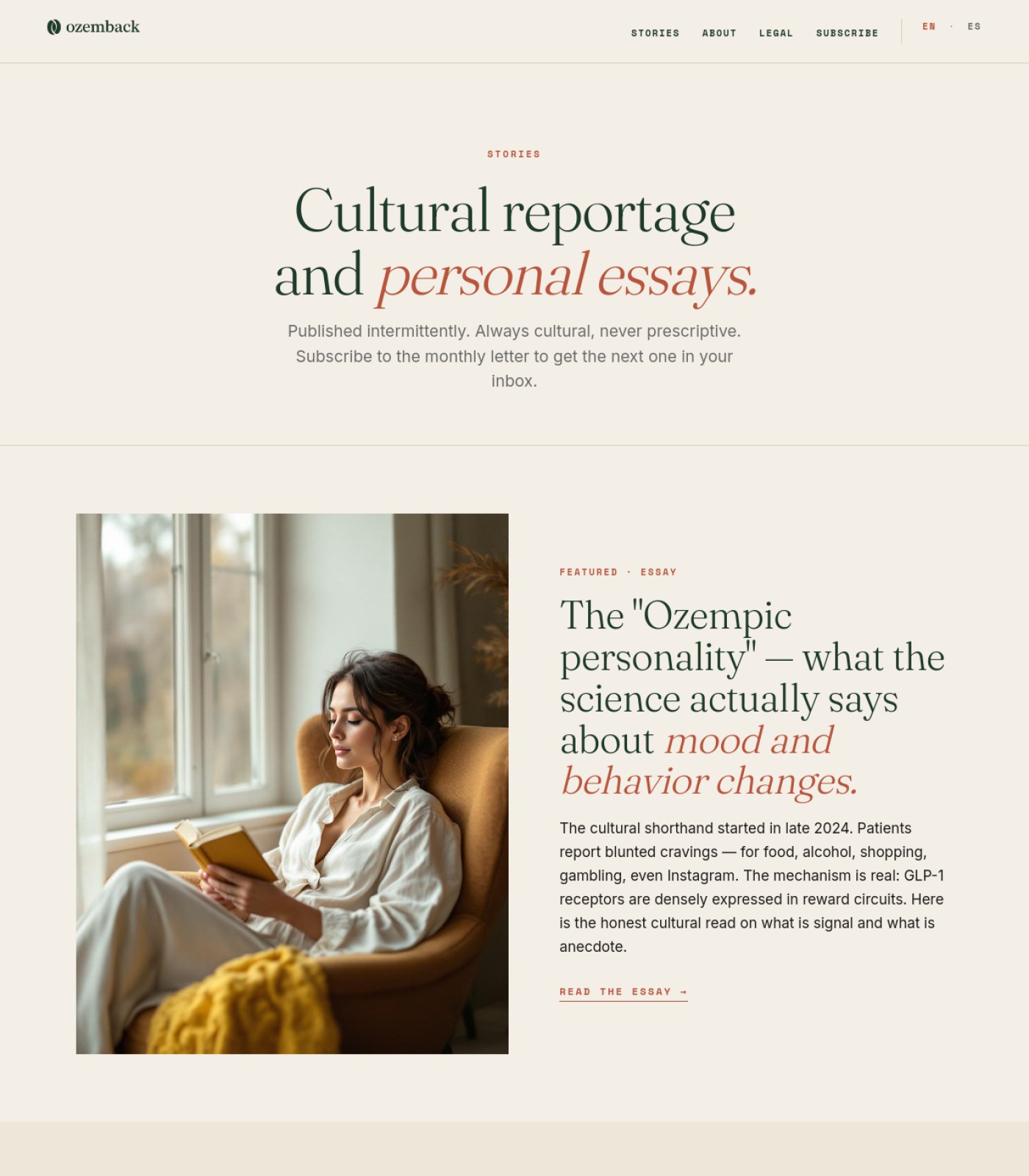
Section 1 of 6
ozemback.com screenshot
1
3
Section 2 of 6
ozemback.com screenshot
Section 3 of 6
ozemback.com screenshot
Section 4 of 6
ozemback.com screenshot
Section 5 of 6
ozemback.com screenshot
2
Section 6 of 6
ozemback.com screenshot
1

Dropper bottle vs injectable mismatch

2

Sources listed but not linked

3

No named author or reviewer

⚡ Ship the fixes

Send this page's fixes to whoever ships it

Check or uncheck items in the checklist below, then use the bar right above it: Copy prompt pastes into a chat-based AI agent (Claude, ChatGPT...). Download JSON or the Advanced API below hand it to an autonomous coding agent (Claude Code, Cursor...). Download checklist is a plain to-do list for a human developer. Or skip all of that — see "Path 2" below.

Or open the raw JSON (all pages) →
Path 2: let it apply fixes for you automatically (private beta)

Instead of you copying a prompt or downloading a file, a weekly check can do the finding-and-proposing part for you:

  1. Once a week, it re-reads your latest Audit Brief and picks out fixes that need no file and no judgment call from you (blocker-free ones only — anything marked "needs a file" or "ask before doing" is never touched by this).
  2. Nothing is written to your site at this point. Each fix is queued as a proposal, exactly like this one:
{ "domain": "yoursite.com", "file_path": "index.html", "pillar": "Words on the Page", "task": "Clarify what 'GEO' means on first mention", "why": "Visitors may not know the acronym.", "old_snippet": "GEO optimizes for citation...", "new_snippet": "GEO (Generative Engine Optimization) optimizes for citation...", "status": "pending" }
  1. You get notified that proposals are waiting. You open your review queue, see a before/after diff for each one, and click Accept or Reject individually — nothing ships to your live site without that click.
  2. You can reject anything, anytime, for any reason. There is no "auto-approve" setting — every single change needs your explicit yes.

This is a private pilot right now, not a self-serve toggle yet — ask us to turn it on for your site.

selected
🖼️

Photos & Images

3 to fix
Replace the dropper-bottle hero photo with an image that matches how retatrutide is actually administered (injectable pen/vial, not a dropper serum)
Showing the wrong drug format on a medical article damages credibility and could mislead readers about how the product works.
why: hero image, section 1
Add cover images to the two book recommendation cards
Book cards with only text and no cover art look unfinished and get fewer clicks than cards with a visual.
why: Books on the Shelf cards, section 6
Confirm the hero photo has descriptive alt text
Screen reader users need a text description of what the image shows, especially since the image is decorative stock photography rather than informative.
why: hero <img>, section 1
🔘

Buttons & Actions

3 to fix · 1 already good
Make each entry in 'Sources cited in this article' a clickable link to its source
Right now the five citations are just bold text with no way to click through and verify them, which weakens trust in the data.
why: Sources cited block, section 5
Hyperlink the in-body mentions of 'Drugs.com's pipeline page' and 'the Lilly investor relations site'
The article tells readers to bookmark these pages but doesn't give them a clickable way to get there.
why: 'What to actually do, now' list item 3, section 4
Style the three 'Further Reading' article titles as clear links (underline or arrow)
As plain dark text they look like headings, not clickable links, so readers may not realize they can click through.
why: Further Reading list, section 6
Keep the 'GET THE GUIDE', 'JOIN THE LIST', and 'View on Amazon' buttons as-is
These are styled distinctly, high-contrast, and clearly clickable.
why: header CTA, newsletter CTA, book cards
Already good
📐

Layout & Structure

1 to fix · 2 already good
Add a short jump-to-section list near the top using the existing headings (Naming, Data, Timeline, What to do)
This is a long 9-minute article; letting readers jump to the part they care about keeps them from bouncing.
why: H2 structure across sections 2-4
Keep the consistent callout-box style (TL;DR, editorial caution, pull quote) with the left green accent bar
Repeating the same visual treatment for asides makes the page easy to scan.
why: TL;DR box section 2, caution box section 4, quote block section 3
Already good
Keep the three-stat row (29%, 71.2, 7+) as a simple, scannable summary
Large numbers with short labels are an easy way to communicate the key data points at a glance.
why: stat row, section 3
Already good
✏️

Words on the Page

1 to fix · 2 already good
Add a named author or medically-reviewed-by credit near the byline
For health content, readers and search engines trust a real name and credentials more than an anonymous editorial team.
why: byline 'OZEMBACK EDITORIAL', section 1
Keep the repeated hedging language ('investigational,' 'not yet approved,' 'averages vary')
This kind of careful, honest wording is exactly what regulators and readers expect from medical content.
why: body copy, sections 2-3
Already good
Keep the TL;DR summary box near the top
It gives readers (and AI tools scanning the page) a fast, accurate summary of the whole article.
why: TL;DR box, section 2
Already good
🧭

Menu & Getting Around

1 to fix · 1 already good
Add a simple text breadcrumb (Home > Journal > Retatrutide) above the headline
A breadcrumb helps readers understand where they are in the site and makes it easy to back out to the full journal.
why: top of article, section 1
Keep matching navigation links in both the header and footer
Having the same core links (Map, Guide, Journal) in both places makes the site easy to navigate from anywhere on the page.
why: header nav section 1, footer nav section 6
Already good
🔍

Being Found by AI & Google

2 to fix · 1 already good
Hyperlink every source in the citations list to its real source page
Search engines and AI tools reward health content that clearly links to verifiable primary sources; unlinked citations look unverified.
why: Sources cited block, section 5
Add visible author credentials or a medical reviewer line
Google's guidance for health topics puts heavy weight on who wrote or reviewed the content; an anonymous 'Editorial' byline is a weak signal.
why: byline, section 1
Keep the clear dated bylines ('April 2026', 'Updated Q2 2026') and structured H2s
Visible freshness dates and clean headings help both search engines and AI summarizers understand and trust the content.
why: byline and H2 structure, sections 1-4
Already good
⚖️

Legal & Accessibility Risk

2 to fix · 2 already good
Add a named, credentialed medical reviewer or author bio
For content making direct drug efficacy comparisons, an anonymous byline increases legal and reputational risk if claims are ever challenged.
why: byline, section 1
Check the orange link color against the cream background for contrast
Light orange text on a light cream background may not meet accessibility contrast standards for readers with low vision.
why: orange hyperlinks, sections 4-5
Keep the full medical disclaimer and 'not affiliated with Lilly/Novo Nordisk' trademark notice in the footer
This is exactly the kind of disclosure regulated health content needs, and it's already clearly present.
why: Medical Disclaimer block and footer trademark text, sections 5-6
Already good
Keep the Amazon affiliate disclosure text under the book cards
Disclosing paid affiliate relationships is required and is already handled clearly here.
why: affiliate disclosure text, section 6
Already good
For your boss / your team

One-line summary you can forward

This retatrutide article scores about 69/100: the writing is careful and well-organized with good disclaimers, but three things are holding it back from being fully trustworthy as health content. First, the hero photo shows a dropper bottle even though the drug is actually injectable, which is a mismatch that can confuse or mislead readers. Second, the 'Sources cited' list at the bottom names real studies and reports but doesn't link to any of them, so nobody can click through to verify the claims. Third, the article has no named author or medical reviewer, just 'Ozemback Editorial,' which weakens trust for both readers and search engines on a medical topic. Fixing the image, linking the sources, and adding a real byline with credentials would push this page to roughly 87/100.

Audit Brief

ozemback.com

Blog Fda Peptide Reclassification 2026 · generated automatically · https://ozemback.com/blog/fda-peptide-reclassification-2026

74
Today
89
After fixes

This page is 74% ready to send traffic to. Fixing the items below gets it to an estimated 89%.

Do these 3 first
1

Put a real disclaimer inside the article, not just a nav linkThis is health/regulatory content about FDA drug rules and peptide legality, so readers need a clear caution right in the story, not buried in a menu item.

2

Add a jump-to-section outline near the topIt's a 9-minute read with 8+ sections and no way to skip to the part a reader actually needs, like the July 23 meeting or the FAQ.

3

Give readers a next step partway through the articleThe only clickable action on the whole page is the 'Free Guide' button in the header, so a long, engaged reader has nothing to click until they scroll all the way back up.

📍 The map

 — this page, with the fixes marked where they happen
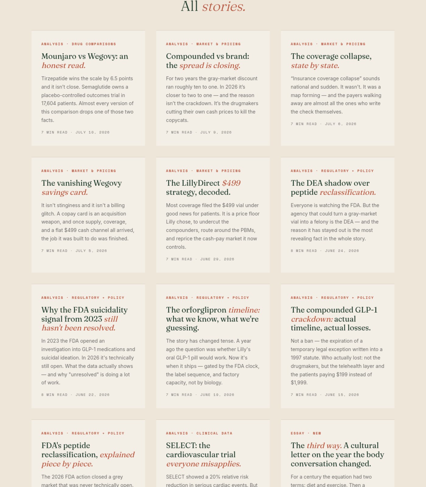
Section 1 of 6
ozemback.com screenshot
1
Section 2 of 6
ozemback.com screenshot
Section 3 of 6
ozemback.com screenshot
2
Section 4 of 6
ozemback.com screenshot
Section 5 of 6
ozemback.com screenshot
3
Section 6 of 6
ozemback.com screenshot
1

Check orange headline text contrast

2

Decorative band text contrast

3

No mid-article call-to-action

⚡ Ship the fixes

Send this page's fixes to whoever ships it

Check or uncheck items in the checklist below, then use the bar right above it: Copy prompt pastes into a chat-based AI agent (Claude, ChatGPT...). Download JSON or the Advanced API below hand it to an autonomous coding agent (Claude Code, Cursor...). Download checklist is a plain to-do list for a human developer. Or skip all of that — see "Path 2" below.

Or open the raw JSON (all pages) →
Path 2: let it apply fixes for you automatically (private beta)

Instead of you copying a prompt or downloading a file, a weekly check can do the finding-and-proposing part for you:

  1. Once a week, it re-reads your latest Audit Brief and picks out fixes that need no file and no judgment call from you (blocker-free ones only — anything marked "needs a file" or "ask before doing" is never touched by this).
  2. Nothing is written to your site at this point. Each fix is queued as a proposal, exactly like this one:
{ "domain": "yoursite.com", "file_path": "index.html", "pillar": "Words on the Page", "task": "Clarify what 'GEO' means on first mention", "why": "Visitors may not know the acronym.", "old_snippet": "GEO optimizes for citation...", "new_snippet": "GEO (Generative Engine Optimization) optimizes for citation...", "status": "pending" }
  1. You get notified that proposals are waiting. You open your review queue, see a before/after diff for each one, and click Accept or Reject individually — nothing ships to your live site without that click.
  2. You can reject anything, anytime, for any reason. There is no "auto-approve" setting — every single change needs your explicit yes.

This is a private pilot right now, not a self-serve toggle yet — ask us to turn it on for your site.

selected
🖼️

Photos & Images

3 to fix · 1 already good
Add descriptive alt text to the hero photo of the bottle and pen
Screen reader users and Google both need a text description of what the image shows.
why: WCAG 1.1.1 non-text content
Add a small author photo or avatar next to the byline
A face next to 'Ozemback Editorial' makes the article feel more trustworthy, especially for medical/regulatory content.
why: E-E-A-T trust signals for YMYL content
Add a thumbnail image to each 'Keep reading' card
The three related-article cards are currently text-only, which makes them easy to skip past.
why: visual scanning / recognition over recall
Hero photo tone matches the editorial, regulatory subject well
A moody, considered photo (bottle, pen, paper) fits a legal/regulatory story better than a generic stock shot.
why: brand-content fit
Already good
🔘

Buttons & Actions

2 to fix · 1 already good
Add one clear call-to-action inside the article body (e.g. link to a Paid Guide or the Free Guide)
Right now a reader has to scroll all the way back to the top header to take any action after reading 9 minutes of content.
why: conversion path / calls-to-action per scroll depth
Make the 'Keep reading' cards look more clickable (e.g. add a visible arrow or underline on the title)
As shown, they read like plain text blocks rather than obvious links.
why: affordance cues for interactive elements
Header 'Free Guide' button stands out clearly with good color contrast and consistent placement
It's easy to spot on every scroll position since it's in the fixed header.
why: consistent primary CTA placement
Already good
📐

Layout & Structure

2 to fix · 1 already good
Add a short jump-to-section list (using the existing H2 headings) near the top of the article
Readers skimming a long regulatory piece need to jump straight to 'July 23 meeting' or 'FAQ' without scrolling through everything.
why: long-form content navigation aids
Add a breadcrumb trail above the headline (Home > Journal > Article)
It orients readers to where they are in the site and gives them an easy way back.
why: breadcrumb navigation for content hierarchy
TL;DR and Important callout boxes visually separate summary and warning content from the main body
This lets readers get the key facts even if they don't read the whole piece.
why: content chunking for scannability
Already good
✏️

Words on the Page

2 to fix · 1 already good
Add a one- or two-line disclaimer directly in the article body (e.g. right after the intro paragraph)
The article discusses drug legality and dosing pathways; a visible reminder that this isn't medical/legal advice belongs in the story itself.
why: YMYL content disclosure best practice
Replace generic 'Ozemback Editorial' byline with a named author and their credentials
Google and readers trust health-adjacent content more when a real, qualified person is attached to it.
why: E-E-A-T author expertise signals
TL;DR summary and FAQ format make dense regulatory content easy to digest quickly
Busy readers get the core answer ('not legal yet, meeting July 23') without reading the full piece.
why: front-loaded summary pattern
Already good
🧭

Menu & Getting Around

2 to fix · 1 already good
Style the Sources & References links (and any other real links) so they look different from bold body text
Right now bold citation text looks the same as bold emphasis elsewhere, so readers can't tell what's clickable.
why: link affordance / discoverability
Add anchor links from each FAQ question straight down to its own answer
Helps readers who arrive from a search result looking for one specific question jump right to it.
why: in-page anchor navigation
Top navigation is short, clearly labeled, and consistent (Peptides, Journal, Paid Guides, Disclaimer)
A small, clear menu keeps visitors from getting lost.
why: minimal, task-focused navigation
Already good
🔍

Being Found by AI & Google

2 to fix · 1 already good
Confirm the FAQ section is marked up as structured FAQ data
This content is already formatted as clean Q&A, which is exactly what Google and AI answer engines look for to feature it directly in results.
why: FAQPage schema for rich results
Add author credentials/bio block to strengthen the page's trust signals for search and AI citation
Named expertise on regulatory health content makes it more likely to be cited as a trustworthy source.
why: author-level E-E-A-T signals
Specific dates, named agencies (HHS, FDA), and a Sources & References list make this article highly citable
This is exactly the kind of concrete, sourced detail that search engines and AI tools prefer to quote.
why: citation-worthy content structure
Already good
⚖️

Legal & Accessibility Risk

2 to fix · 1 already good
Add a visible disclaimer inside the article body given the subject is FDA drug classification and compounding legality
Relying on a separate nav 'Disclaimer' page is a weaker legal protection than a disclaimer readers actually see while reading claims about drug legality.
why: health/legal content disclosure risk
Check color contrast on the orange/terracotta italic headline text and the pale green text inside the dark decorative divider band
Both of those color combinations look like they could fall short of readable contrast for users with low vision.
why: WCAG 1.4.3 contrast minimum
The 'Important' callout clearly states that an HHS announcement is not yet an FDA rule
This directly reduces the risk of readers assuming these peptides are already legal, which matters a lot for a regulated-substance topic.
why: clear disclosure of regulatory status
Already good
For your boss / your team

One-line summary you can forward

This long-form article scores 74/100 today — the writing, TL;DR summary, callout boxes, FAQ, and sourced references are genuinely well done for a regulatory topic, but three gaps hold it back: there's no disclaimer visible inside the article itself even though it covers FDA drug legality (only a nav link), there's no way to jump to a specific section in a 9-minute read, and there's no call-to-action anywhere in the body so engaged readers hit a dead end until they scroll back to the header. Fixing these three plus tightening up author credentials and link/color contrast would bring this to an estimated 89/100, all without needing to build any new page sections.

Audit Brief

ozemback.com

Legal · generated automatically · https://ozemback.com/legal

71
Today
89
After fixes

This page is 71% ready to send traffic to. Fixing the items below gets it to an estimated 89%.

Do these 3 first
1

Fix low-contrast orange text in the callout boxThe orange/red disclaimer text on the tan background is hard to read for many people and is the most legally important content on the page.

2

Add jump links to the long legal documentThe page has 15+ sections and no way to jump to a specific one, so readers (and their lawyers) have to scroll through the whole thing to find one clause.

3

Turn 'Subscribe' into a real buttonIt currently looks like every other plain text nav link, so the site's main growth action barely stands out.

📍 The map

 — this page, with the fixes marked where they happen
Section 1 of 4
ozemback.com screenshot
1
2
Section 2 of 4
ozemback.com screenshot
Section 3 of 4
ozemback.com screenshot
Section 4 of 4
ozemback.com screenshot
3
1

Low-contrast orange disclaimer text

2

Subscribe not styled as button

3

No separate privacy/cookie link

⚡ Ship the fixes

Send this page's fixes to whoever ships it

Check or uncheck items in the checklist below, then use the bar right above it: Copy prompt pastes into a chat-based AI agent (Claude, ChatGPT...). Download JSON or the Advanced API below hand it to an autonomous coding agent (Claude Code, Cursor...). Download checklist is a plain to-do list for a human developer. Or skip all of that — see "Path 2" below.

Or open the raw JSON (all pages) →
Path 2: let it apply fixes for you automatically (private beta)

Instead of you copying a prompt or downloading a file, a weekly check can do the finding-and-proposing part for you:

  1. Once a week, it re-reads your latest Audit Brief and picks out fixes that need no file and no judgment call from you (blocker-free ones only — anything marked "needs a file" or "ask before doing" is never touched by this).
  2. Nothing is written to your site at this point. Each fix is queued as a proposal, exactly like this one:
{ "domain": "yoursite.com", "file_path": "index.html", "pillar": "Words on the Page", "task": "Clarify what 'GEO' means on first mention", "why": "Visitors may not know the acronym.", "old_snippet": "GEO optimizes for citation...", "new_snippet": "GEO (Generative Engine Optimization) optimizes for citation...", "status": "pending" }
  1. You get notified that proposals are waiting. You open your review queue, see a before/after diff for each one, and click Accept or Reject individually — nothing ships to your live site without that click.
  2. You can reject anything, anytime, for any reason. There is no "auto-approve" setting — every single change needs your explicit yes.

This is a private pilot right now, not a self-serve toggle yet — ask us to turn it on for your site.

selected
🖼️

Photos & Images

1 to fix · 1 already good
Keep this page text-only / image-light
A legal disclaimer doesn't need photos, and the current bare-bones layout keeps the focus on the important text.
why: content hierarchy
Already good
Confirm the small logo icon has descriptive alt text
Screen reader users need to know this icon represents the Ozemback brand mark, not just a decorative circle.
why: img alt attribute
🔘

Buttons & Actions

2 to fix · 1 already good
Style 'SUBSCRIBE' as a distinct button, not a plain nav link
It's the site's main conversion action but visually blends in with informational links like Stories and About.
why: visual hierarchy / primary CTA affordance
Add a small 'Subscribe to the newsletter' link near the Contact section
The page mentions a monthly newsletter twice but gives readers no easy way to act on it right there.
why: call-to-action placement
Make the mailto email links visually match other clickable elements
Right now the only interactive elements on the page are text-colored links, so people may not realize they're clickable.
why: link affordance consistency
Already good
📐

Layout & Structure

1 to fix · 2 already good
Add anchor/jump links for each section heading (What Ozemback does, References, Editorial standards, etc.)
The page is very long with 15+ headings and no way to skip straight to the one you need.
why: long-document in-page navigation
Keep the red vertical accent bar highlighting the core disclaimer
It clearly visually separates the single most important legal statement from the rest of the page.
why: visual emphasis pattern
Already good
Consistent heading hierarchy throughout (Legal & Disclaimer > section headers > body)
This makes the document easy to scan and is good for both readers and screen readers.
why: heading structure
Already good
✏️

Words on the Page

1 to fix · 2 already good
Keep the plain-language explanations of what the site does/does not do
Turning legal boilerplate into a simple bulleted list is genuinely reader-friendly and reduces confusion.
why: plain-language legal writing
Already good
Double check the 'LAST UPDATED: MAY 2026' date is correct
A future-dated 'last updated' stamp can look like an error and undermine trust in the document's accuracy.
why: content accuracy check
Continue citing sources and years for regulatory/scientific claims
This is already being done and builds credibility for a site writing about medical topics.
why: sourcing transparency
Already good
🧭

Menu & Getting Around

2 to fix · 1 already good
Keep the matching header and footer navigation
Having the same core links (Stories, About, Legal) in both places makes the site easy to navigate from anywhere.
why: nav consistency
Already good
Add a short table of contents near the top of this legal page
With this many sections, a simple list of links at the top would save readers a lot of scrolling.
why: in-page navigation for long content
Add a visible 'Privacy Policy' or 'Cookie Policy' footer link if one exists separately
Currently only 'Legal & Disclaimer' is listed, so shoppers can't tell if privacy terms are covered elsewhere or bundled here.
why: footer link completeness
🔍

Being Found by AI & Google

2 to fix · 1 already good
Keep the clear, descriptive page title 'Legal & Disclaimer'
This helps both users and search engines immediately understand the page's purpose.
why: page title clarity
Already good
Add hreflang tags to support the EN/ES language toggle
Without this, Google may not correctly show Spanish-speaking users the Spanish version in search results.
why: international SEO / hreflang
Add a meta description summarizing this is a legal/medical disclaimer for a cultural magazine
A good meta description improves how this page appears in Google search results and AI answer summaries.
why: meta description / snippet optimization
⚖️

Legal & Accessibility Risk

3 to fix · 1 already good
Increase contrast of the orange/red highlighted text against the tan callout background
This color combination likely fails accessibility contrast standards, making the most critical disclaimer text hard to read for many people.
why: WCAG 2.1 AA contrast ratio (4.5:1)
Add a visible cookie consent notice if any tracking/analytics is used
None of the four page sections show a cookie banner, which is a compliance gap if the site collects data from EU or other regulated visitors.
why: cookie consent / GDPR-style compliance
Keep the thorough disclaimer covering medical advice, liability, indemnification, and governing law
This is a strong, complete legal disclaimer for a magazine writing about medications — better than most sites in this space.
why: legal disclaimer completeness
Already good
Add a skip-to-content link for keyboard and screen reader users
None is visible across any part of the page, and it would help users skip the repeated navigation on such a long page.
why: WCAG 2.4.1 bypass blocks
For your boss / your team

One-line summary you can forward

This legal disclaimer page scores 71/100 today — the actual legal writing is thorough and clearly worded, which is a real strength for a site discussing weight-loss medications. The biggest issues are practical, not legal: the highlighted orange disclaimer text likely doesn't meet contrast/readability standards, the page has no jump links despite being extremely long (15+ sections), and the 'Subscribe' button in the navigation looks identical to plain informational links, quietly hurting newsletter growth. There's also no visible cookie consent notice, which is worth a quick compliance check given the bilingual (EN/ES) audience. None of these fixes require new content or design elements — mostly restyling, adding anchor links, and a quick legal review — and doing them would bring the score up to an estimated 89/100.

Nice, your score went up

It was 64/100 last check, now 71/100. Keep going.