Audit Brief

insureichra.com

Homepage · generated automatically · https://insureichra.com

58
Today
83
After fixes

Your page is 58% ready to send traffic to. Fixing the items below gets it to an estimated 83%.

Do these 3 first
1

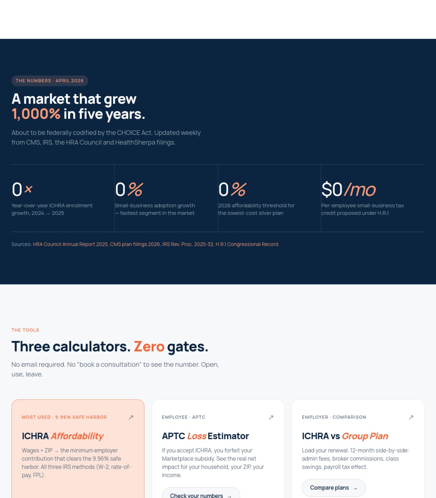
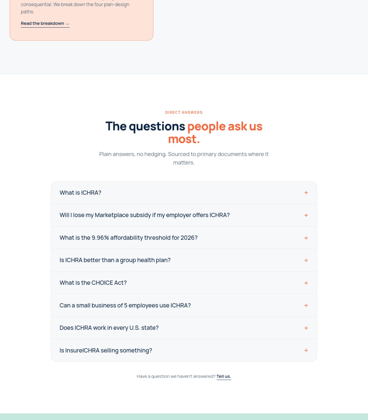
Fix the broken stat counters showing '0'The 'market growth' numbers all display as 0x, 0%, 0%, $0 instead of the real figures, which directly contradicts the '1,000% growth' headline right above them and undermines trust in an insurance site.

2

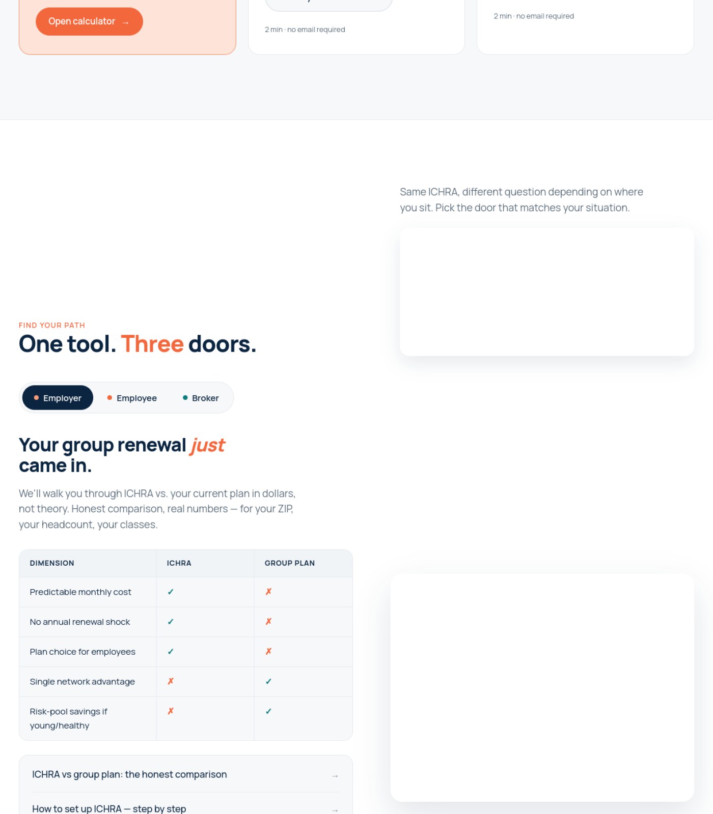
Fill or remove the two empty white boxes in the 'Find your path' sectionTwo large blank rectangles sit next to the employer/employee/broker copy with nothing in them, making the page look unfinished.

3

Add real footer legal and licensing informationAs an insurance publication the footer needs visible license/NPN details, privacy policy, and terms links, but the footer that's visible is just a color bar with no content.

How to use this

Every fix below has a checkbox — checked by default. Uncheck anything you don't want to send along, then use the buttons above the map to copy a prompt for your AI coding agent, download a checklist for your developer, or download the raw JSON.

⚡ Ship the fixes

Take only what you selected below

Check or uncheck items in the list further down, then come back here — these options only include what's still checked.

Or open the raw JSON →
Advanced: my agent has internet access, skip the files

Your site's API key (keep it private):

ff7e4a4cc880a911846ec3ffe2cf6a3597f3e9eb

Give your agent this command — it always fetches your latest saved findings, live:

curl "https://vislumbra.com/agent-fetch.php?api_key=ff7e4a4cc880a911846ec3ffe2cf6a3597f3e9eb"

📍 The map

 — your real page, with the fixes marked where they happen
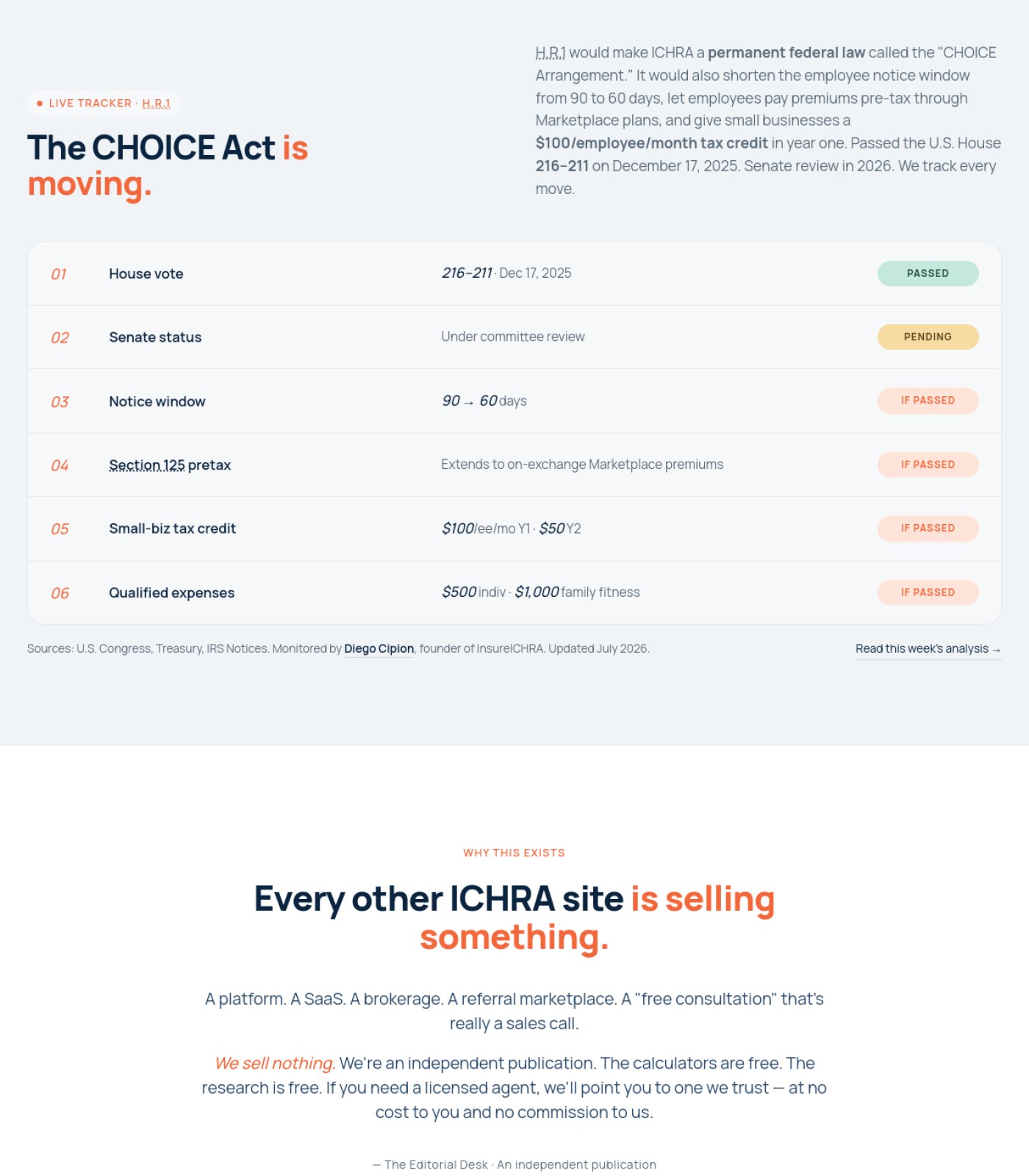
Section 1 of 6
insureichra.com screenshot
3
Section 2 of 6
insureichra.com screenshot
Section 3 of 6
insureichra.com screenshot
1
Section 4 of 6
insureichra.com screenshot
2
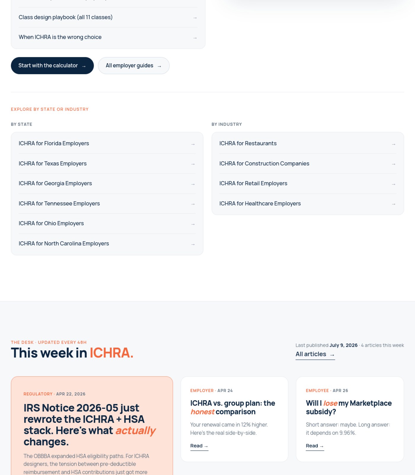
Section 5 of 6
insureichra.com screenshot
Section 6 of 6
insureichra.com screenshot
1

Stat counters stuck at 0

2

Empty content box #1

3

Overlapping ticker text

12 of 12 selected
🖼️

Photos & Images

2 to fix · 1 already good
Populate the two empty white content boxes in the 'Find your path' section with the intended graphic or remove them
Large blank boxes next to real copy make the section look broken or half-built to visitors.
why: empty div containers, no rendered image/illustration, section 4
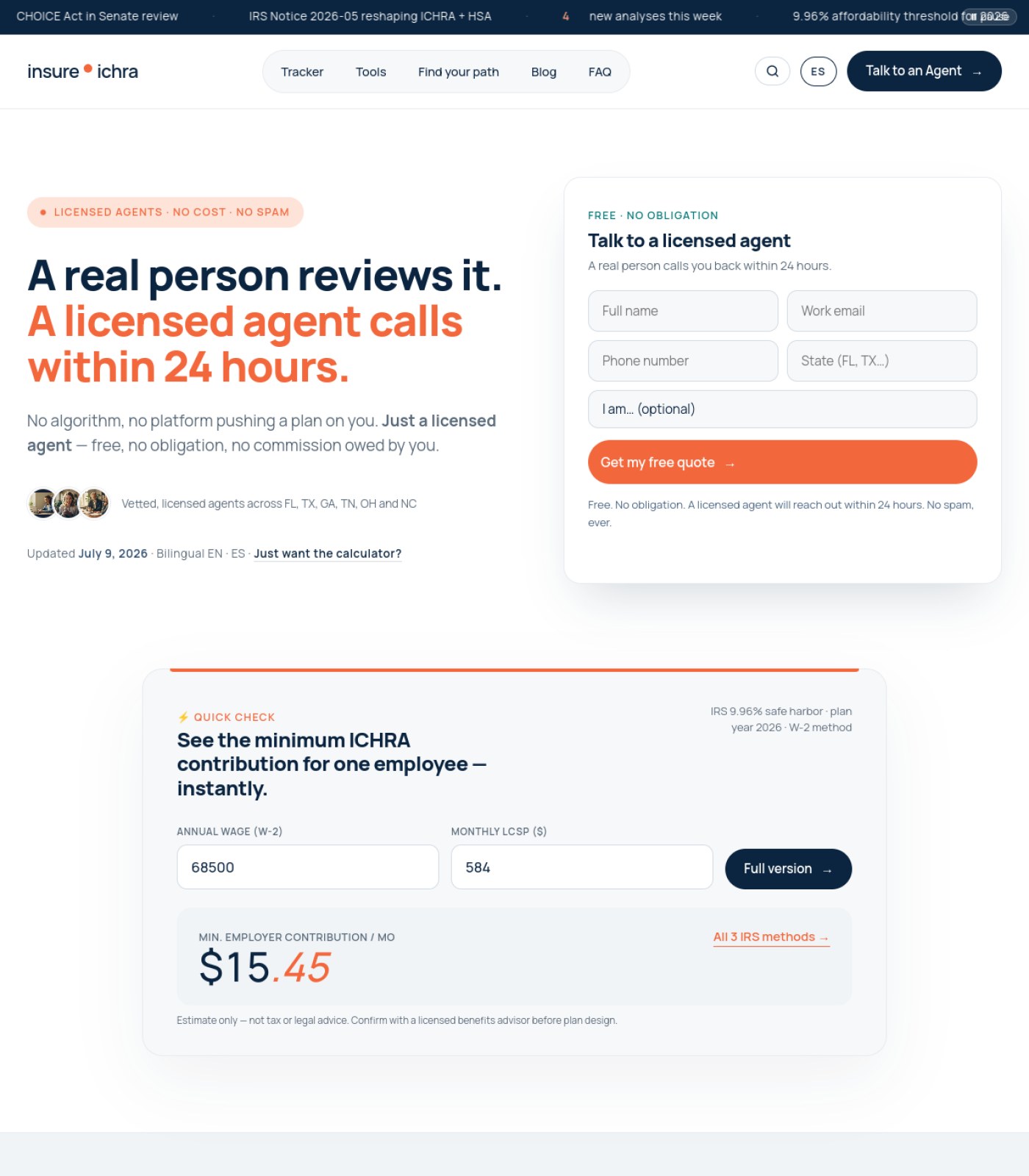
Add a real photo of a licensed agent near the 'A real person reviews it' claim
The headline promises a real person but the only faces on the page are three tiny generic circular avatars, which weakens the trust claim.
why: hero section, 3 small circular headshots ~40px, no larger supporting photo
Keep the small agent avatar row as-is
Having actual small headshots next to 'vetted, licensed agents' is a good lightweight trust signal.
why: hero, avatar cluster + caption 'Vetted, licensed agents across FL, TX, GA, TN, OH and NC'
Already good
🔘

Buttons & Actions

2 to fix · 1 already good
Keep the repeated, context-specific calculator CTAs
Buttons like 'Open calculator', 'Check your numbers', and 'Compare plans' are labeled differently per calculator, which helps people pick the right tool instead of one generic button everywhere.
why: section 3-4, three calculator cards with distinct CTA labels
Already good
Make the primary lead-gen button style consistent across the page
The main quote form uses a solid orange button while similarly important actions ('Full version', 'Compare plans') use outline/dark buttons, which can make it unclear which action is the top priority on each screen.
why: orange 'Get my free quote' vs. dark 'Full version' and 'Compare plans' buttons
Double check the ticker banner links at the very top are tappable/clickable
News-style ticker items ('CHOICE Act in Senate review', 'IRS Notice 2026-05...') look like headlines but it's not visually clear if they link anywhere.
why: top scrolling ticker bar, section 1
📐

Layout & Structure

2 to fix · 1 already good
Fix the overlapping text in the top ticker bar
The text '9.96% affordability threshold for 2026' visibly overlaps with other text, making it unreadable.
why: top ticker bar, right side, section 1, overlapping strings
Fix the stat counters that are stuck at zero
A big dark 'The Numbers' section shows 0x, 0%, 0%, $0/mo where real figures should be, right under a headline claiming 1,000% growth — this reads as a bug, not as data.
why: section 3, four large stat blocks all rendering '0'
Keep the alternating dark/light section backgrounds
Switching between navy, white, and light gray sections helps visually separate the tracker, stats, tools, and FAQ areas so the long page doesn't feel like one wall of text.
why: sections 1-6, alternating background colors between content blocks
Already good
✏️

Words on the Page

1 to fix · 2 already good
Make sure the numbers in the stats section match the numbers stated in the surrounding copy
The text says the market 'grew 1,000% in five years' and cites a '$100/employee/month tax credit', but the big numbers directly below both read 0 — this contradiction damages credibility.
why: section 3 headline vs. stat tiles below it
Keep the plain-language disclaimers on the calculators
Lines like 'Estimate only — not tax or legal advice. Confirm with a licensed benefits advisor before plan design' clearly manage expectations, which matters a lot for an insurance product.
why: quick-check calculator, section 1 bottom
Already good
Keep citing primary sources for every stat and tracker item
Naming the HRA Council report, CMS filings, IRS Revenue Procedure, and Congressional Record gives readers and search engines a reason to trust the numbers.
why: sources lines under tracker table and stats section
Already good
🧭

Menu & Getting Around

1 to fix · 2 already good
Build out visible footer navigation (legal pages, sitemap, contact)
The bottom of the page ends in a plain colored bar with no visible links, address, or company info, so visitors reaching the end have nowhere else to go.
why: final section, bottom of page, solid mint-colored bar with no visible content
Keep the top navigation short and task-focused
Tracker, Tools, Find your path, Blog, FAQ plus a clear 'Talk to an Agent' button gives visitors an obvious next step no matter what they came for.
why: top nav bar, section 1
Already good
Keep the Employer/Employee/Broker toggle for the 'Find your path' tool
Letting people self-select their role before showing content is a simple, clear way to route different audiences without extra menus.
why: section 4, pill toggle 'Employer / Employee / Broker'
Already good
🔍

Being Found by AI & Google

1 to fix · 2 already good
Add FAQ structured data to the question list at the bottom
The page already has a clean list of real questions and answers ('What is ICHRA?', 'What is the CHOICE Act?'), which is exactly the content Google and AI answer engines look for — marking it up properly helps it get pulled into search answers.
why: FAQ accordion, section 6
Keep the frequently-updated news ticker and 'This week in ICHRA' article dates
Visible fresh dates ('Updated July 9, 2026', 'Last published July 9, 2026 · 4 articles this week') signal to search and AI crawlers that this is an actively maintained authority page, not a stale one.
why: hero subtext and 'This week in ICHRA' section header
Already good
Keep sourcing claims to named primary documents
Explicit citations like 'IRS Rev. Proc. 2025-32' and 'H.R.1 Congressional Record' are strong trust signals for AI systems evaluating expertise on regulated financial/insurance topics.
why: sources line, section 3
Already good
⚖️

Legal & Accessibility Risk

3 to fix · 1 already good
Add visible, persistent labels above each form field instead of relying on placeholder text alone
Fields like 'Full name', 'Work email', 'Phone number' only show as gray placeholder text inside the box, which disappears once someone starts typing and is hard for screen readers to announce correctly.
why: lead form, section 1, 'Full name'/'Work email'/'Phone number'/'State' inputs
Add licensing and compliance information to the footer (NPN/license numbers, state disclosures, privacy policy, terms of service)
For an insurance-related site, regulators and users expect to see who holds the license and how data is used, but none of this is visible anywhere on the page including the footer.
why: footer area, final section, no visible legal links or license text
Check color contrast on orange status tags and links against their light backgrounds
Orange text/badges like 'IF PASSED' on a pale pink or white background can be hard to read for people with low vision if the contrast ratio is too low.
why: tracker table status pills and orange text links throughout, sections 2-6
Keep the clear 'estimate only, not tax or legal advice' disclaimer on the calculator
This is exactly the kind of liability-limiting language regulated insurance content needs next to any number an employer might rely on.
why: quick-check calculator disclaimer, section 1
Already good
For your boss / your team

One-line summary you can forward

This page scores 58/100 today. The content strategy and legal disclaimers are genuinely strong for an insurance site, but there are visible bugs that undercut trust: the 'market growth' stats all display as 0 instead of real numbers right under a headline claiming 1,000% growth, two large content boxes in the 'Find your path' section are blank, and text in the top news ticker overlaps itself. There's also no visible footer with licensing, privacy, or terms information, which is a real gap for a regulated insurance publication, and the lead-gen form relies on placeholder text instead of real field labels. Fixing the broken counters, filling in the empty boxes, and building out a proper footer with legal/licensing details would address the biggest risks and should lift the score to roughly 83/100.

Tracked automatically, every week

We check this page weekly and only email when something changes, plus a monthly check-in either way.