We use cookies for basic analytics and to keep you logged in if you have an account. See our Privacy Policy.
AI page audits, without the redesign

Get more from the website you already have.

Paste any page. Vislumbra tells you exactly what to move, swap or rewrite to get more signups and sales — using only the buttons, cards and colors your site already has. No redesign, no new template, no agency retainer.

It also weighs legal and accessibility risk by industry, and needs nothing installed — so it works even if your company locks down what software you can use.

Free page review · results in under a minute · no credit card

yourbank.com/open-account
1

Keep one main buttonThree equal buttons split attention. One clear action converts better.

2

Bring the form upYour signup sits too low. Most visitors never scroll that far.

Uses your componentsEvery fix works with buttons and styles your site already has.

Page score 6288 9 fixes found · 6 doable this week Backed by UX research, not opinion
Nielsen heuristicsFitts's lawHick's lawGestalt principlesWCAG 2.2 AASaliency modelingCognitive loadSchwartz awarenessADA risk by industry Nielsen heuristicsFitts's lawHick's lawGestalt principlesWCAG 2.2 AASaliency modelingCognitive loadSchwartz awarenessADA risk by industry

THE PROBLEM

Every AI tool assumes
you can start over. You can't.

In a bank, an insurer, a hospital, a franchise, the template is governed. Brand owns the colors. Legal owns the claims. IT owns the components. Vislumbra is the only tool built for that reality.

AI page graders

Critique in a vacuum

They score your page as if you could rebuild it freely. The advice dies in your first compliance meeting.

Figma linters

Look at the file, not the page

Design system checkers audit the design file, before development. They never see the live page or whether it sells.

Page builders

Only optimize their own template

Unbounce and Instapage optimize within a template, as long as it's theirs. Yours lives in your CMS.

Most AI audit tools grade freely, as if you could redesign.

HOW THE REST OF THE CATEGORY WORKS

THE METHOD

Inventory first.
Then, and only then, advice.

The step every other tool skips is the one that makes recommendations executable instead of aspirational.

01

Map what the template allows

Vislumbra renders your live page and catalogs the components it already uses: buttons, cards, image slots, brand tokens.

02

Score six pillars against science

Saliency, cognitive load, copy, WCAG and AI visibility. Every finding ties to a named law, never to taste.

03

Deliver only feasible changes

A prioritized list where every item reorders or restyles something you already have. Your dev can start today.

THE SIX PILLARS

What a design director checks. Codified.

Does the image support the message, or fight it?

Saliency scoring against the CTA, brand fit, and whether a slot would work harder with different content.

Grounded in saliency modeling · Gestalt
Hero photo competes with CTAHIGH
Stock image, low brand fitMED
Alt text present on all slotsPASS

One primary action per page goal.

Visual hierarchy, size, distance, competing choices, button copy, sized and placed for the thumb and the eye.

Grounded in Fitts's law · Hick's law
3 competing CTAs above the foldHIGH
Primary CTA below the foldHIGH
Button contrast meets 4.5:1PASS

Clarity, awareness level, claim-to-proof ratio.

Does the headline match what the visitor already knows and wants? Jargon and reading level checked against your audience.

Grounded in Schwartz awareness levels
Headline assumes prior product knowledgeMED
3 unsupported superlative claimsHIGH
CTA copy is specific and activePASS

Can a visitor tell where they are?

Menu structure, click depth, orientation, in seconds, not minutes.

Grounded in Nielsen's usability heuristics
Nav label "Solutions" is unclearMED
Checkout is 4 clicks deepHIGH
Breadcrumbs present and accuratePASS

Is this page citable by AI engines?

Structured data, alt text, entity links, the layer AI crawlers actually read. Powered by the SeenLayer engine.

Grounded in GEO research
No ImageObject structured dataHIGH
Product schema incompleteMED
FAQPage schema presentPASS

WCAG 2.2 AA, weighted by industry.

Contrast, labels, focus, target size. Legal risk rises automatically for healthcare, finance and e-commerce.

Grounded in WCAG 2.2 · ADA case data
Disclaimer text at 2.8:1 contrastHIGH
Two form fields missing labelsMED
Focus states visible sitewidePASS

THE EVIDENCE

Not taste. Numbers.

Subjective feedback is the enemy. Every check traces to published research or measured data, shown as the source in your report.

r=0.83

Correlation between screenshot-level clutter metrics and human ratings of visual noise.

93%

Saliency model correlation with real human eye-tracking data, used to predict first-impression attention.

15-50%

Higher selection rate for a distinctly styled CTA versus one that blends in with the rest of the page.

8,667

ADA website lawsuits filed in the US in 2025. E-commerce is the most targeted sector.

+52%

Year-over-year growth in healthcare ADA lawsuits, driven by patient portals and telehealth.

56 criteria

WCAG 2.2 AA success criteria checked directly in your template code, never patched by an overlay.

Vislumbra does not predict conversion from a screenshot: no honest tool can. It evaluates readiness against codified anti-patterns and cites its sources in every report.

Analyze my page free

THE DELIVERABLE

A work list, not a lecture.

Each finding says what to change, where, why, and how urgent, restricted to your components, ready to hand to a developer.

yourbank.com/checkingScore 62 → 88
01

Merge three competing CTAs into one primary

Seven choices above the fold. Keep "Open account" as primary, demote the rest to the text-link style you already use. Cited: Hick's law.

HIGH
02

Move the application CTA above the fold

Saliency drops 40% before users reach it at 82% page depth. Move it into the hero using the existing button component. Cited: Fitts's law.

HIGH
03

Fix contrast on rate disclaimers

Light gray on white measures 2.8:1, below the WCAG 2.2 minimum of 4.5:1. Use your existing dark-gray text token. Cited: WCAG 1.4.3.

MED

WHO IT'S FOR

Built for the people who hear "that can't be changed" every week.

Two things put you in this category, either one is enough: you work in a regulated industry where brand, legal or compliance controls the design system, or you work at any company where IT controls what software you're allowed to install — often the same companies, not always. Vislumbra treats both as a design parameter, not an inconvenience: no redesign, and nothing to install.

Banking & financial servicesgoverned design, locked-down IT
Insurancestate-regulated disclosures
Healthcare & healthtechHIPAA-aware, compliance-locked templates
Biotech & pharmasecurity review to install anything
Legal & professional servicesbar/licensing-governed copy
Any large enterpriseapproved-software lists, no exceptions

REAL AUDITS, REAL RESULTS

We ran Vislumbra on our own sites before asking you to trust it.

No customer testimonials yet — we're not going to make those up. What we do have: real Audit Briefs on real live sites, fixes applied, scores re-measured. Click any card for the actual report.
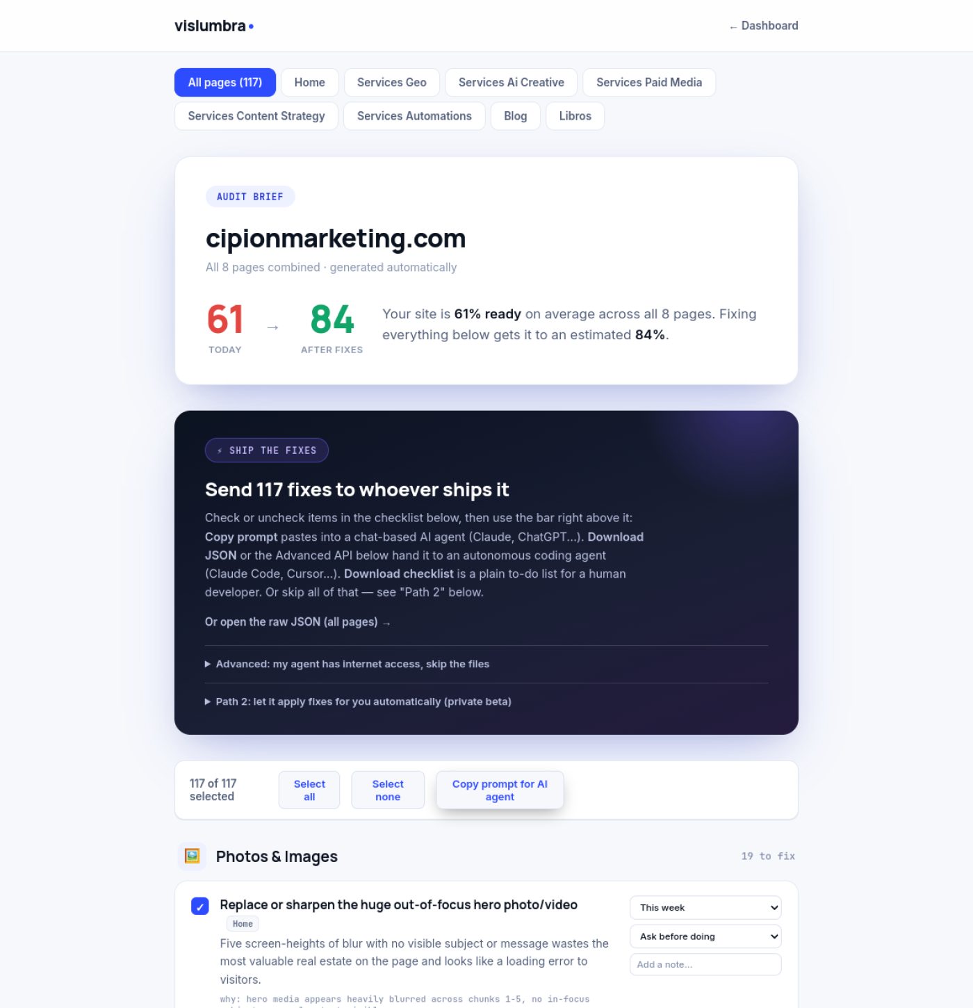
Vislumbra web app dashboard showing cipionmarketing.com audit brief, 61% readiness, AI fix options, and image optimization tasks.

Screenshot of an actual report — cipionmarketing.com, all 8 pages combined

More audits get added here as we run them. See all real audit examples.

FAQ

Straight answers.

Graders critique your page as if you could rebuild it from scratch. Vislumbra first maps the component system your page already uses, then restricts every recommendation to reordering, restyling or reconfiguring what exists.

Because at most banks, insurers, healthcare systems, biotech and pharma companies, you're not allowed to install Claude or a browser extension — corporate IT only approves a short list of tools, often just Copilot. Vislumbra is a hosted web app: paste a URL, get the report, nothing to install, nothing for security to approve.

A pre-traffic evaluation across six pillars: images, CTAs, copy, navigation, AI visibility and accessibility. It is not a conversion prediction: no honest tool can predict conversion from a screenshot.

Nielsen's 10 heuristics, Fitts's law, Hick's law, Gestalt principles, WCAG 2.2 AA, and saliency models validated against real eye-tracking. Every finding cites its source in the report.

Yes, against WCAG 2.2 AA, weighted by your industry's legal risk. Vislumbra reports what to fix in the template itself, not an overlay widget that papers over it.

One URL, audited across all six pillars: your Readiness Score, the component inventory detected, and the top redline items with priority and cited sources.

FREE READINESS REPORT

One URL. Six pillars. Only feasible fixes.

Paste the page you can't redesign. We'll send the report: score, component inventory, prioritized changes, sources cited.

Generated automatically. Your Audit Brief opens right here in under a minute — we'll email you a copy too. By submitting, you agree to our Privacy Policy (includes our cookie use) — we only use your email to send this report.

Vislumbra help
Hi — ask me anything about how Vislumbra works, what it audits, or pricing.